COLOR OF THE YEAR
It begins with inspiration. A movement of color across the globe. A viewpoint of hue highlights over time. The colors of the year showcase color and design tipping points and visual inspiration.
Create a Dunn-Edwards account
Sign up for an account to unlock a variety of features for both professional and retail customers.
How Dunn-Edwards Picks Its Color of the Year
At Dunn-Edwards, our Color of the Year isn’t just a trendy pick; it’s a curated expression of what’s happening in the world of design and how people want to feel in their spaces. It’s part inspiration, part intuition, and a whole lot of research.
Each year, our color team dives headfirst into the ever-evolving world of interior design. We explore what’s gaining momentum in homes, studios, showrooms, and across the global design scene. From cozy textures and material palettes to shifts in how people use color to shape mood and meaning, we take it all in.
We pull inspiration from everywhere: international design fairs (yes, we’ve got our eyes on you, Milan), cultural trends, emerging lifestyles, and emotional undercurrents. What are people craving in their homes? What color stories are interior designers leaning into? How are moods and materials shaping color choices? These are the questions we ask all year long.
Our selection process is never rushed. It’s a full-year journey—a rolling conversation between our color experts, who look beyond the surface and dig into how color influences well-being, identity, and space. We study shifts in lighting trends, popular finishes, and the subtle emotional signals color sends in a room. Because let’s be honest, paint isn’t just paint. It sets the tone for how a space feels the moment you walk in.
The color name is essential as it is part of the magic of the Color of the Year. A name doesn’t just describe a color—it brings it to life. It evokes feeling, sparks imagination, and sets the stage for how it’ll be embraced in interiors, from statement walls to accent furniture and everything in between.
When we select our Color of the Year, it’s because it captures something truly real. Something current. It’s rooted in design relevance, cultural reflection, and emotional connection. It’s the color we believe will define how people want their spaces to look and, more importantly, how they want them to feel.
In the end, it’s about more than aesthetics. At Dunn-Edwards, we believe color has the power to transform a space and tell a story. And each year, our Color of the Year tells a story that’s deeply connected to design, emotion, and the moment we’re in.
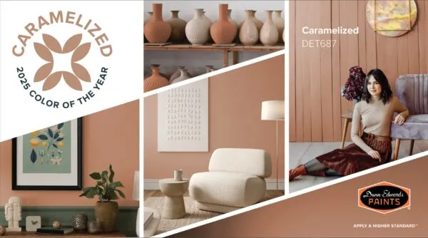


2025 Caramelized (DET687)
Dunn-Edwards® 2025 Color of the Year, Caramelized, is a warm terracotta brown with soft, earthy tones reminiscent of sunbaked clay. The ultimate new neutral, this sophisticated color demonstrates versatility, pairing well with various styles, from vintage-inspired interiors to sleek, contemporary spaces that embrace the concept of ‘old is new.’
2024 Skipping Stones (DET567)
Dunn-Edwards® 2024 Color of the Year, Skipping Stones, is a serene and steely blue with hints of green and gray is meditative and energizing like the sea. As we move into 2024, Skipping Stones lets you capture the feeling of dreamy nostalgia blended with a future of unlimited possibilities.
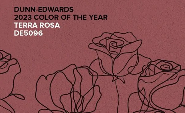
2023 Terra Rosa (DE5096)
Dunn-Edwards® 2023 Color of the Year, Terra Rosa, is a deep, rosy pink hue with a touch of terra-cotta influence that exudes confidence, creativity and coziness.
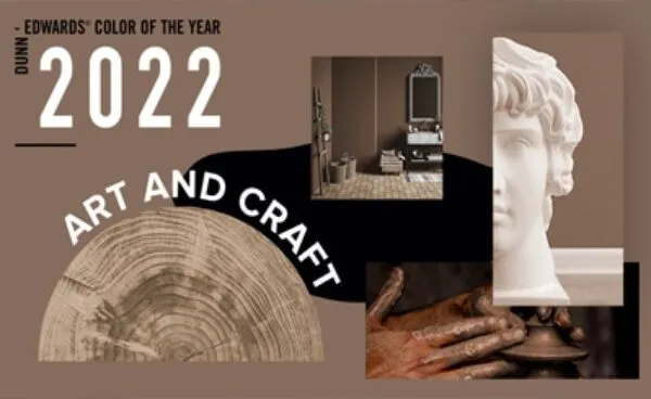
2022 Art and Craft (DET682)
Dunn-Edwards® 2022 Color of the Year, Art and Craft, is a timeless, versatile hue that beckons us to revisit the classics. It evokes an earthy, sophisticated quality—the perfect backdrop for showcasing handmade objects and works of art. Inspired by academia, 17th-century painters, cottagecore and artisans everywhere, Art and Craft infuses any space with effortless opulence.
2021 Wild Blue Yonder (DE5855)
Dunn-Edwards® 2021 Color of the Year, Wild Blue Yonder, a light, airy and soothing pale blue — encourages us to slow down, take a deep breath, and approach 2021 with new hope and confidence. At the same time, Wild Blue Yonder symbolizes our insistence for transparency and authenticity as we continue to navigate these challenging times. Versatile and layered, this pale blue hue complements nearly any design style — lifting us up and reminding us that brighter days are ahead.
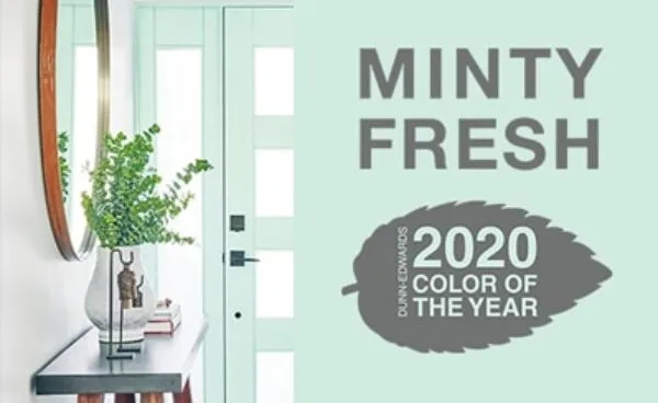
2020 Minty Fresh (DE5687)
Dunn-Edwards® 2020 Color of the Year, Minty Fresh, captures the enthusiasm and optimism of a new decade. As we stand at the portal of a new era, infinite potential lies ahead. It’s invigorating, exciting — Minty Fresh!
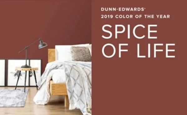
2019 Spice of Life (DET439)
Dunn-Edwards® 2019 Color of the Year, Spice of Life, is inspired by a celebration of what makes life interesting and exciting. It’s warm, inviting, adventurous and life-affirming. This strong, enticing, spice-market blend adds a complex, flavorful seasoning to design palettes. The elements of orange in the hue give a grounded, substantial feeling to design.
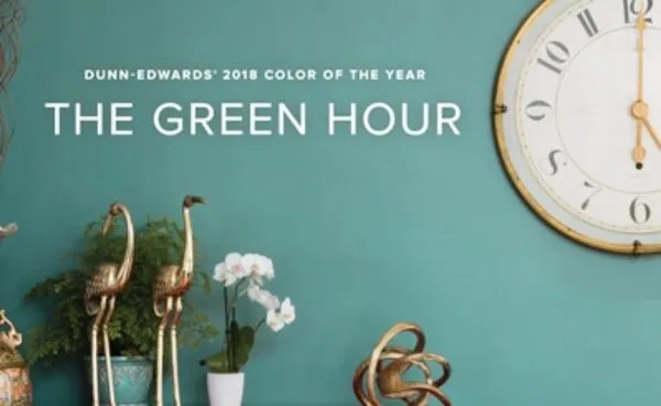
2018 The Green Hour (DET544)
Dunn-Edwards® 2018 Color of the Year, The Green Hour, draws inspiration from turn-of-the-century Paris, when 5 o’clock became known as “The Green Hour” due to the popularity of absinthe. A darker shade of gray blue-green, this color embodies the timeless sense of mystery and creative revelry of the era.
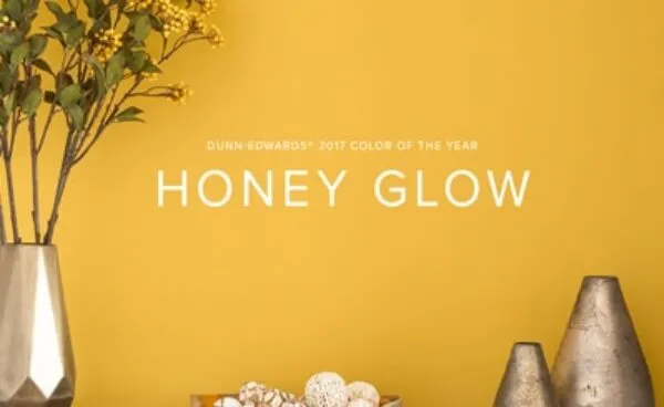
2017 Honey Glow (DE5354)
Dunn-Edwards® 2017 Color of the Year, Honey Glow, is a warm, golden yellow with orange undertones that will make a bold statement in any space. Whether it’s applied to every wall or used strategically for pops of color, the cheerful spirit that radiates from Honey Glow will re-energize any room. Try it on an accent wall, paired with white or gray, and embellish with pillows, throws and other accessories in a Honey Glow color.