


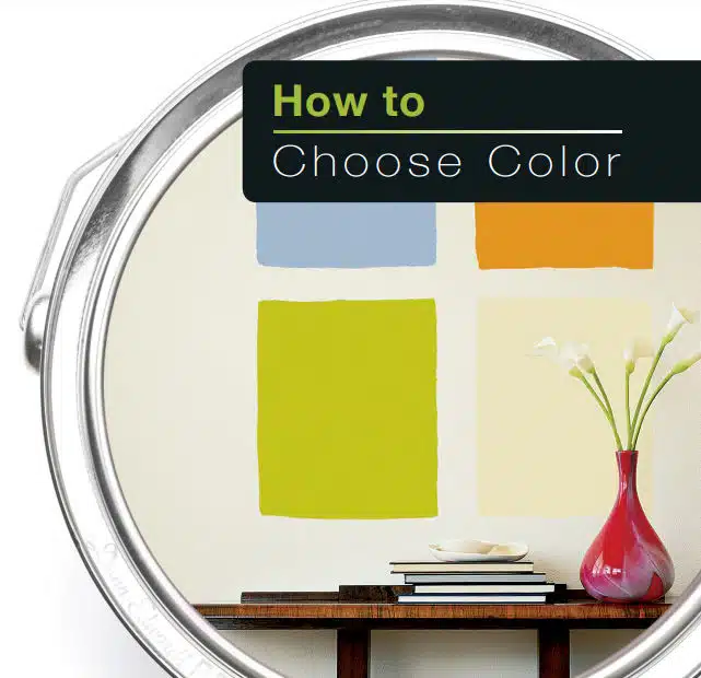
CHOOSE PAINT COLOR
As humans, we instinctively react to color. Countless objects in the natural world send messages to our brain via color. Whether it’s a blue sky, red fire engine, or a yellow and black bumblebee, color evokes a psychological response.
Common Uses of Color
Knowing how color is commonly used in design projects is another helpful approach to selecting color. The design professionals constantly monitor the latest research on psychological and physiological responses to color to create effective and stimulating design. As you think about your project, consider the following uses of color.
Red
The strongest energy of any color, red is best used in rooms that require interaction, such as dining rooms, where it is thought to stimulate the appetite. Red also adds drama to dens, hallways and powder rooms.
Pink
A pale red, pink is associated with a delicate, feminine look and is used to soften and lighten the look of bathrooms and bedrooms. Pink may be looked upon as elegant, refined and poised.

Orange
Often considered the most social color, orange is also the color of creativity and imagination. It works well in family rooms and dining rooms, as well as bathrooms where its peach tones help complement skin complexions.
Yellow
The color of happiness and optimism, yellow suggests positive, cheerful feelings and can be used to brighten practically any room. Yellow is great for “work rooms” such as kitchens and laundry rooms.
Green
Associated with health and fertility, green is a cool, relaxing color that also connotes a feeling of renewal and growth. It works well in living rooms, dens and bedrooms and is considered a natural, neutral tone.

Blue
Tranquil and meditative, blue is perhaps the most peaceful of all colors, exerting a soothing, calming influence. Great for bedrooms and baths, it’s often used with an accent color, as too much blue can create a cold, dreary feeling.
Purple
Traditionally the color of royalty, purple tones evoke a feeling of luxury and nobility. This majestic color works well in bedrooms, living rooms and bathrooms where it can give a sense of lavish opulence.
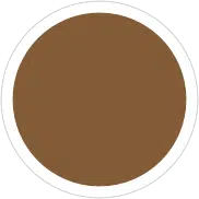
Brown
An earth tone, brown is the most natural of all colors and helps “ground” any color scheme. Brown is good for living rooms, dens and hallways. It works best with an accent color that will keep it from becoming too monotonous.

White
White is the most neutral of all colors and gets along well with practically any other shade. Elegant and sophisticated, it can be used to open up spaces and as a backdrop for kitchens, baths and any room that requires a crisp, clean, well-designed look.

Black
A dramatic color, black is often used as an accent to embolden other tones.It works well with white to create a classic, timeless motif. You can also use black with jewel tones for a sparkling magical appearance.
SIMPLE COLOR GUIDELINES FOR PROJECTS
Finding the perfect color for your home is no easy task. Discover how factors such as landscaping, roofing, lighting, flooring and time of day can make all the difference!
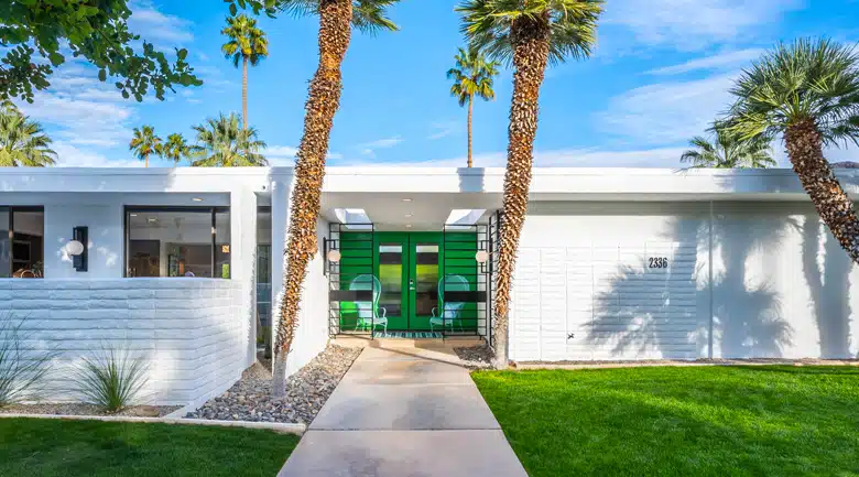
Exterior Projects
- For certain styles of homes, research the appropriate traditional color schemes for time-tested ideas that work.
- Pick a color that complements the home’s brick, siding, stone or roofing.
- Choose a color scheme that blends with the neighborhood. If required, check with the homeowners’ association for any color restrictions.
- Because color may appear different depending on the time of day, paint a section of the house where the body, trim and accent colors can be viewed together. Then check the colors throughout the day to see how they look.
- To highlight architectural details, such as shutters and columns, choose a color that contrasts with the wall color of the house. For example, if the wall is a light color, choose a darker color.
- To minimize attention to unattractive elements such as downspouts, air-conditioning units, vents and gutters, paint them the same color as the wall of the house or choose a trim color that is a similar shade.
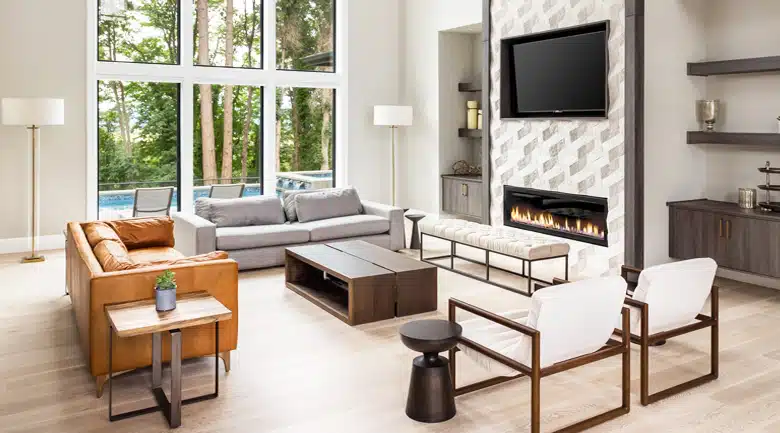
Interior Projects
- Light colors make a room seem larger, while dark colors are best for accenting recessed areas and highlighting details.
- Use items in a room to provide color hints. Pick a piece of furniture, art or even a pillow for inspiration. Select your color preference and see what other colors work well with it.
- Connecting rooms should share color elements. For example, using the same color on molding in adjoining rooms unifies an open space.
- Use light and dark colors to create interest. Attractive architectural features, such as molding and columns, can be emphasized by painting them darker or lighter colors.
- Consider the home’s flooring. The color of the carpet, tile or hardwood flooring plays an important role in the feel of a room and affects how a color appears.
- Pay attention to the trim in a room. Painting the trim and walls the same color will remove attention to the trim and make it less noticeable. Using a contrasting color for the trim will give it a focal point, making the room more interesting, and add some dimension to the room.
FAQ
What is the best type of interior wall paint?
Neutral colors like white and grays are usually the best type of wall paint colors, paired with a strong primer that goes with the particular paint that you’re using. You can also choose a type of paint made for interiors along with a color you choose. Most popular paint brands like Dunn-Edwards develop paints specifically for indoors.
What is the best color for the house interior?
Warm neutral and cool neutral colors like gray and shades of white tend to be the most popular interior colors because they match just about any other type of color scheme and context.
What is the best color for the exterior of a house?
Similar to indoor paints, simple colors like beige, gray, brown and white tend to be the most popular exterior paint colors. They go well with greens, browns and blues common in most yards and neighborhoods.
How many colors should be on the exterior of a house?
Exterior paint schemes should usually have three colors. That’s the general rule of thumb as it allows flexibility but also keeps things simple in a color scheme.
What is the longest-lasting exterior paint?
The most durable outdoor or exterior paint is generally considered to be acrylic paint. It’s long-lasting, flexible and capable of withstanding the sun and other weather factors like wind and rain.
How Light Affects Color
Nothing changes our perception of color more than light. Paint, textures, fixtures and furnishings are all affected by light. That’s why it’s imperative that you assess colors under the predominant lighting conditions for your projects. There are three primary lighting sources: direct sunlight, indirect sunlight and artificial lighting.

Direct sunlight
Direct sunlight is considered the most ideal light source because it provides the truest interpretation of color and provides the best balance between warm (yellow shades) and cool (blue shades) extremes.

Indirect sunlight
Indirect sunlight is inconsistent, varying throughout the day and greatly impacting the color in a room. The intense gold rays of sunrise and long dark shadows of twilight “warm” and “cool” room colors in dramatic fashion. Indirect sunlight is the most volatile and unpredictable lighting to assess

Artificial lighting
Artificial lighting can be separated into either warm or cool light. Incandescent and halogen lights enhance reds and yellows, warming up a room. Fluorescent and energy-saving bulbs enhance blues and greens,cooling or flattening a room’s color. Artificial light will change colors simply by the type of bulb that is used.
FAQ
Do paint colors look lighter or darker on the wall?
Flat paint can look lighter once applied on a wall, since it absorbs light and can have a chalky finish.
How does light absorb color?
Different surfaces and colors absorb different wavelengths of light, which reflect back a specific light wavelength or color interpreted by the human eye.
Which color absorbs more light?
Black absorbs the most light and heat, while white objects reflect all wavelengths and absorb the littlest amount of heat or light energy. Similarly, red objects absorb less heat than blue objects, and darker colors absorb more than lighter in general.
What is the best paint color to reflect light?
Lighter paint colors like whites, grays and beiges are the coolest or most reflective colors.
What colors make a room look bigger and brighter?
Off-white paints and lighter colors are the best for making a room seem open and larger than it really is. In most cases for an airy and open room, use a lighter color.
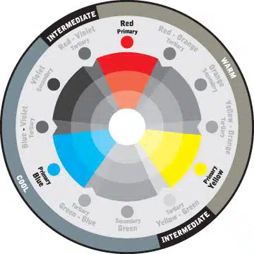
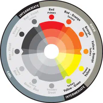
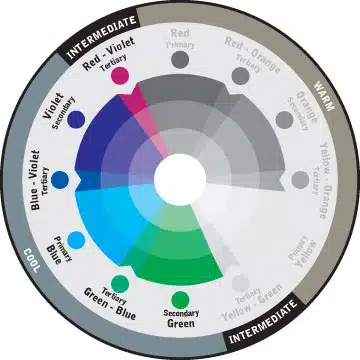
Explore the Color Wheel
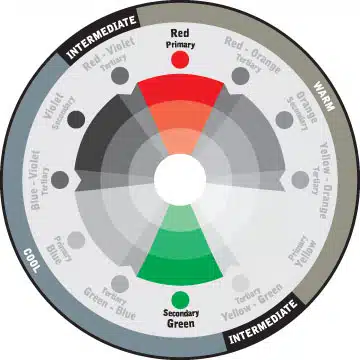
Red, blue and yellow are the three primary colors that cannot be made by mixing any other colors. These three colors can be mixed to create all other colors and can be combined with white or black to create tints (lighter tones) and shades (darker tones) of these colors.
FAQ
What are the primary paint colors on the color wheel?
The three primary colors on the color wheel are red, yellow and blue.
How do you make a secondary paint color?
Orange, green and violet are the secondary colors, which are created by mixing two primary colors.
How many tertiary colors are there?
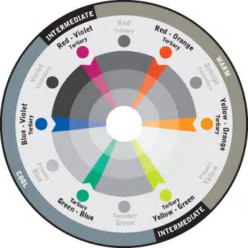
There are six tertiary colors, which are a combination of primary and secondary colors. Red-orange, yellow-orange, yellow-green, blue-green, blue-violet, and red-violet are the tertiary paint colors.
What is a monochromatic color harmony?
A paint color scheme has monochromatic harmony when it is derived from a single hue and uses the same shades, tones and tints.
What are examples of complementary colors?
Some examples of complementary paint colors are red and green, yellow and purple (or violet), and also blue and orange.
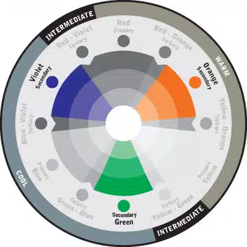
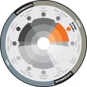
Secondary colors are created by mixing two primary colors together. For example, mixing blue and red make purple, red and yellow make orange, and yellow and blue make green. The exact color of the secondary color you get depends on which red, blue or yellow you use and the proportions in which you mix them.
FAQ
What are the primary paint colors on the color wheel?
The three primary colors on the color wheel are red, yellow and blue.
How do you make a secondary paint color?
Orange, green and violet are the secondary colors, which are created by mixing two primary colors.
How many tertiary colors are there?
There are six tertiary colors, which are a combination of primary and secondary colors. Red-orange, yellow-orange, yellow-green, blue-green, blue-violet, and red-violet are the tertiary paint colors.
What is a monochromatic color harmony?
A paint color scheme has monochromatic harmony when it is derived from a single hue and uses the same shades, tones and tints.
What are examples of complementary colors?
Some examples of complementary paint colors are red and green, yellow and purple (or violet), and also blue and orange.
If you mix three primary colors together, you get a tertiary color, which can also be made by mixing primary and secondary colors. Varying the proportions of these colors creates different tertiary colors.
FAQ
What are the primary paint colors on the color wheel?
The three primary colors on the color wheel are red, yellow and blue.
How do you make a secondary paint color?
Orange, green and violet are the secondary colors, which are created by mixing two primary colors.
How many tertiary colors are there?
There are six tertiary colors, which are a combination of primary and secondary colors. Red-orange, yellow-orange, yellow-green, blue-green, blue-violet, and red-violet are the tertiary paint colors.
What is a monochromatic color harmony?
A paint color scheme has monochromatic harmony when it is derived from a single hue and uses the same shades, tones and tints.
What are examples of complementary colors?
Some examples of complementary paint colors are red and green, yellow and purple (or violet), and also blue and orange.
Clean and elegant, a monochromatic scheme feels sophisticated and stately. The scheme revolves around colors from the same family with varying intensity and value. Lighter tints and darker shades, as well as muted forms, are used.
Monochromatic colors are easy to manage and always look balanced and visually appealing. However, they lack color contrast and are not as vibrant as other schemes.
What are the primary paint colors on the color wheel?
The three primary colors on the color wheel are red, yellow and blue.
How do you make a secondary paint color?
Orange, green and violet are the secondary colors, which are created by mixing two primary colors.
How many tertiary colors are there?
There are six tertiary colors, which are a combination of primary and secondary colors. Red-orange, yellow-orange, yellow-green, blue-green, blue-violet, and red-violet are the tertiary paint colors.
What is a monochromatic color harmony?
A paint color scheme has monochromatic harmony when it is derived from a single hue and uses the same shades, tones and tints.
What are examples of complementary colors?
Some examples of complementary paint colors are red and green, yellow and purple (or violet), and also blue and orange.
Opposition creates interest, which is the idea with a complementary color scheme. Using colors that are opposite each other on the color wheel creates visual excitement. When these warm and cool colors mix, they energize each other, bringing any décor to life.
Complementary colors offer stronger contrast than any other color scheme and draw a lot of attention. They can, however, be harder to balance than other schemes, especially when working with desaturated or warm colors.
FAQ
What are the primary paint colors on the color wheel?
The three primary colors on the color wheel are red, yellow and blue.
How do you make a secondary paint color?
Orange, green and violet are the secondary colors, which are created by mixing two primary colors.
How many tertiary colors are there?
There are six tertiary colors, which are a combination of primary and secondary colors. Red-orange, yellow-orange, yellow-green, blue-green, blue-violet, and red-violet are the tertiary paint colors.
What is a monochromatic color harmony?
A paint color scheme has monochromatic harmony when it is derived from a single hue and uses the same shades, tones and tints.
What are examples of complementary colors?
Some examples of complementary paint colors are red and green, yellow and purple (or violet), and also blue and orange.
When painting the interior or exterior of your home, a good first step is to gain an understanding of a color’s visual temperature.
The temperature of a color – whether “warm” or “cool” – must be considered both individually and when used with other colors. Reds, oranges and yellows are considered warm colors, while blues, greens and violets are perceived as cool colors.
The visual temperature of a color can accentuate or change the look and feel of your project. For example, cool colors make a small area feel spacious and calm. On the flip side, large areas feel cozier and more intimate in warm colors.
FAQ
What are the primary paint colors on the color wheel?
The three primary colors on the color wheel are red, yellow and blue.
How do you make a secondary paint color?
Orange, green and violet are the secondary colors, which are created by mixing two primary colors.
How many tertiary colors are there?
There are six tertiary colors, which are a combination of primary and secondary colors. Red-orange, yellow-orange, yellow-green, blue-green, blue-violet, and red-violet are the tertiary paint colors.
What is a monochromatic color harmony?
A paint color scheme has monochromatic harmony when it is derived from a single hue and uses the same shades, tones and tints.
What are examples of complementary colors?
Some examples of complementary paint colors are red and green, yellow and purple (or violet), and also blue and orange.
Big Decisions. Made Small
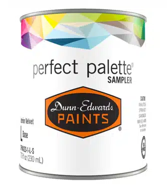
Now you can test almost any Perfect Palette ® color before making a major purchase with a Dunn-Edwards 8-oz. Perfect Palette ® Sampler. Just select the color that piques your interest, and we’ll mix it on the spot so you can see exactly how it will look before you paint. It’s the quick and easy way to cut those big decisions down to size.
TEST YOUR COLOR
To see how natural and artificial light affect your color, paint the same color on different walls. Paint the wall that gets the most light and the wall that gets the least amount of light. It’s best to paint at least a 2-foot-by-2-foot sample area on a white background. To get the best results, apply at least two coats and let the paint dry for a couple of hours.
Now live with the color for a few days. See how the colors feel in the morning and evening. Which color best expresses your vision? Once you’ve made your decision, you’re ready to start painting.
FAQ
How do I test paint colors?
Always test paints on multiple walls since lighting can be different across different angles and rooms. Test the paint on the wall (not a board) and always use two coats of paint. For bright colors, test with a primer, and pick paints based on the style of the room.
Is paint darker or lighter than a paint swatch?
Flat paints, once painted and dried, tend to be lighter than the color on the swatch. Glossy pants can look darker after painting in certain lighting.
Why does my paint look different on each wall?
Different gloss levels in paints could create walls that look slightly different with different lighting or sunlight at different times of day.
Will a second coat of paint make it darker?
Adding a second coating of paint will not make the color darker, or the richness of the final product. It will only add more coverage and a thicker layer of paint.