The Art and Craft of Color Selection
03/10/2022 | Dunn Edwards |
The Art and Craft of Color Selection
Choosing color for properties is an underappreciated art.

In these increasingly opinionated times, it can be hard to remain neutral. But there's at least one area where you shouldn't: paint color.
With 2,006 color options in the Dunn-Edwards Perfect Palette® alone, deciding on the perfect hue for a rental property can be a daunting task. It's easy to underestimate the difficulty of it, since we all interact with color all of the time and we're all familiar with our own likes and dislikes. We tend to think: How hard can it be to pick a favorite? But then when we consider which colors will stand up to renter's preferences AND the test of time, doubt starts to set in. It feels impossible to know what colors will be appropriate now, or even in the future.
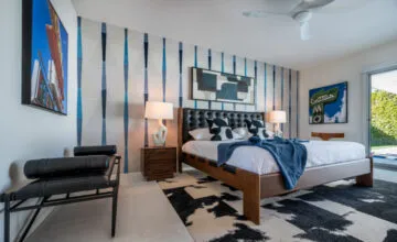
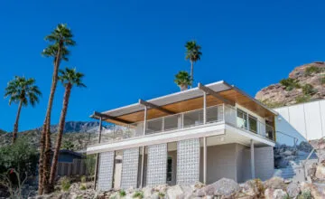
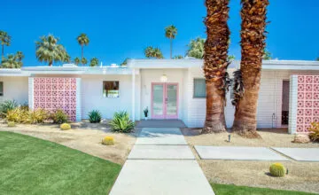
These are the circumstances that lead property managers to load up on gallons upon gallons of white paint. Properties become bland boxes featuring all-white walls, white trim, and even in some cases, white exteriors. While there's nothing inherently wrong with white (we love it so much we created 115 shades of it!), many properties are better served by a little bit of color. The overuse of white tends to make a place feel clinical and inhospitable, and softening up a property with a little bit of color could make the difference between commanding above market rates, or just barely holding the status quo. In fact, the most desirable renters tend to gravitate toward properties that have a stand-out feature: an interesting bit of architecture, extra amenities, beautiful landscaping, and yes...beautifully thought-out color schemes.
Here are a few questions to guide you in the underappreciated art of making color selections. When it's time to repaint a property, ask yourself:
Is it future-based?
Knowing if the selected colors will be in style for months, years, decades to come is often the most anxiety-causing aspect of making a color decision. Thankfully, you don't need a crystal ball—you just need to have friends in the design field. That's where we come in. With expert in-store color recommendations and an online design blog, it's easy to stay on top of the latest color trends and themes. Our design experts look to macro shifts in global trends and micro shifts in the human psyche to determine which colors will be popular in the years to come.
For example, the 2022 Color of the Year, Art and Craft (DET682) is an earthy, plush brown that creates a feeling of stability and calm against the backdrop of the world's quickly shifting unknowns. It looks great on siding, trim, and for creating cozy, refined interiors—perfect for shared spaces. Art and Craft is an excellent option for property owners who are looking for lasting style.
Does it harmonize?
This is a question property managers almost never ask, but you should. It will help you avoid making unnecessarily risky color choices that you and the property owner end up regretting. For example, you might find that a shade of dark green looks great on the exterior siding next to certain elements of landscaping, but if it clashes with the architectural style or even with the other buildings around it, the color choice will ultimately fail. A good way to explore color is to take a picture of the wall you're about to paint and look critically at the other colors around it: surrounding views (whether it's outside or through a window), architectural elements that have their own color (e.g., unpainted bricks or stone), furniture (for furnished spaces), and even nearby buildings. By looking at the space through the perspective of a photo, the 3D space is flattened to 2D and your brain will be better able to separate the colors that you would normally tune out in real life. Once you've taken stock of the surrounding colors, you'll be in a better position to harmonize your color choices so that they'll feel seamless within the chosen environment.
Thinking in this way can also be useful when creating a palette for a project, even when it contains white. For example, pairing a warm yellow siding color with a cool bluish-white trim might not feel as harmonious as pairing it with a warm white trim. Since most people don't understand how many different shades of white there are, the tendency is to just pick a white at random without careful attention to the undertones. Make sure you are double-checking your white choices to ensure that they harmonize. While potential renters may not be able to identify why a less harmonious palette could make them feel ill at ease and steer them toward another property instead. When in doubt, ask your local color experts at Dunn-Edwards.
Is changing colors the end of the world?
The answer to this question is pretty obvious, but it's important to ask nonetheless. With so many color choices out there, it can be easy to fall into analysis paralysis! When you realize that color is a relatively easy thing to change (compared with other property updates), you'll feel freer to experiment with color choices and break out of the white box. Remember: nothing is permanent, not even paint color. Why not try something new—even if it's just in one unit—to see how the market responds and then continue to optimize from there?
Asking these questions can help guide you to make better, more confident color decisions. And that will ultimately lead to better tenants and better reviews for your business.


