Best Home Office Colors for Calm and Productivity
05/20/2024 | Dunn Edwards |
Creating an inspiring and productive home office environment is essential for anyone who works remotely or runs a home-based business. While the physical layout and ergonomics are crucial, the color scheme you choose can have a profound impact on your mindset, focus, and overall well-being. Colors have the power to evoke specific emotions and influence our mood, making it essential to select the right hues that align with your personal and professional needs. Whether you have a dedicated office in your home or a makeshift workspace, we'll explore how to harness the power of color to create a harmonious and motivating workspace that fosters calm, productivity, and creativity.
Right now, says interior designer Nicolette Tsukamoto of Studio Akiko, is the perfect excuse to give your home office some little TLC because you want to create an environment that keeps you working efficiently. When it comes to home office wall colors, design duo Paul and Becky Heintz — the husband and wife team behind Local Studio LA — suggest that lighter colors work better overall. “Darker colors require more lighting and require your eyes to work harder, especially if you're looking at a computer screen,” stated Paul Heintz.
So what exactly are those ideal colors for your home office?
Home Office Paint Colors For Calm
Work can become incredibly stressful, which is why creating a home office space that’s soothing is so important.
Architect Colin Haentjens with The Knobs Company points to biophilic design to ensure a restorative home office space. Biophilic design, he stated, “connects occupants to nature, be it real or artificial, which has been proven to improve productivity and reduce stress.” When it comes to colors, consider earth tones. He suggests hues such as Shaded Spruce (DE5587), Ripe Pumpkin (DE5307), or Aquatic (DEA134). For anyone seeking to create a more soothing space, “emulating nature is always a wise guide,” agrees Los Angeles-based interior designer Melissa Kite.
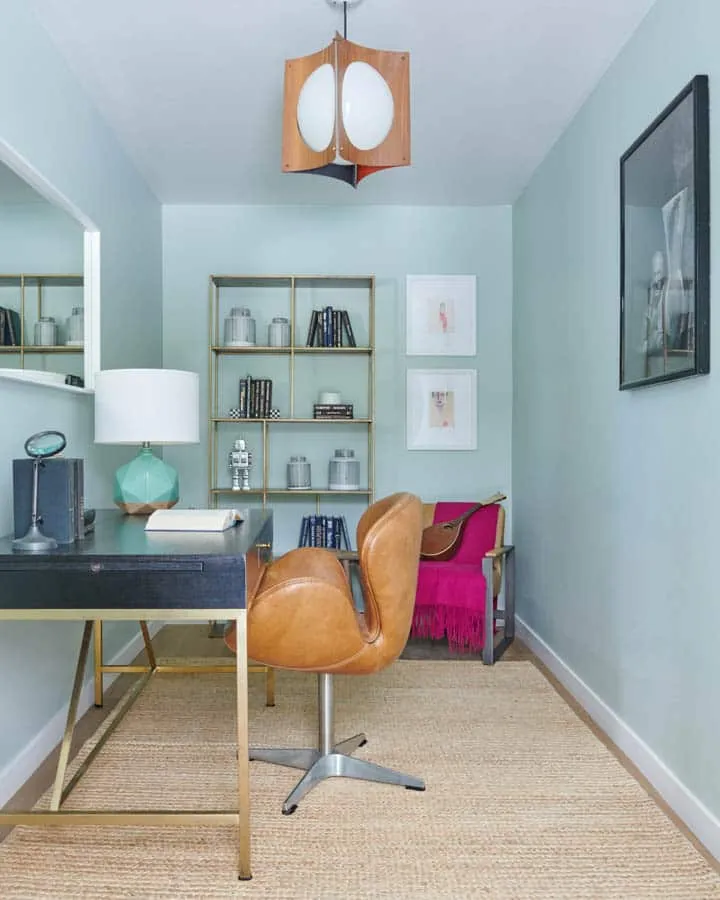
Soothing Granite (DE6283) in a home office. Photo Credit: Bethany Nauert
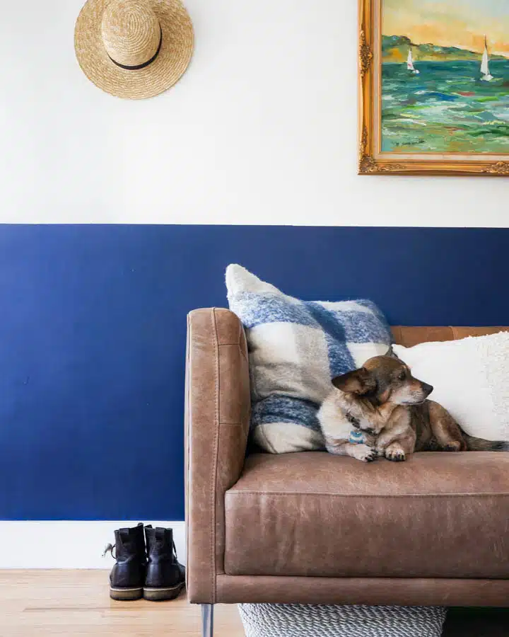
Blues are also a favorite among color experts to create a soothing home office space amid Coronavirus. Dunn-Edwards’ own color expert and stylist Sara McLean has previously described the color’s natural ability to generate positive emotional responses in the body, including calmness and comfort. And, adds Paul Heintz, when blue is paired with a warmer color, a nice balance of energy is achieved. Some ideal shades of blue to look to include Dew Not Disturb (DE5708), Spirit Mountain (DE5795) or Sidewalk Chalk (DE5791).
When your living room sofa becomes your home office, Singing The Blues (DET576) creates calm. Photo Credit: Marni Epstein-Mervis
Home Office Paint Colors For Productivity
Motivating yourself to work at home during Coronavirus can be a challenge. Whether it’s the lack of a truly dedicated work space, lack of resources, or dealing with constant distractions, the right colors can provide a necessary boost.
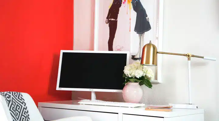
Home office featuring Amour (DE5104). Photo Credit: Marni Epstein-Mervis
To heighten productivity and motivate during times of social distancing, look to orange, yellow and red. “They’re all exciting colors that can help energize if used in small doses,” stated Paul Heintz. Practice smart applications with these colors in the home office — if applied too liberally in a space they can transition into colors that feel overwhelming. Some of the Heintzs' favorite productive colors for a home office include Golden Crest (DE5353), Red River (DE5125) and Pueblo Rose (DET438).
For a productive hue in your home office that’s a little more on the neutral side, designer Kite suggests, “a bright white to keep your mental focus as bright as the noon hour.”
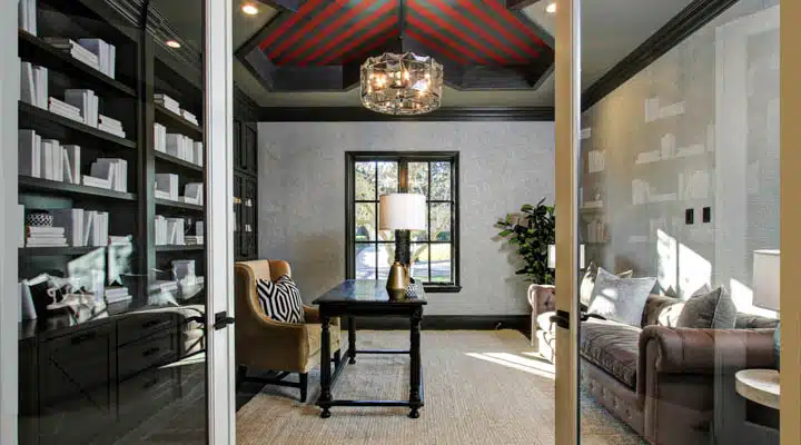
Vintage Red (DET427), Metal Fringe (DET626) and Renwick Brown (DET630) create vintage
library vibe. Photo courtesy of Studio Akiko.
A great place to start, suggests designer Tsukamoto, who worked on 2019’s Pasadena Showcase House, is first figuring out what ambiance your workflow and mind thrive in, and then emulate it at home. Maybe a coffee shop? Nature? For example, Tsukamoto’s ideal space is reminiscent of a grand library. In order to create the library feeling, Tsukamoto uses heavily saturated neutrals, a warm charcoal gray like Stone Mason (DET615), “while incorporating pops of stimulating reds, plums, and oranges in a fun pattern to stimulate energy and creativity without going overboard.”
Dunn-Edwards Paints is trusted by designers and paint professionals alike, and is committed to providing you with only the best quality paint, including zero VOC, low odor interior paints. If you’re looking to cultivate a more conducive home office then try our InstaColor® app to preview colors with a virtual home office paint makeover. Just upload a photo from your library, or use one from ours, to give your space an instant paint makeover!


