

4 Color Palettes To Embrace the Cottagecore Design Trend
08/18/2021 | Carolyn Neuhausen |
Great design stems from continually reinventing and remixing past influences for modern applications. And lately, one such design trend sweeping across social media is cottagecore. Cottagecore is a movement that looks to the nostalgic whimsy of “simpler times." The trend aims to connect with nature and embrace time-honored handiwork like gardening, baking, foraging and pottery making.

As we sheltered in place in 2020 and worked from home in 2021, many of us turned to the comfort of hobbies closer to home like gardening, escaping to the country and nearby national parks and exploring local trails — in short, turning to simpler pleasures. Pop culture echoed our inward gaze. Video streaming services were full of shows focused on organization, home renovation and gardening. Even lifestyle maven Martha Stewart leveraged all the time she spent in quarantine at her upstate New York farm into her new show “Martha Knows Best,” where she filmed her process on gardening, composting and cooking.
Throughout the pandemic, many people moved to more ideal locations, sometimes leaving the congestion and population of cities for smaller communities and rural areas. Although the term “cottagcore” has circulated throughout social media since 2018, this great relocation has also hastened the design movement’s adoption into the popular vernacular. To bring cottagecore vibes into your own home and designs, try exploring these cottagecore-designed color palettes.
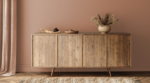
Stone, Aqua and Purple
We commonly associate a clean white and black color scheme with industrial accents as the “farmhouse look," a look made popular by HGTV phenoms Chip and Joanna Gaines. But we’re offering up a twist on the rural home palette with the colors below — a mix of Porous Stone (DE6220) on the roof tiles, while the Wishful White (DE6260) of the cottage sets the tone for the fun Jade Mountain (DE5697) on the doors and window trim. Add in a pop of purple influence from the garden in Royal Pretender (DE5999), and this is one new take on the cottage home.


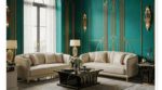
Getting Cozy in Green
Part of the cottagecore movement is the emphasis on timeworn items and coziness as we seek refuge in the quiet moments of simpler times. Picture taking down a well-loved book from the bookshelf and curling up with a furry friend in this plush and welcoming emerald velvet chair.

Dunn-Edwards green Fern Gully (DE5692) would make a great color choice for a family room that envelops guests, friends, and family in its warmth. Accent the green with Half Moon Bay Blush (DET457) on the trim and use Presidio Peach (DET435) in textiles. Picture frames and wood tones in O’Brien Orange (DET460) complete the look.

Oranges and Lavender
This image depicts the very essence of what has made cottagecore sticky with social media types and photographers. In the picture, the woman is our proxy, showing us what it is to unplug from our busy, hectic work lives and run with childish glee into a field of lavender. The yellow-oranges play in exciting opposition to the pink-purple hue of the flowers and would make good color choices for a dining room. Choose either Yams (DE5200) or Market Melon (DE5199) on the walls for a rich, inviting look, and paint trim and any molding or chair rail with the light gray-blue Sidewalk Chalk (DE5791). Then play with purple textiles or dishware for the
table.


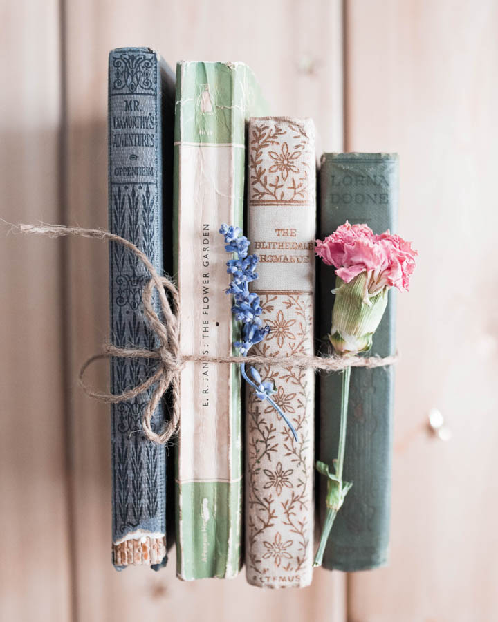
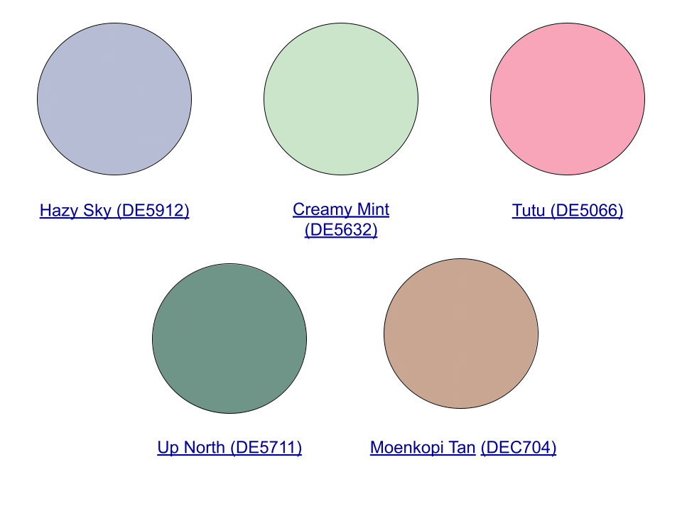
Blues and Mint
This antique collection of books with its vintage vibe and pressed flowers exemplifies cottagecore and presents a restful pastel palette that would look stellar in a bedroom or a living room. The lighter colors bounce sunlight around and feel like a breath of fresh spring air. Go with Hazy Sky (DE5912) or Creamy Mint (DE5632) as the main color on the walls with Up North (DE5711) on the baseboards or on built-in bookcases. Accessorize the room with Tutu (DE5066) pink for a warm color pop.
Take a look at how design will track over the next year with our 2022 color + design trend stories.