


As the world shakes off winter’s chill, the spring season brings a color story that feels fresh, hopeful, and full of renewal. Soft pastels like blush pink, lavender, and sky blue mingle with tender greens and warm neutrals, mirroring the first blooms and longer days of light.
Carousel


SEASONAL COLOR PALETTE COLORS 21 colors
FEATURED SPRING COLORS
These gentle hues bring a sense of airiness and optimism into any space, and interior walls are the perfect canvas to let these colors bloom. Pair them with soft textures or natural wood finishes to let the colors sing, creating interiors that feel fresh, graceful, and brimming with new beginnings.
Canyon Dusk | DE6094
Capturing the warmth of fading desert light, Canyon Dusk is a warm, rosy beige with a flattering glow that feels intimate yet airy, perfect for creating serene, sunset-washed spaces.
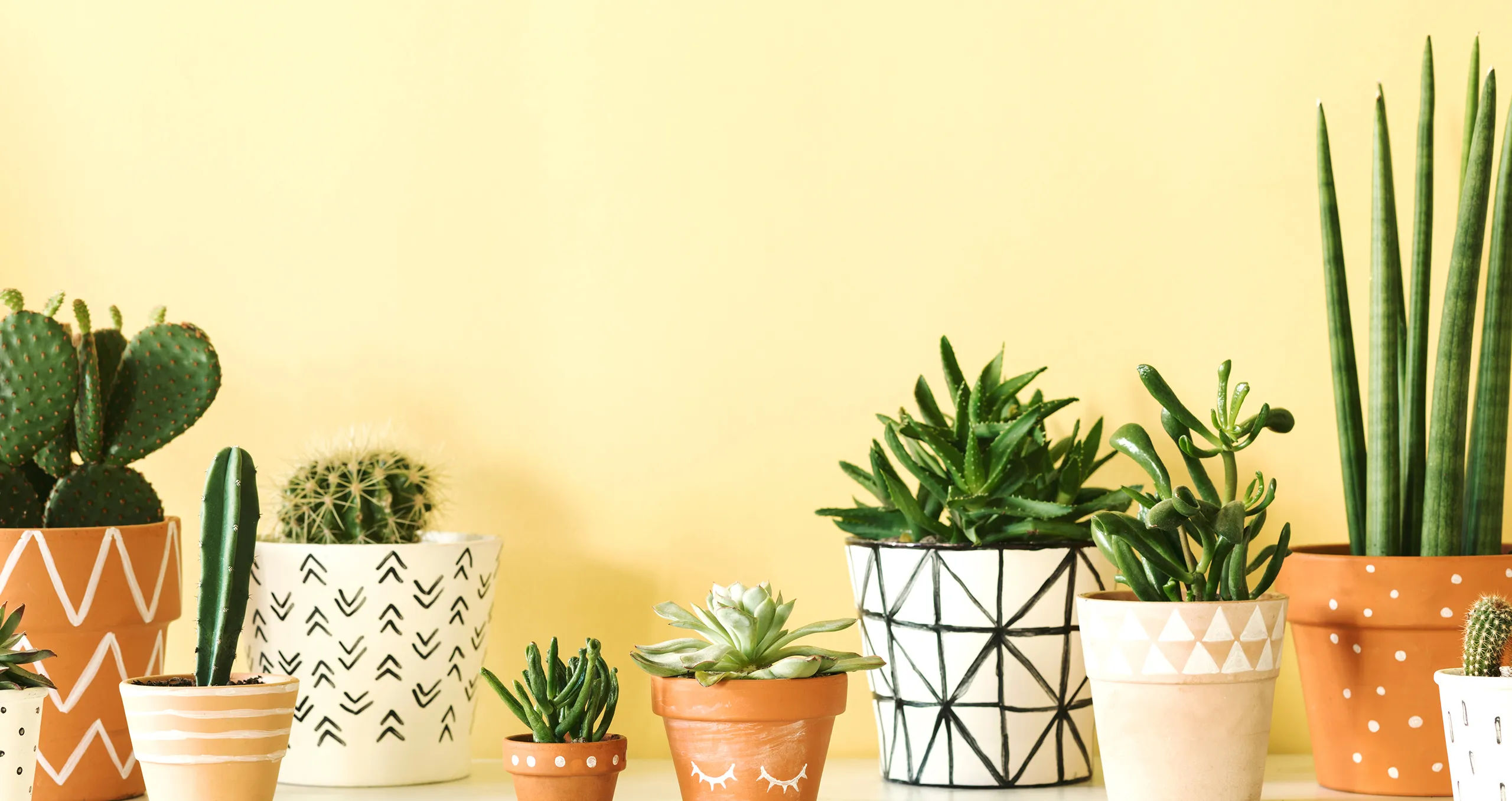
Floating Lily Pad | DE5493
A softened yellow-green with warm undertones, Floating Lily Pad creates spaces with a light botanical presence that pairs beautifully with rattan, pale oak, and matte porcelain.
Lazy Daisy | DET491
Lazy Daisy color is a warm, soft shade of pale yellow with creamy, buttery undertones. This color evokes a cheerful, sunny feel, like the gentle warmth of a spring morning. Lazy Daisy has a subtle, nostalgic charm, reminiscent of blooming wildflowers, making it ideal for adding a touch of warmth and joy to rooms while maintaining a light and airy aesthetic. It pairs beautifully with other soft neutrals or earthy tones for a fresh, uplifting look.
Drenched Rain | DE5883
A cool, airy blue with subtle violet undertones, Drenched Rain refreshes any space with cool clarity and lightness that feels crisp next to white accents and cool-toned metals like polished chrome.

Antique Heather | DE5975
With whispers of vintage romance, Antique Heather is a soft mauve with cool violet undertones, paring beautifully with deep botanical colors while bringing graceful softness to any space.
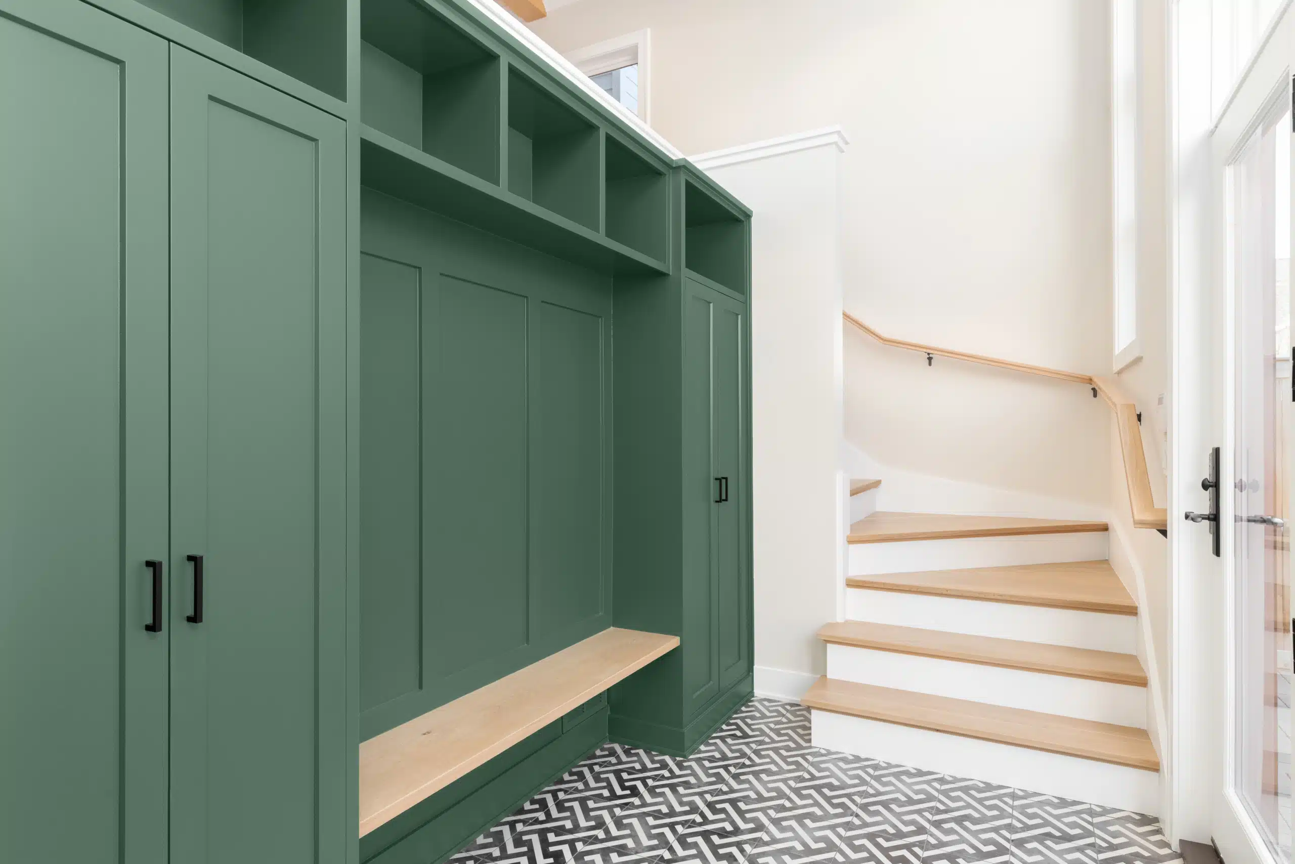
Mother Earth | DE5718
Grounded and nature-inspired, Mother Earth is a tranquil green with cool blue undertones that creates calm and balance pairing naturally with limestone, raw oak, and soft black details.
Rosewine | DE5019
Rich and graceful, Rosewine is a deep rosy lilac with cool undertones providing a bit of romantic drama that pairs beautifully with bronze hardware and creamy off-whites.
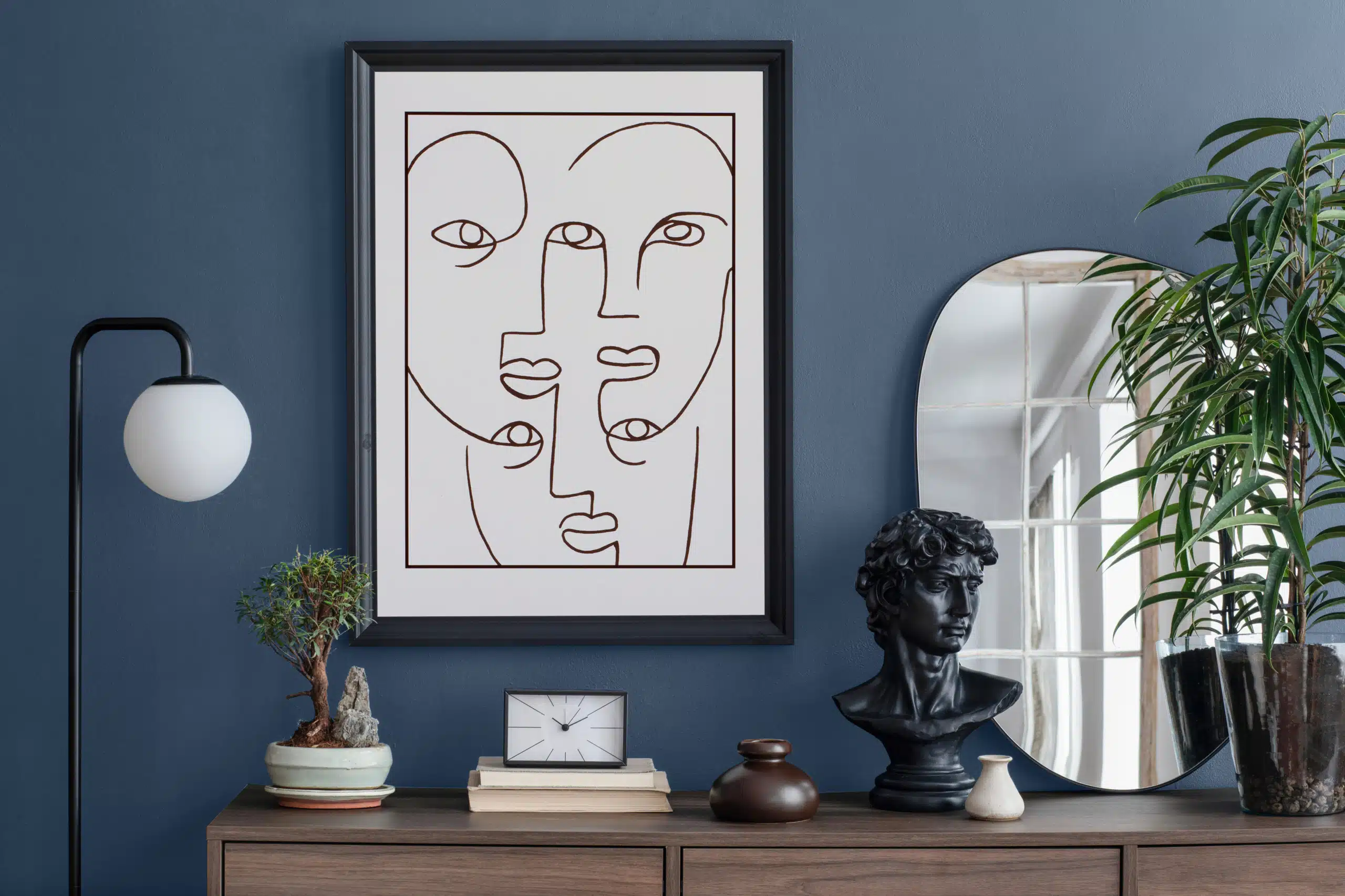
Blue Print | DET575
A structured, mid-tone blue with cool undertones, Blue Print charts a confident and refined path ideal for elevating cabinetry and feature walls while remaining a versatile choice with timeless appeal.

Poppy Crepe | DEW308
A warm, pale blush with a soft brightness, Poppy Crepe adds gentle warmth and a subtle wash of color that feels fresh and inviting, complementing woven textiles and light woods.
FAQS
SHOP NOWWhat makes the spring palette unique?
The spring palette is inspired by the season’s sense of renewal and optimism. It features soft pastels, gentle greens, and warm neutrals that echo blooming flowers and longer days. These shades bring a sense of airiness and fresh energy to any room.
How can I use spring colors to brighten my home?
Lighter hues like Lazy Daisy (DET491) and At First Light (DEHW05) can help make spaces feel larger and more welcoming. Try using them on walls or as accent colors to introduce a gentle glow and a cheerful mood.
Can I combine several spring hues in one room?
Absolutely. The Spring Seasonal Color Palette is designed for versatility. Pairing colors like Floating Lily Pad (DE5493) with Antique Heather (DE5975), or layering soft neutrals with light blues, lets you create dimension and interest while maintaining a harmonious look.
Which spring shades work best as accents?
Consider using vibrant options like Blue Print (DET575) or Rosewine (DE5019) on a feature wall, doors, or trim for a pop of color. These shades add character and can help highlight your room’s best features.
How do I use the palette to create a calming space?
Earthy greens like Mother Earth (DE5718) and soft lavenders such as Antique Heather (DE5975) are great for establishing a serene and relaxing atmosphere. Use these colors in bedrooms, bathrooms, or any area where you want to unwind.