Then, Now & Forever® – The Victorian Era Color Collection
03/16/2015 | Dunn Edwards |
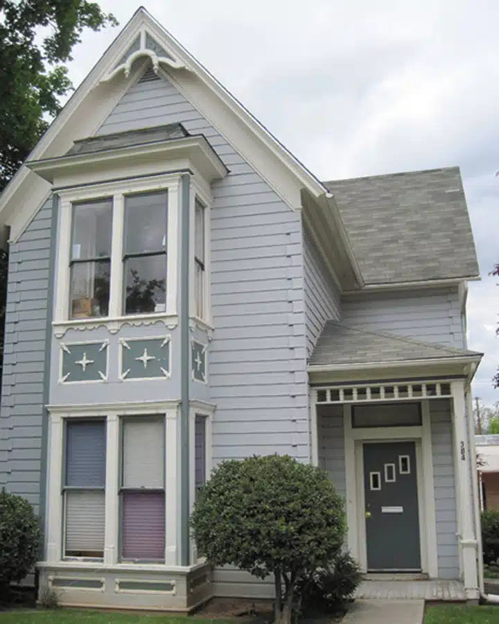
We are pleased to introduce the next in our Then, Now & Forever® historic collection series, the Victorian Era collection. Through extensive research done by the team at Architectural Resources Group, Inc., in San Francisco, we focus on the Stick, Queen Anne and Italianate styles of Victorian color, design and architecture. The Victorian Era had a profound influence on the American West, as many cities and towns known today were just springing up, newly formed and looking for influences for home choices.
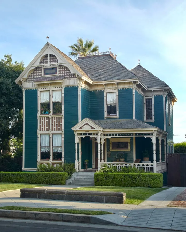
Stick and Queen Anne (1870s to 1900s)
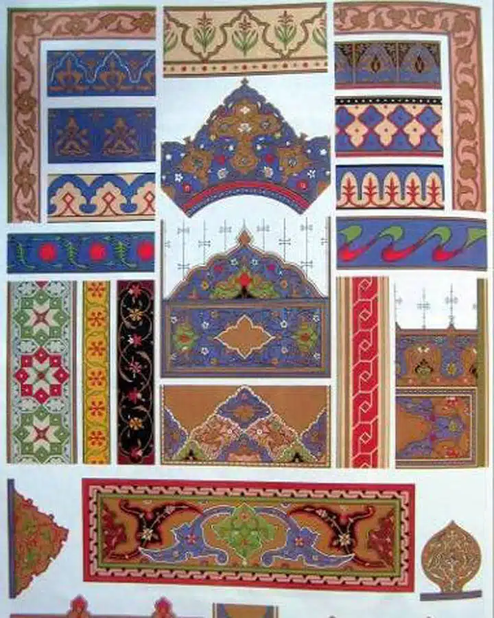
The Aesthetic Movement grew in Europe in reaction to industrialization and made its way to America, extolling the principles of good design and art for its own sake. In 1851, designer and architect Owen Jones was involved with the decoration of the Crystal Palace Exhibition in London. Here, he introduced his theories on design and color developed through, and heavily influenced by, his travels to the Moorish and Islamic worlds. These thoughts were documented later in his 1856 book, "The Grammar of Ornament," which eventually found its way into the hands of American designers and architects, influencing their color palettes.
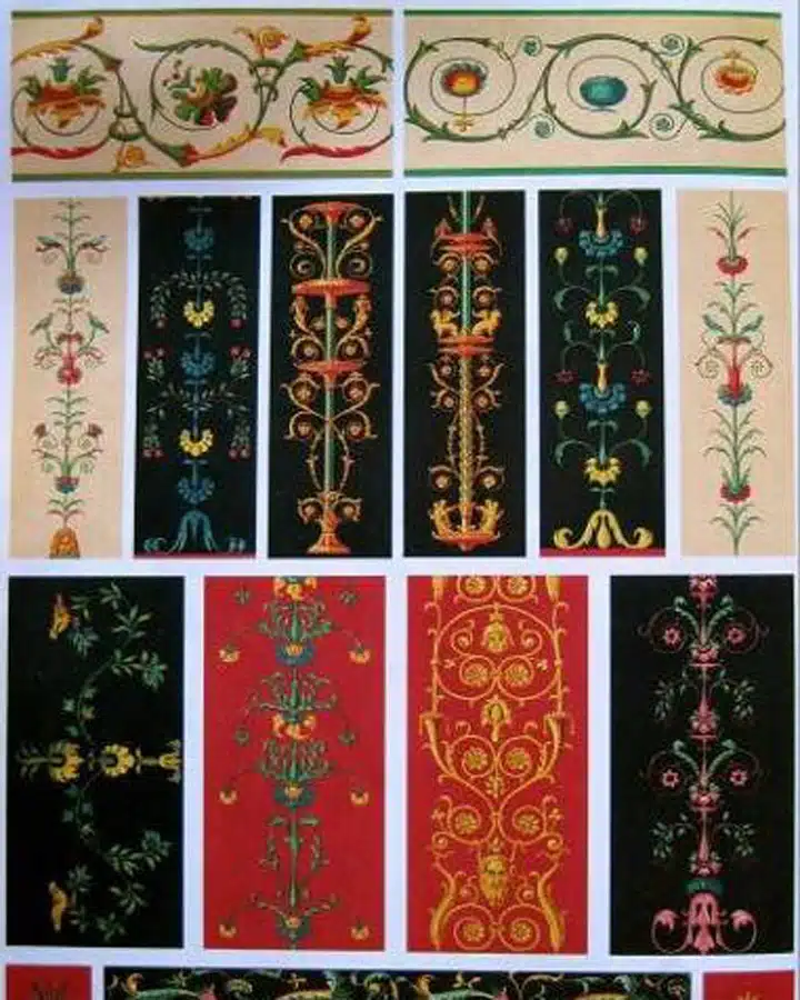
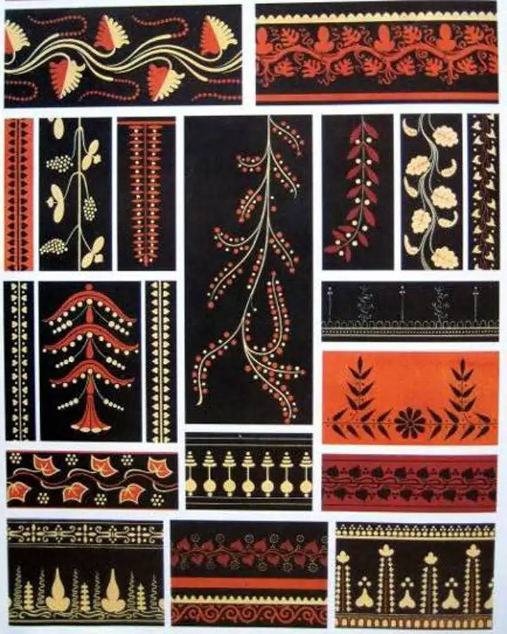
Details from “The Grammar of Ornament", Owen Jones, Dover Publications, Inc.: NY; 1987. Reprinted from original Day and Sons: London, 1856.
The newly settled towns of the West had ready access to an abundant supply of lumber in untouched forests, while technological innovations allowed factories to mass produce new and innovative millwork, making it more affordable and available. Building floor plans became not only much more vertical and of complex form but the structural framing and roof truss were highlighted by ornamental detailing reminiscent of medieval timber framing. Dormers, projecting bays and square towers opened up rooms and created strong angles within the body of the house. Builders were no longer attempting to portray an appearance of stone through materials or paint and became advocates of the quality and look of woodwork.
Henry Hobson Richardson figures prominently in the use of this design element, as does Richard Morris Hunt, the first American to study architecture at the École des Beaux-Arts. Visits to the 1876 Centennial Exposition in Philadelphia popularized the latest architectural styles where exhibit buildings, in what is called the Stick style, showcased the use of applied woodwork and carved details with polychromed paint color. Architects and builders in Europe continued to embrace the Picturesque movement, looking backward in time with a romantic bent toward designs evocative of medieval manor homes and Swiss chalets.
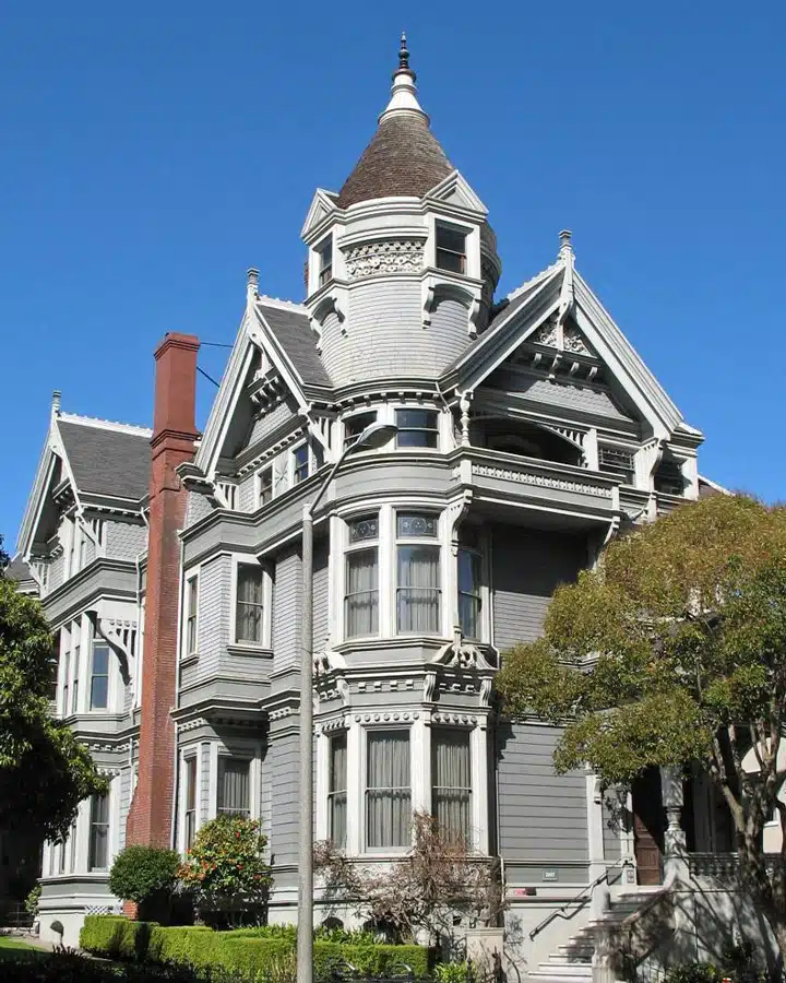
Haas-Lilienthal House, 1886 San Francisco, California
Charles Locke Eastlake, in his writings on household furnishings, felt that simply carved furniture not only aided in keeping a clean house but contributed to the design ethos of the country. His book, "Hints on Household Taste," provided both British and American readers with advice on furnishings and decoration, as well as the merits of well thought out architectural design.
In the book, Eastlake wrote, "The decision of a Parliamentary Commission in 1836 — that the new Houses were to be mediaeval in character — gave great impetus to the growing taste; and though the Palace of Westminster may not have realized the highest qualities of the architecture which it is supposed to represent, it has at least proved an excellent school for the encouragement of ancient art."1
Yreka Church, 1880 Yreka, California [now known as St. Mark's Episcopal Church]. Photo Credit: Architectural Resources Group
The masonry buildings of British architect Richard Norman Shaw are decorated with circular towers, stained-glass windows, multiple intersecting roofs and corbelled chimneys in what was being called the Queen Anne style. Jacob Wrey Mould, who had worked in the office of Owen Jones, designed with stone in contrasting colors.
The Influence of Color on Stick and Queen Anne
Paint colors were heavily influenced by the fascination with exotic locales and rich tapestries and fabrics imported from far-away countries. Recent trade activity with Imperial Japan resulted in the public's fascination with all things exotic. Eastlake's advice for wall paint included the use of a delicate green or warm grey tint when the room is dimly lit, and "…the dull red hue, which may still be traced on the walls of Pompeii, and on the relics of ancient Egypt, will be found an excellent surface colour [sic]" when the room is sufficiently illuminated.2
As building plans became more elaborate and the use of decorative elements increased, the desire grew to use greater variety in paint colors. It was no longer fashionable to utilize just a two-color paint palette. "No building should be painted with less than three shades of color."3 Interior woodwork was no longer coated only with varnish or shellac, but given a paint color that is in harmony with the room's decoration. Colors previously used only on exterior trim were now seen on the body of the building as well, although the tint remains subdued. "In all chromatic decoration, I need scarcely say that bright and violent hues en masse should be avoided," according to Eastlake.4 And as towns and cities grew, paint colors darkened. One reason given was to hide the airborne soot created as a result of industrialization.
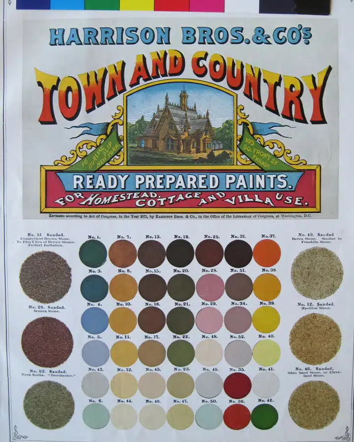
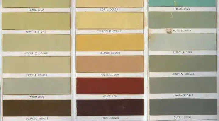
Harrison Brothers and Company, Inc., paint color card, 1871
Tastes were changing, and the neutral tints literally receded to the background, giving way to a greater variety and number of colors. "The fashion for compound hues, neutral tints, grays, and other so-called quiet colors, is giving place to a preference for combinations of red, blue, yellow, and other colors of the prism," John W. Masury wrote in "A Popular Treatise on the Art of House-Painting."5 Paint companies provided decorating tips and examples of color combinations on their color cards that were now considered acceptable and in harmony with each other. "It has not been thought necessary to mention the combinations with drab, fawn, and stone-color, or with all the hues and tones of the primaries and secondaries. Some of the former are better suited for grounds than for any marked position in color composition," Maury added.6 Color combinations become stronger. "The roof should be shingled and painted a dark red, while the body of the house should be painted an olive green, and the trimmings, that is, cornices, corners, porch and bay-window, a dark chocolate, with corners, or chamfers, where there are any, in vermilion," according to Almon c. Varney in "Old Homes and Their Adornments.7
Soon, color schemes become quite elaborate and complicated.
Paint the inside of windows or that part of the frame nearest the sash, light color; the sash and the flat part, or face of the frame, dark color. If the frame is cased with a molding on the edge next the wall, paint it the light color, as the gradation of color between the dark on the frame and the general color of the wall is more pleasing to the eye and is not as strong a contrast as a dark color will make. Paint the base dark, and the molding at the top of the base light color, the panels of the doors dark and the stiles light. We have noticed that in many instances the panels are painted light and the stiles dark, which is entirely wrong, as the stile is the most prominent part of the door, and of necessity must receive the most light. But as most of the woodwork now in use is perfectly flat, with the exception of grooves or beads run in them, we would advise the use of three colors. Paint high-lights light color, shadows dark, and in grooves or on beads, use a contrasting color, or one that will harmonize well, and at the same time make the woodwork look brighter, always being careful to use a receding color in the grooves and an advancing or stationary color on the beads — Sherwin Williams.8
Italianate (1860s to 1880s)
William Wordsworth's "Lyrical Ballads" of 1798 is thought to have begun the Romantic movement in England; American Romanticism followed and was strong in the early 19th century. After a series of conflicts, the country had expanded its borders and put land up for sale. A flood of immigrants had arrived looking for opportunity. Artists were painting idealistic landscapes of the newly opened territories.
Newfound wealth, obtained either directly or indirectly as a result of gold and silver discoveries, provided the means for building new homes to display that affluence. Industrialization enabled the less-privileged to improve their status. With the expansion of the railroad to California from its terminus in the Midwest, a building explosion occurred, as lumber could now be easily shipped to the quickly growing cities of the western territories.
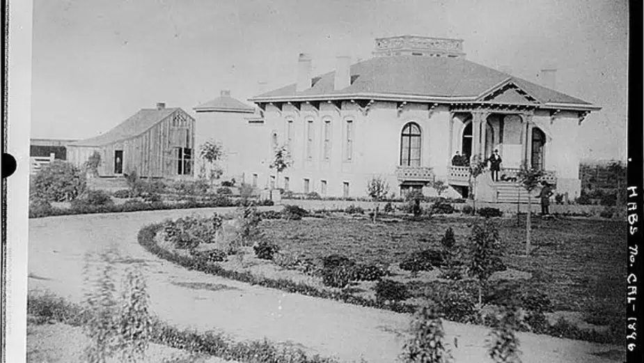
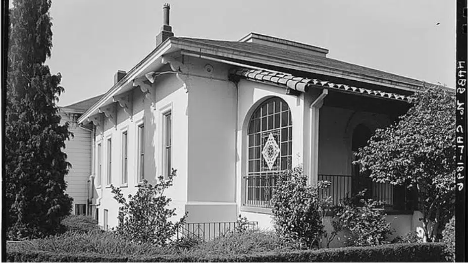
Ignacio Peralta House (Alta Mira Club), 1860 San Leandro, California
c. 1960, after alteration
The invention of balloon frame construction facilitated the introduction of more flexible building designs, resulting in complex floor plans. The publication of house pattern books, such as Alexander Jackson Davis' "Rural Residences" of 1837, supplied the design ideas and plans that enabled Western settlers to create dwellings as sophisticated as those seen in the larger, established cities to the east. The plans in these books were of cottages with board-and-batten siding, designs that were new and romantically evocative of Italian villas. Technological developments in machinery and tools — such as the scroll saw — enabled carpenters to create the elaborately decorative details such as vergeboards (trim on the eaves of a gable roof). Ornamentation becomes prominent. Within the crowded Midwest and East cities, more people were utilizing the ever-expanding railroads and canals, which allowed them to move further from the city and build new country homes as their permanent residence. Toward the end of this time period, the invention of a suitable container created the ability to package and ship ready-mixed paints. Manufacturers produced paint color cards as advertisement for their wares, encouraging homeowners to maintain their homes with the latest fashionable colors.
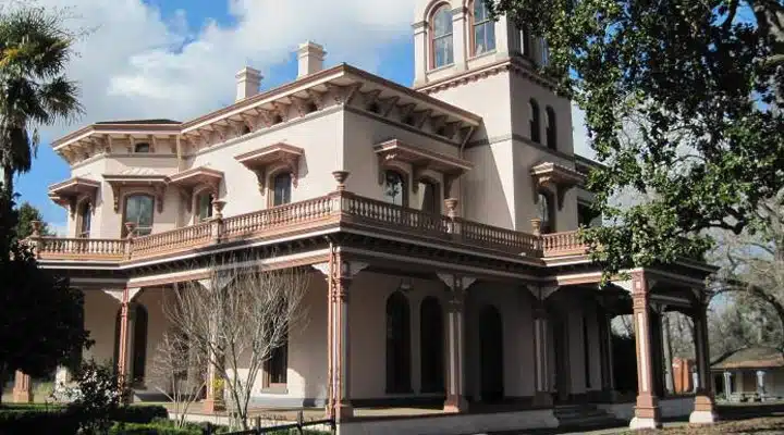
Bidwell Mansion, 1865 Chico, California
The Influence of Color on Italianate Architecture
The landscape gardener, writer, nurseryman and nature-lover Andrew Jackson Downing first published "Cottage Residences" in 1842. In this book, Downing provides building plans, designs for landscape and furnishings, and a great number of details for creating a home that is in harmony with nature and is aesthetically pleasing to everyone who views it. He provides six color swatches that are in keeping with the ideals of the Picturesque movement, in which the subtle colors of nature are espoused as less discordant than the whites and greens, which seemed to have been prevalent. "No painter of landscapes that has possessed a name was ever guilty of displaying in his pictures a glaring white house, but, on the contrary, the buildings introduced by the great masters have uniformly a mellow softened shade of color, in exquisite keeping with the surrounding objects," Downing wrote.9
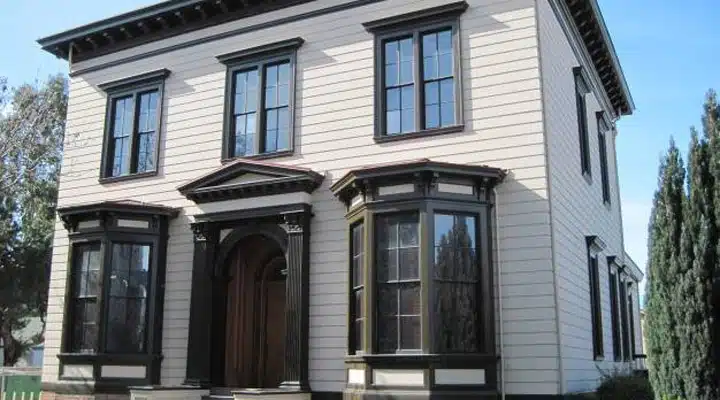
Fallon House, 1855 San Jose, California
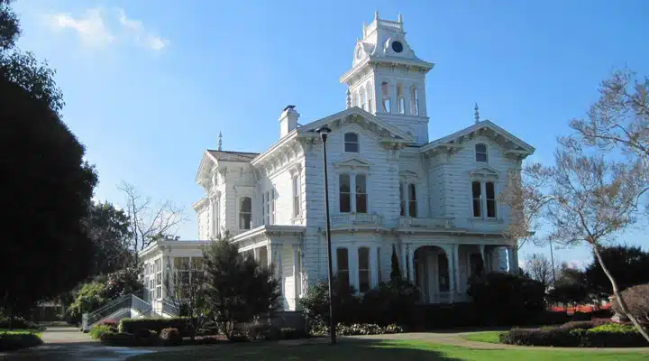
Meek Mansion, 1869 Hayward, California
The colors he espoused are neutral and include gray, brown, fawn and what he called "drab" — all the colors of natural materials such as sand, earth, clay, straw, slate and stone. In her journal, Susan F. Cooper wrote, "…and as it has already been observed, sober gray and drabs are the colors in favor today, as though all the houses in the land were turning Quaker."10
Travelers' journals record the appearances. "Excepting some old frame houses, and a few new ones, the buildings of the town are of brick or stone…; many of the dwelling houses are painted white or stone colour [sic], and have balconies on the roofs. The frame houses are painted more variously, according to the fancy of the owners or occupiers," Varney wrote.11
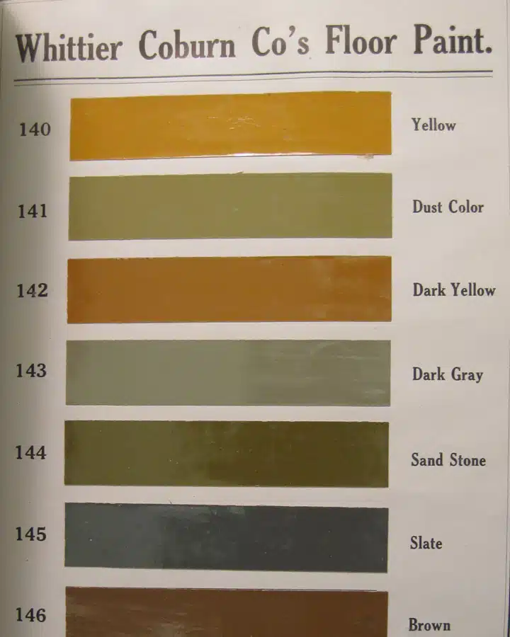
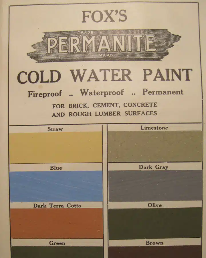
Whittier Coburn Co. catalog, 1909
Paint color card for Masury's Liquid Colors, Whittier Coburn Co. catalog, 1909
As the Civil War ended and prosperity returned, many new East Coast homes were built with stone and brick, a material thought to signify wealth; westerners built with wood and attempted to mimic the appearance of building stone by adding sand to the final coat of (exterior) paint. The paint colors were often those that resembled the stones they were trying to imitate — sandstone, granite, slate, serpentine.
Click here to download the PDF document of Victorian Era color names and origins.
Note: A special note about the Gothic Revival style, around during the early Victorian era from 1840s to 1870s, will be covered in our Revival styles reporting.
Report References:1 Charles L. Eastlake, "Hints on Household Taste in Furniture, Upholstery and other Details", Longmans, Green and Co.: London: 1869, p. 33. Although Eastlake's name is frequently correlated with the Stick of architecture, this is a tangential connection and he is better known for his furniture designs.2 Eastlake, p. 47.3 Sherwin Williams & Co., "House Painting", Cleveland, 1883, p.5.4 Eastlake, p. 117.5 John W. Masury, "A Popular Treatise on the Art of House-Painting", D. Appleton & Co.: NY: 1868; p. 167.6 Masury. p. 187.7 Almon c. Varney, "Old Homes and Their Adornments", J.C. Chilton & Co., Detroit: 1883; p. 112.8 Sherwin Williams, p. 149 A.J. Downing, "Cottage Residences; or A Series of Designs for Rural Cottages and Cottage Villas, and their Gardens and Grounds Adapted to North America"; Wiley & Halsted: NY, 1856, p. 14.10 Susan Fenmore Cooper, "Rural Hours", George P. Putnam; NY: 1850, p. 384.11 Almon c. Varney, "Old Homes and Their Adornments"; J.C. Chilton & Co.; Detroit: 1883, p. 131.

