


The Color Pink: Essential Color Theory, Symbolism and Design Application
04/12/2022 | davidcamacho |
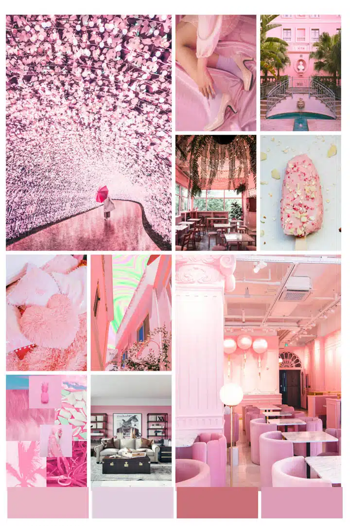
With just a touch of red, the color pink is a playful hue replete with a multitude of associations around the world. Whether baby pink or fierce fuchsia, pink has been at the forefront of fashion and interior design over the past decade. And as 2010s Millennial Pink morphs into varying degrees of peach and warm tones for the 2020s, we continue to see all shades of pink pop up each year in various design industries.

So, what does the color pink symbolize? Viewed as a feminine-centric color in many cultures, pink has historical references to romance and tenderness, as well as children and women, though it has only been considered a symbolic color for girls since the 1940s. So what else can we learn about this color that has captured so much global attention?
How to Create Different Shades of Pink?
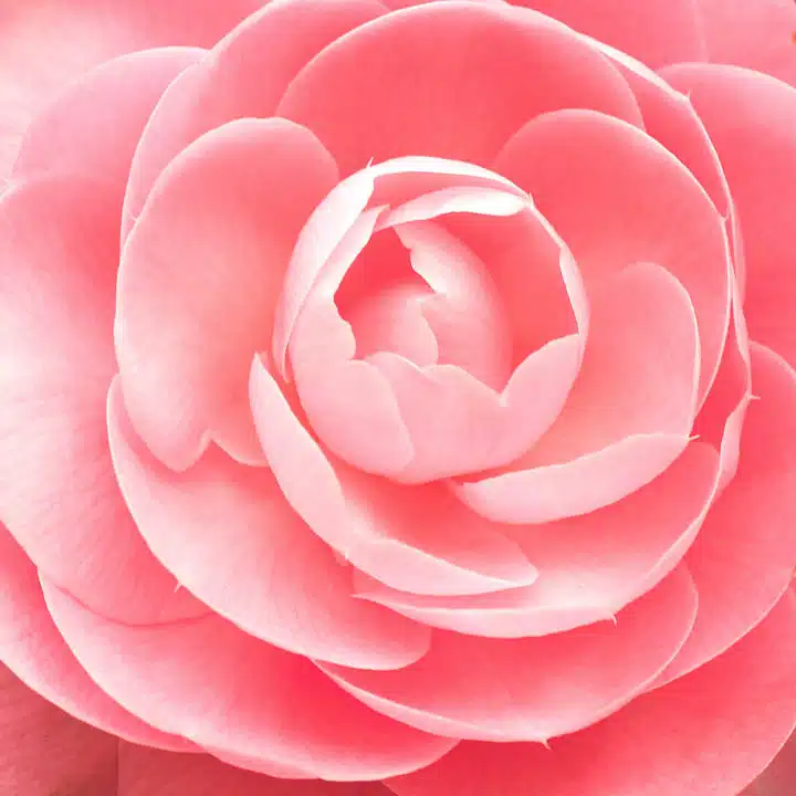
Let’s explore what makes pink a color. Pink is a tint of the primary color red, so it doesn’t appear on a traditional color wheel. It is made by mixing white and red together, creating a paler version of red. On modern color wheels, pink is viewed alongside red and mauve. Lighter pinks are created by adding more white to red pigment. More red or a little black is added to the recipe to achieve darker pinks.
To achieve other shades of pink, other colors can be mixed:
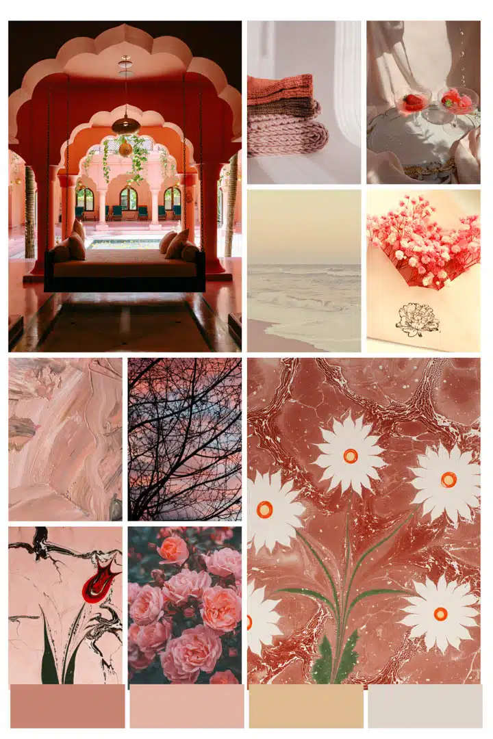
Dusty Pink: A Muted Rose Tone
Mix pink and violet. This nostalgic-looking color has been a longtime favorite for both interiors and fashion.

Coral pink
Mixing together pink and orange creates this shade reminiscent of precious coral. First recorded as a color in England in 1513, coral can create a sophisticated, feminine atmosphere.

Peach pink
Mix pink and orange together with a touch more orange to create this shade of pink that is brighter than coral pink. This shade takes its name from peach fruit skin and brings a warmer, more vibrant feel than traditional pink. Inviting and energizing, peach pink was a key color of the Art Deco period in the 1920s – ’30s.
Blush
Mix purple with pink to create a soft, warm, glowing, muted shade of pink. Blush is a term first used to describe this shade of pink in English in 1590. As it leans toward the hint of neutrals, blush is widely appealing in fashion and interiors.
Powder pink
A soft, delicate shade of pink. As one of the most versatile and likable shades of pink, which can be used as a neutral, it has been a favorite for centuries and has been shown everywhere from Versailles to modern homes.

Cameo pink
A fresh shade of pink that leans toward mauve and is chic and feminine. Cameo pink is popular in fashion and interiors and is a great color choice for almost any room in the home. This is a great color option for cottagecore-themed room interiors.
Camellia rose
A vibrant pink named after the flower native to Japan. As a hot pink, this shade looks great in spaces that invite attention, such as entryways, dining, and living spaces.
Flamingo pink
A brighter pink with a touch of orange, similar to flamingo feathers. A tinge of fluorescence to the shade of pink creates a bright, eye-popping touch to fashion and interiors.
Magenta pink
A vivid mix of red and blue. This color is quite lively and pleasing to the eye because of how bright it appears, and it is ever-present in fashion and art.
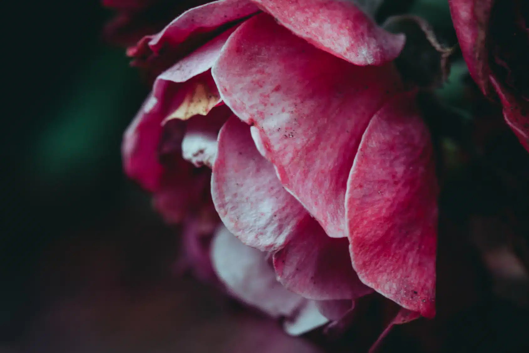
Hot pink
A classic pink that has shown up in documents back to 1849, this brighter shade is most closely associated with the 1980s pink obsession and is once again showing up on fashion runways. It is the shade most frequently paired with red for a vibrant color combination these days.
The Meaning of the Color Pink
The meaning of the color pink comes from a blend of contrasting origins. Derived from the passionate energy of red and the purity of white, pink balances warmth with softness, giving it a youthful, energetic, and approachable quality. While often seen as a positive and uplifting hue, what pink symbolizes can vary depending on the cultural and historical context. Some of the most common pink color associations include:
- Friendship, care, and compassion. Many nurses' and healthcare professionals’ uniforms are in shades of pink.
- Femininity and a color for girls. Within the last century, pink has become a gender-specific color for females and is connected to kindness, romance, and love.
- Luxury, boldness, and even masculinity. Historically, pink was linked to wealth and status and often appeared in preppy fashion and men’s sports uniforms. Its confident use in modern design continues to blur gender lines and challenge traditional roles.
- In branding and design, pink is frequently used to convey creativity, optimism, and approachability in the wellness, beauty, and lifestyle industries.
Where Does the Color Pink Originate From?
Pink is a naturally occurring hue that shows in sunrises and sunsets, in a variety of flowers and the feathers of birds, the scales of fish, and even within precious stones. Since ancient times, there have been references to the color pink.
- In the 8th century BC, Homer’s The Odyssey often references the beginning of a day using pink: "When the child of the morning, rosy-fingered dawn appeared…"
- In ancient Roman times, the Latin word roseus, from the flower of the same name, was used in reference to pink.
- During the Middle Ages and the Renaissance, pink was depicted in many religious paintings and became a symbol of marriage and bonds between mothers and children. One such painting by Raphael, The Madonna of the Pinks, shows the Christ child giving a pink flower to his mother, the Virgin Mary.
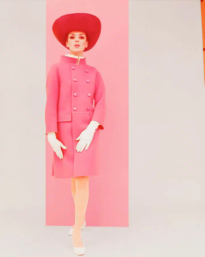
- During the 18th century, pink became fashionable in Europe among the royals and upper echelon. As many famous mistresses favored this color, it became known as a color of seduction and romance.
- By the 19th century, English boys dressed in pink outfits and ribbons, as pink was a lighter version of red, which was the color of military uniforms. Signifying nationalistic pride, these outfits were prevalent during the period.
- Finally, by the 20th century, pink became associated with females, most notably after World War II, when famous figures such as Mamie Eisenhower, Jackie Kennedy, and Elsa Schiaparelli wore and designed fashions with pink, and it quickly became a favorite of women to wear and use in the home.
- In the 1970s, hot pink became a symbol of rebellion and anarchy, and the punk rock movement took over the underground music scene. Posters, album covers, shirts, and other musical ephemera were layered in hot pink.
- Most recently, Millennial Pink has become the color symbol of the millennial generation. With its connotations of gender fluidity and rejection of conservative values, the flesh-tone shade of pink has become ubiquitous over the past decade.
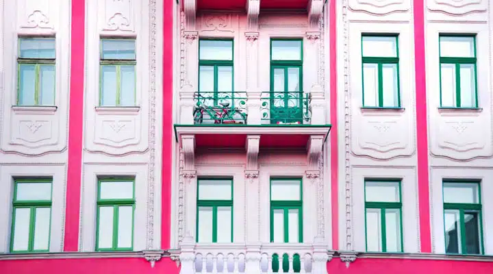
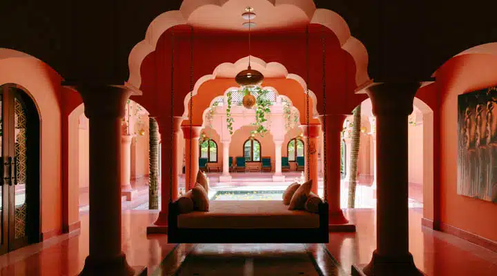
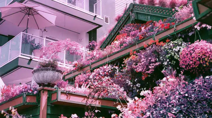
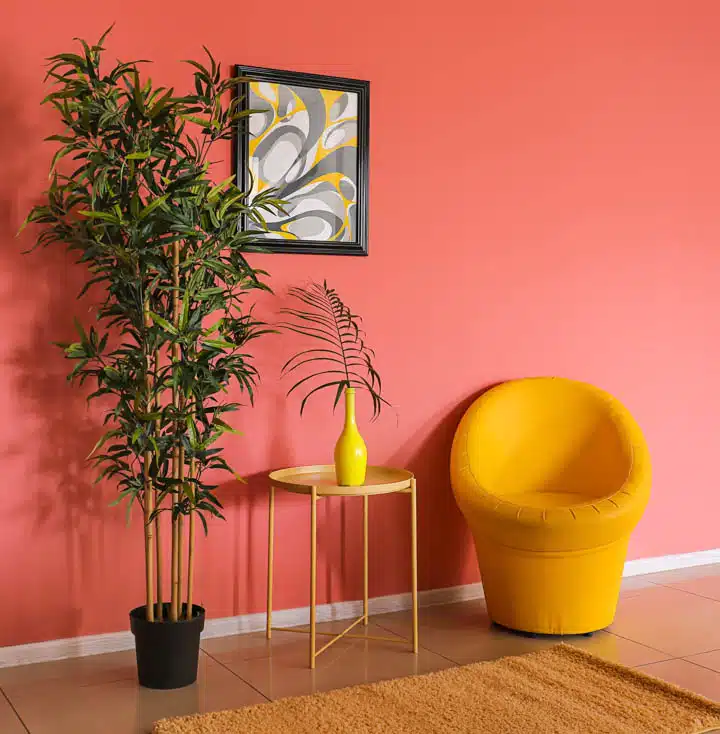
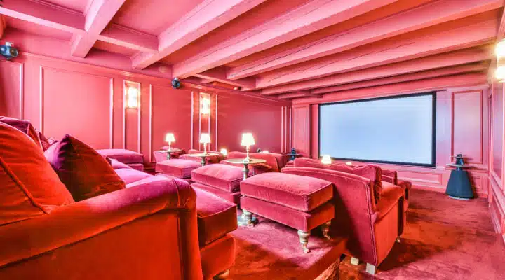
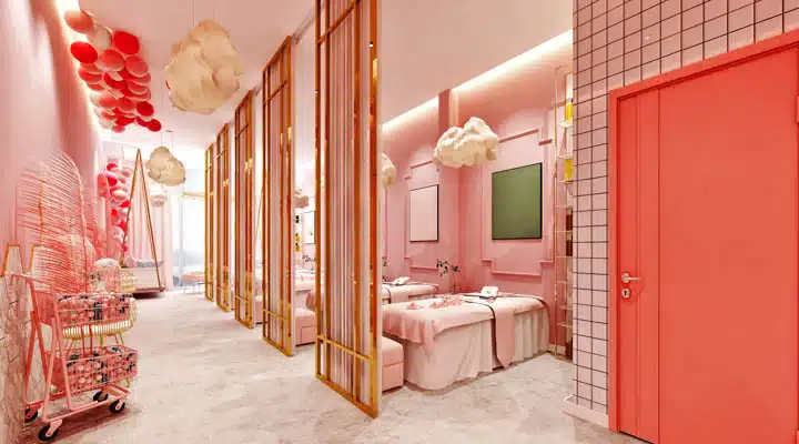
How to Design With Pink
Pink is such a versatile hue that it can be included in designs that range from sweet nurseries to sophisticated restaurants. There really are no limitations when using the color in the right shade for its intended space. When considering how to design with pink, the key is choosing the right tone and pairing it thoughtfully with other colors and textures. Here are several design ideas:
- Pair dusty pink with charcoal and navy for a moody effect.
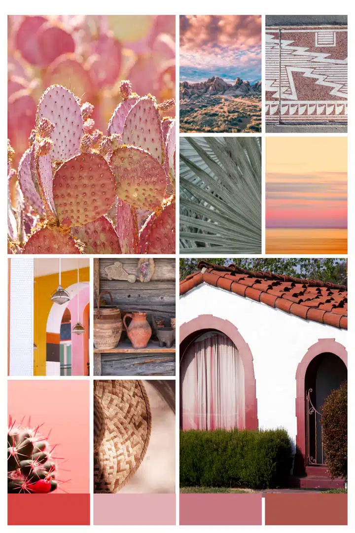
- Use coral pinks and peach pinks with earthy, warm neutrals, yellows, and greens for a natural and grounded interior.
- Try hot pink with crisp white and silvery gray for an uptown penthouse vibe.
- For a monochromatic palette, use different shades of the same tone of pink.
- Incorporate a complementary color palette by pairing pink with lime green.
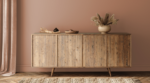
- Combine blush pink with soft beiges, warm wood tones, and brass for a romantic and timeless interior.
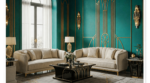
- Use vibrant magenta or fuchsia with teal or emerald green for bold, contemporary contrast.
- In minimalist spaces, layer soft pinks with off-white and natural textures like linen or oak for a serene, airy feel.
- Apply pink in small doses—like accent walls, artwork, or statement furniture—to add charm without overpowering the room.
- For commercial interiors, balance bold pinks with neutral flooring and clean lines to create a modern, inviting atmosphere.
Opposite Color of Pink
In traditional color theory, the opposite of pink, a tint of red, is found in the green family. While pink conveys softness, warmth, and compassion, green offers a sense of balance, renewal, and tranquility. Together, these complementary hues create visual harmony and are often used in design to evoke a refreshing yet approachable aesthetic. The pairing adds energy without overwhelming, making it a versatile combination across styles and settings.
Find out how Millennial Pink became such a global phenomenon and look at more ways to incorporate pink into your designs. Need more inspiration? Look to our 2022 color + design trends report.