

The Color Brown: Essential Color Theory, Symbolism and Design Application
11/10/2021 | davidcamacho |
The many shades of brown found in nature can bring comfort and stability to interior spaces. Often present in wood, soil, and stone, the color brown reflects a grounded simplicity that feels familiar and steady. Designers often choose brown when they want a palette that feels timeless, lived-in, and easy to connect with.
Furthermore, there's something honest about the color brown. It does not try too hard. It sets the tone quietly, offering warmth, depth, and a strong sense of place.
Brown Color Theory: How It Works
In simple terms, brown color theory comes down to mixing. Brown isn't on the color wheel, but you can create it by combining primary or complementary colors, like red and green, or orange and blue.
In color theory, brown is seen as a low-saturation version of orange. It forms when colors with strong hues cancel each other out, creating a muted, earthy result.
If you've ever mixed paints and ended up with something muddy, you've seen what makes brown. It's a blend that softens boldness, adds depth, and helps other colors feel more grounded.
And as brown is trending forward and permeating all areas of design, Dunn-Edwards even named Art and Craft (DET682) as the 2022 Color of the Year.
Brown on the Color Wheel
Since brown is a product of mixing other hues together, you won't find it on a standard color wheel. Envision the color wheel brown as a muted version of orange with less brightness and more depth.
The color brown is considered a warm hue, and depending on how it's mixed, can also have undertones of red or yellow. Artists usually vary the blends of this composite color to achieve these rich, earthy tones.
The Meaning of the Color Brown
Like most colors in color theory, brown has both positive and negative associations.
Brown Color Symbolism
Across cultures, brown color symbolism is tied to nature, resilience, and tradition. It's the color of soil, leather, wood, and worn paths—all things that last, carry weight, and feel familiar.
In positive settings, brown suggests warmth, safety, and reliability. It's dependable and honest. But in other contexts, it can feel dull or too serious if not balanced with light or texture. In branding, it's often used by companies that want to appear stable, trustworthy, and grounded in heritage.
Brown Color Psychology
In design and daily life, brown color psychology centers around comfort and connection. Brown calms the senses. It wraps a space in quiet energy that doesn't overwhelm.
This makes it a strong choice in homes, where it supports feelings of stability and warmth. In branding, it speaks to authenticity and roots. Too much brown can weigh things down, but used thoughtfully, it brings balance, warmth, and timeless appeal.
Where does the Color Brown Originate From?
Nature and soil are the first ideas that come to mind when asked where brown comes from. We see it all around us in the dirt, wood, and sand, plus on the fur and hides of animals. With the color so prevalent all around us, it is perceived as neutral.
Used in art since prehistoric times, thanks to the availability of natural clay, this is one of the oldest color names on record in English and was first used in the 10th century. Many cultures use a word similar to the word for coffee to describe this color.
In ancient history, some of the earliest drawings in cave dwellings were created using umber and sienna(link). In ancient Greece, they experimented and created a red-brown dye called sepia, made from the ink of the cuttlefish. This sepia was also used by many Renaissance artists, including Leonardo da Vinci and Raphael, and continues to be used by artists today.
Traditionally, brown was associated with poverty and lower classes, and many couldn't afford the more colorful dyes for their clothing. The Romans even had a name for the poor–pullati, which translates to "those dressed in brown." It then makes sense that in the Middle Ages, monks wore brown as a sign of poverty and humility.
Over time, the significance and use of brown have changed in artwork. In the 17th and 18th centuries, brown was favored by painters such as Caravaggio and Rembrandt for creating layers of depth and shadow.
In the 1970s, brown was a staple of color palettes in all areas of design. Typically infused with other earthy colors, including harvest gold, avocado, and sunny orange, this decade solidified the popularity of brown.
In recent years, brown has cycled through a few trending phases, with coffee color ranges showcasing the popularity of coffee shops, particularly Starbucks, which created a mass market chain of coffee shops in the 1990s.
Then, more recently, brown has been highlighted as a key color through this decade as part of the eco-sustainable movement, along with ties to cottagecore, light and dark academia, and general rural fantasy design aesthetics.
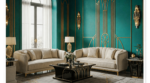
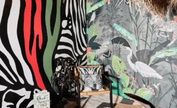
On fashion runways and in luxury interiors, brown is often seen as a luxury color in camel, taupe, and beige tones, often on leathers, fine-grain woods, and fine linen weaves.
How to Design with Brown
Brown is an incredibly versatile color with a wide range of tones for almost every design aesthetic. When choosing colors to go with these elements, try matching undertones. Here are four trending design themes using brown and warm neutrals:
Warm Scandinavian Design
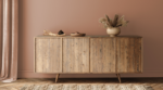
Scandinavian design emphasizes a grounding comfort and return to natural settings. Using a wide range of browns and whites, plus natural woods, creates a soothing, monochromatic palette as a perfect accompaniment to the aesthetic.
Japandi Design
Defined as the juxtaposition of Japanese Zen-minimalism and Scandinavian functionality, Japandi creates a perfect fusion of form and function.
Neutral paint color palettes with calming and tranquil qualities— such as beige, tan, stone, oatmeal—are contrasted sparingly with deep indigo, dark gray, and brown. If brighter hues are chosen, it's done with intention.
Cottagecore Design
A rebuttal against technology overload, Cottagecore is an extension of Grandmillennial or Granny Chic lifestyle and is defined as a romantic interpretation of rural, agricultural times and simpler life through a style of dress, design, and décor.
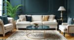
Browns and neutrals are infused through a palette that is worn in and comfortable, paired with muted accent colors including ivory, brown, beige, olive green, mustard yellow, baby pink, dusty rose, light and buttery yellows, baby and watery blues, and warm grays.
Desert Abode
As desert living has trended forward in recent years, with Palm Springs and Joshua Tree highlighting fresh ideals in desert lifestyle and slow living, so too have the color palettes trended to warm neutrals and browns.
Transformative quiet retreats for the "always on" or for anyone looking to take a breath and reconnect with the natural world dot the desert landscape, and the color palettes stay true to the region and its natural, picturesque landscape.
Brown Color Palettes
Browns offer a wide range of choices when it comes to creating color palettes for almost any aesthetic you're creating.
- Monochromatic Palette uses a range of browns and neutrals to create a sophisticated approach.
- Complementary Palette, as brown is considered a deep orange on modern color wheels, blue would be incorporated.
- Analogous Palette uses colors bordering on either side of the color wheel, which means reds and yellows would complete the analogous palette for browns.
Ready to Use Brown with Confidence?
Brown works across styles and holds up in every setting. Its wide range of tones makes it suitable for both traditional interiors and modern updates. If you are updating a single room or planning an entire home, this color supports natural materials and pairs well with current color trends.
Learn how to apply brown in design and understand why warm hues continue to gain ground. Our 2022 color and design trends report includes practical ideas, color direction, and product suggestions to guide your next project.