
Midnight Garden Comes to Life: An Artist’s Take on Dunn-Edwards 2026 Color of the Year
11/25/2025 | Madison Pfeifle |
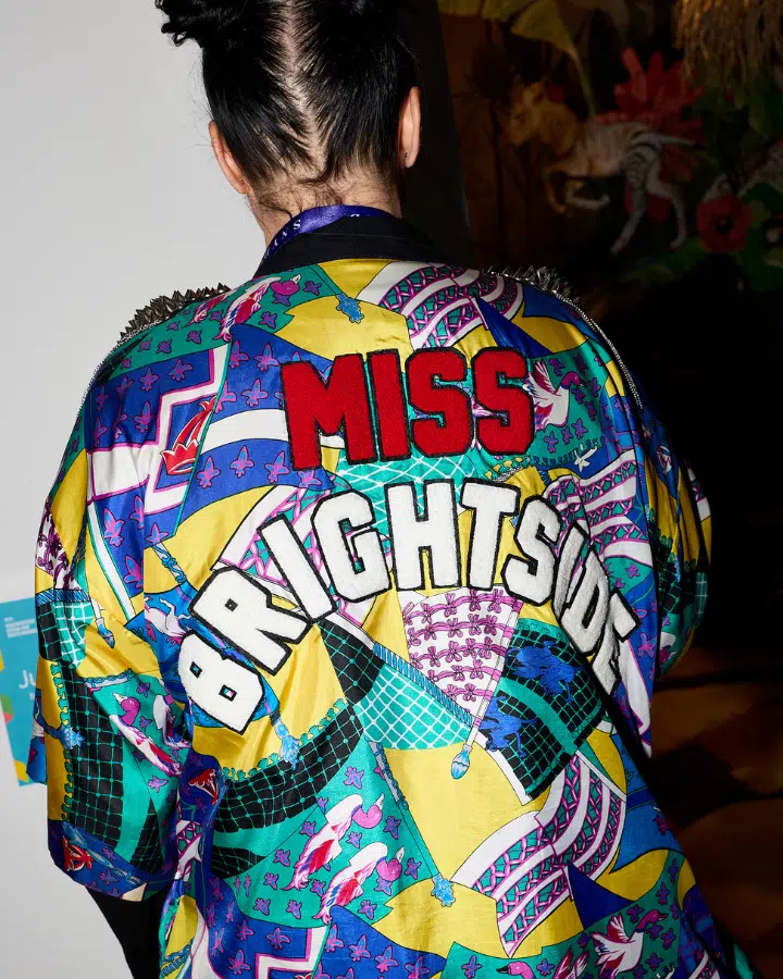
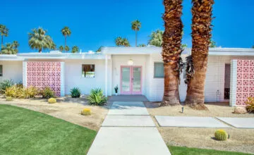
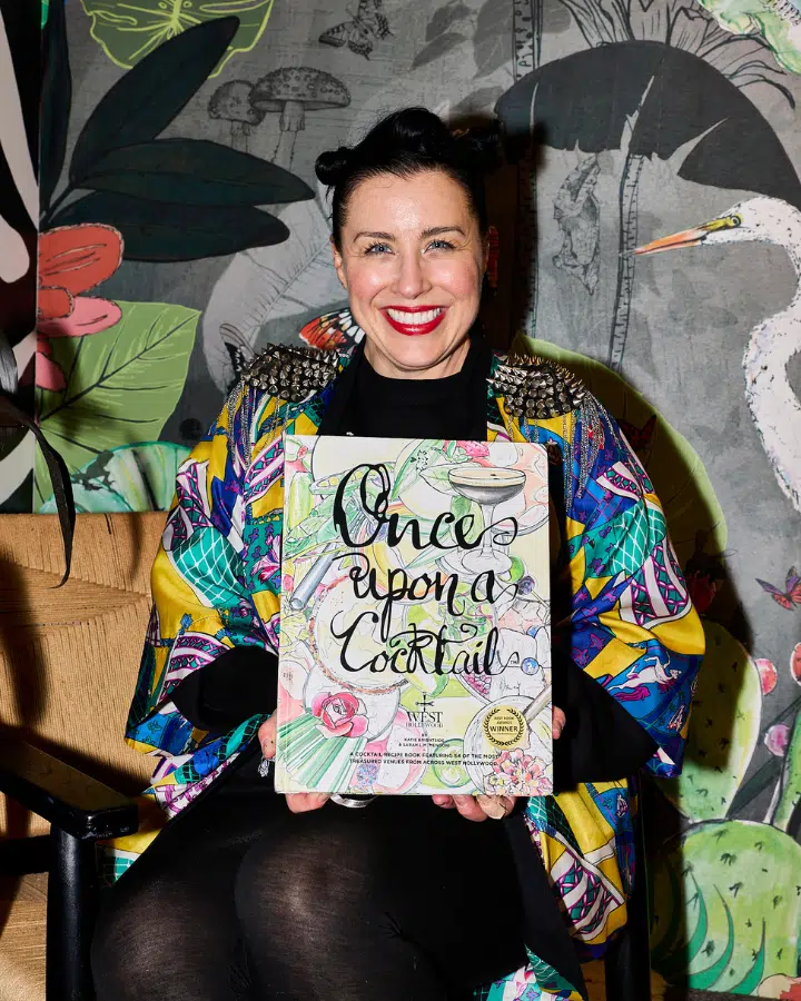
Meet Katie Brightside, Los-Angeles based artist, whose latest projects feel like a much-needed escape. Her secret weapon? Dunn-Edwards 2026 Color of the Year, Midnight Garden (DE5657).
Can you tell us a bit about your background and how you got started as a muralist?
Growing up in the UK, I immersed myself in the Arts and Crafts Movement, steeped in the world of William Morris. As a child, I spent hours wandering garden centers, often finding myself in the renovation department, captivated by wallpaper—figuring out where the repeats began and studying how patterns worked. Naturally drawn to prints, I began my professional career as a fashion designer.
My journey led me from fashion to fine art, and eventually to Los Angeles. There, an Airbnb host introduced me to a lifelong interior design friend who asked me to illustrate wallpaper. The rest is history. Switching mediums has never been difficult for me—soon, I had a paintbrush in hand, climbing ladders, and bringing walls to life. I'm happiest when my hands are full of paint and my nails look like I haven't washed them for weeks! I love it.
I've always lived by one simple rule: say yes. Saying yes has led me here. I just love it, and it's a privilege to do what I do.
What inspired the design for your latest mural, Jardim Tropical Courtyard, and the accompanying Welcome to the Jungle project for the WestEdge Design Fair?
Jardim Tropical Courtyard (Portuguese for Tropical Courtyard Garden)
This project was client-driven; she is Brazilian and wanted to bring the flavor of the rainforest into her courtyard. She is incredibly smart and focused, and the way the space is used is both clever and intentional. She has created a true wellness retreat. One of my favorite nooks is the hand-painted bird aviary, paired with the bathtub/cold plunge and adjoining sauna—it’s simply magnificent. The entire space has been thoughtfully considered and executed with the highest quality. It's truly a slice of heaven.
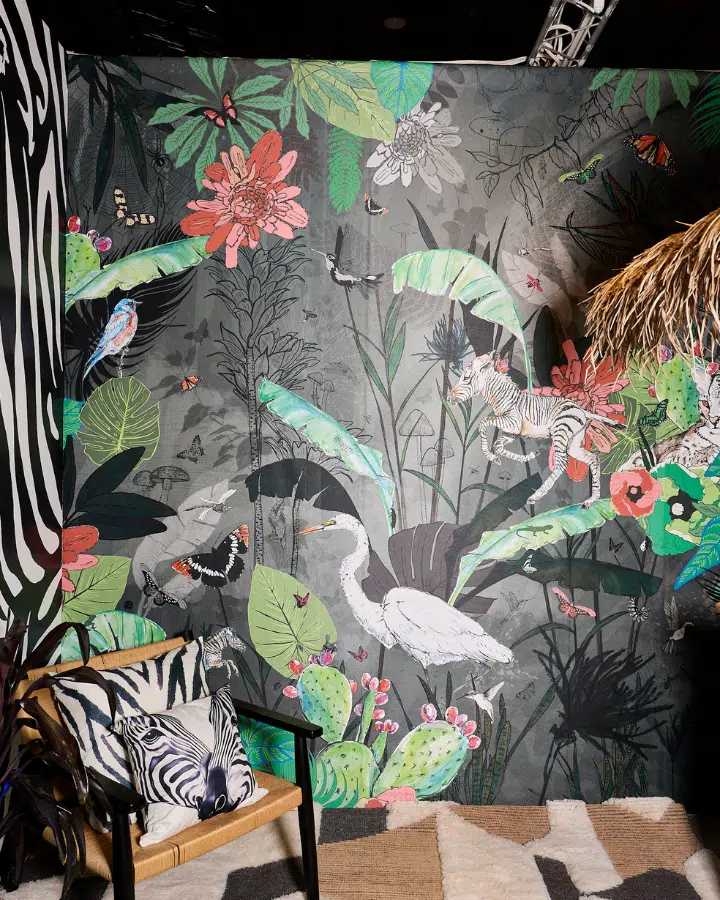
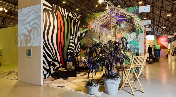
Welcome to the Jungle
Design trade shows like WestEdge are brilliant for giving a designer full freedom to "go to town”—and I brought the cray-cray.
In a world full of contention, I wanted to create a space to escape to. This mural sits in a room in a house, but I envisioned it as a secret space off the architectural plan—a hidden tunnel tucked away where no one would expect it. When you emerge back into the light, you step into a room of effervescent spirit and joy. A place to kick off your shoes, mix cocktails with friends or new encounters, and let the outside world's constraints fall away. It's a space of consensual fun that frees the mind and lifts the spirit.
What emotions do you aim to evoke with these projects?
Jardim Tropical Courtyard reflects peace and tranquility—emotions that evoke calmness and contentment. I wanted to capture the feeling of being fully present, while transporting you to a place of nature that grounds you. My work carries humor and joy, and every detail is made with love.
In contrast, Welcome to the Jungle is a psychedelic trip: animalistic, raw, bold, and dangerous. It's fun, obnoxious, and a perfect reflection of how I was feeling in the moment of its conception.
Can you walk us through your creative process when selecting colors for a project like this?
My color palette is everything—everything. Painting a mural demands precision; clients don't like surprises. For the courtyard project, the brief called for a Brazilian jungle theme, which actually gave me creative freedom. With the density of a tropical rainforest as inspiration, I built the composition around a strong, earthy palette to ground the piece. From there, I layered in pink tones, orange hues, and highlights of yellow and blue. Before I knew it, I was working with 28 colors—but each one feeds off the others, creating a vibrant, cohesive design that brings the mural to life.

What role does Midnight Garden (DE5657), Dunn-Edwards 2026 Color of the Year, play in shaping the mood of your design?
I've always loved green palettes, so when I heard that Midnight Garden (DE5657) was Dunn-Edwards 2026 Color of the Year, I was ecstatic. The hue instantly took me back to my fashion days, designing dresses in that very shade. It also reminded me, in the most unexpected way, of watching David Bowie in 2000—just a few years after the Glastonbury renaissance of 1997—and of how popular Midnight Garden wellington boots had become as a festival staple.
This color embodies everything I adore: military strength, jungle vitality, and raw energy, all captured in the gorgeous name Midnight Garden. For me, it reflects the organic foundation of my work, serving as a staple to build all other colors upon. Truly, Midnight Garden is the new black.
How does Midnight Garden interact with the 2026 Color Trends—Gypsum Rose (DET452), Apple Cinnamon (DEBN46), Cedar Grove (DE5152), Outer Boundary (DE6021), French Press Coffee (DEBN07)—that you used in the mural?
Perfectly—it’s like a melting pot of beauty. Gypsum Rose from Dunn-Edwards 2026 Color Trends actually serves as the base color for the courtyard. Every hue plays a vital role in the grand composition. When I first looked at the full palette, I thought, "28 colors—that’s a lot!” But for a 500-square-foot jungle, it needs that full spectrum and breadth to truly reflect nature.
Midnight Garden is the David Bowie of the 2000 Glastonbury lineup—bold, unforgettable, and commanding the stage. Gypsum Rose takes the Willie Nelson slot, warm and timeless. Apple Cinnamon channels Ladysmith Black Mambazo, adding soulful harmony. Cedar Grove is our Pet Shop Boys, a surprising cheeky-little-number—formidable, fun, and flamboyant. Outer Boundary brings the smooth vibes of Morcheeba, while French Press Coffee roars in like Nine Inch Nails. It’s a mixed bag, but together they created a lineup that became legendary—a festival in color and spirit.
What challenges or opportunities did you encounter creating a mural for a client's home compared to the WestEdge booth?
Creating a mural for my Courtyard client’s home was a very different experience compared to the WestEdge project. The courtyard project is 500-square-foot in a personal space, which requires a slow, meticulous approach. Unlike a quick brush or single coat, every detail has to be perfect, and the effort is absolutely worth it because I deeply value my client and her family—it’s truly a pleasure to be on-site and bring their vision to life.
In contrast, WestEdge is a fast-turnaround environment. I only had five hours to complete the piece, so the design had to work within that constraint. The result is playful, highly Instagrammable, and showcases 28 Dunn-Edwards colors, creating a fun, eye-catching vignette that fits the energy of the event. The painting is still perfect—it’s just more abstract.
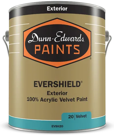
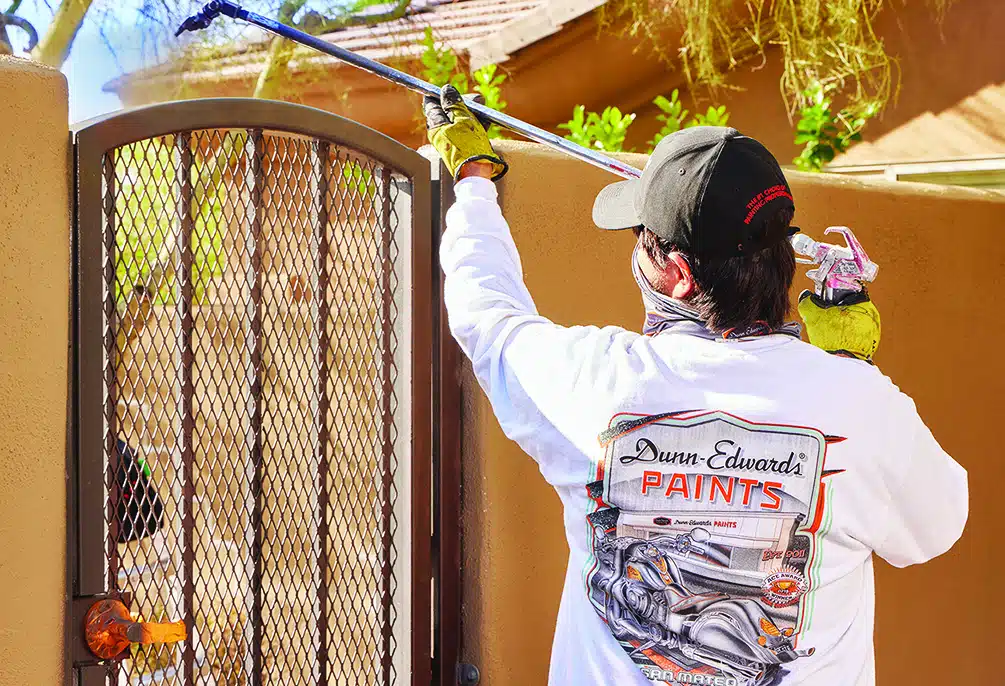
Can you describe your experience using SPARTASHIELD® Exterior 100% Acrylic Paint for the project?
I used SPARTASHIELD Exterior 100% Acrylic Paint for both the courtyard and WestEdge Design Fair projects, and I absolutely love it. The paint delivers exceptional durability and a smooth, consistent finish. Coverage was excellent, even on textured surfaces, and the colors have held up beautifully outdoors. I also appreciated how easy it was to work with—it dries quickly, and cleanup is a breeze, wiping away effortlessly.
Do you have other tried and tested Dunn-Edwards products you've used?
I'm completely obsessed with your paint brushes and rollers. I buy a new Dunn-Edwards Deluxe Kit for every project. I know I can recycle them now, but there's just something about that "first day of school" feeling that comes with fresh tools.
Your products last beautifully with proper care, but on some gigs, cleanup isn't always easy. Even with glad wrap and protection, things can dry out fast in the California heat when there's no access to water and proper wash-up.
As an artist, what do you find most rewarding about collaborating on projects that combine your artistic vision with broader design concepts?
I have a strong aesthetic that I've become known for. The Courtyard commission is a great example: my initial stylized concept didn't match the client's vision, so I adapted to a cleaner style I've used on murals before. It took longer to paint, but when I returned, she was thrilled. The client is always the priority, and the most rewarding part is seeing them feel truly seen. I live by the saying, "leave your ego at the door," which is essential for private commissions.
Can you share what's next on your creative journey?
I'm thrilled to step into the role of Art Curator for a growing California business. The company spans 10 stores (and growing) across the state and hosts 30 exhibitions each year. This is an incredible opportunity to champion both emerging and established talent, nurture creativity, and celebrate the richness of artistic expression. I can't wait to bring these visions to life and create meaningful connections between artists and their audiences.
On top of that, I'm gearing up to launch my next book, Once Upon a Cocktail – The California Guide to the Non-Alcoholic Movement. In fact, I have three books slated for completion in 2026, and I'm so excited to share these projects with the world!
Visit Katie's website to learn more about her work, and follow along her journey on Instagram.