Colors of the Decade 2015
07/15/2025 | Lauren Hoferkamp |

As Dunn-Edwards celebrates its 100-year anniversary, we're revisiting the iconic colors that were in the spotlight throughout our history. The Colors of the Decades Collection highlights top hues from every era through 11 unique palettes. Let's step back into the 2010s—a decade that embraced a softer palette, reclaimed vintage charm, and curated feeds.
2010s Palette
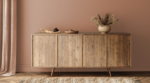
The 2010s brought the rise of home renovation shows, complete with the calming colors of the era. Shows like HGTV's Fixer Upper with Joanna Gaines brought a sort of shabby chic aesthetic to the forefront. Gaines embraced this style by incorporating distressed wood, antique finds, and light, airy colors into her designs.
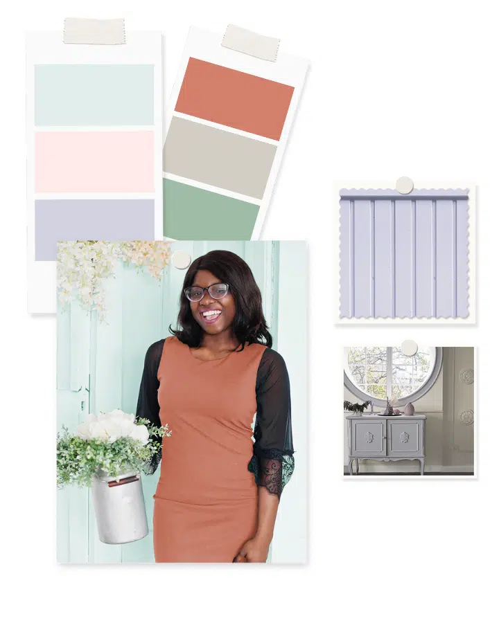
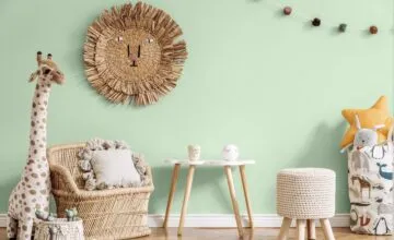
With the growing digital world, Instagram quickly became the new design magazine of the generation. Instagram feeds quickly became digital mood boards and a go-to for design inspiration. The visual storytelling of social media gave pastel shades a new life, leading to a surge of pastel color palettes. People crafted their grids with flea market finds and antique furniture repainted in whimsical shades. Meanwhile, brands leaned into the era's dreamy tones, making a mark with colors like millennial pink.

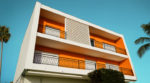
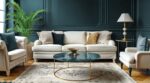
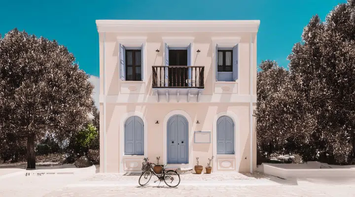
Throughout the decade, design styles evolved to incorporate this softer palette. The Craftsman Revival brought back warm wood and playful accents while Mediterranean-inspired exteriors were retouched with more whimsical hues. Crisp whites, muted blues, and gentle blush tones brought a soft statement to these classic designs, adding fun touches without going overboard.
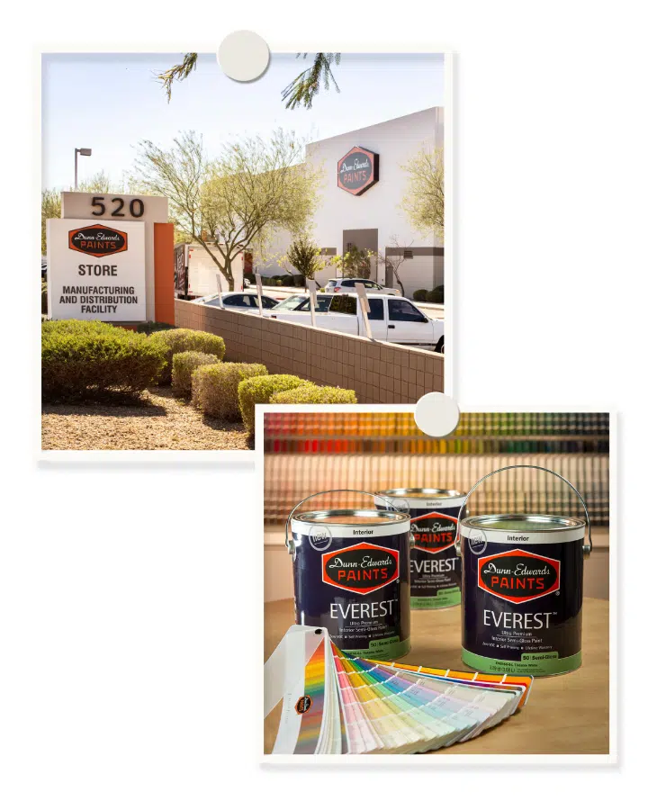
A focus on eco-consciousness continued to evolve during the 2010s, as conversations around climate and green living began to shape building and designing. In 2011, Dunn-Edwards advanced its sustainability efforts by opening the world's first LEED® Gold-certified paint facility in Phoenix, AZ. Then in 2013, the company launched EVEREST®, an ultra-premium, zero-VOC, self-priming paint, giving users a high-performance option that aligned with a greener future.
The 2010s proved that color can be soft yet powerful. With hues like Rose Frost (DE5127) and Tranquil Sea (DE5932), the 2015 Palette is a gentle invitation to create spaces that feel comforting and personal with a touch of nostalgia.
Be sure to subscribe to our newsletter and follow us on Instagram for more Colors of the Decades palette releases.