

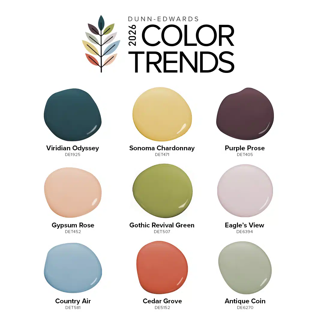
The 2026 Color Trends Collection: A Quiet Joy
09/09/2025 | Dunn Edwards |
The 2026 Color Trends Collection: A Quiet Joy
Some moments in time slip by in a natural evolution; they represent barely perceptible shifts in preferences and styles. But other moments feel like a rebellion against everything that came before: they represent bigger changes that drive our hopes and dreams. We're in one of those big moments right now. And yet, it's not loud. It's a quiet revolution.
Our journey to create the 2026 Color Trends Collection was inspired by the collective desire for spaces that feel grounding, nurturing, and genuinely happy. We’ve seen a clear trend in design to move away from cool, stark neutrals, toward a more tactile, deeply intentional, and joyful aesthetic. While minimalism is still trending, it has taken on a more personal character, where carefully curated pieces each have a special meaning and purpose. On the other side of the spectrum, maximalism has shifted from a somewhat generic display of glam into a much more individualized celebration of prized possessions and handmade decor. And for the range of styles in between, we're seeing that same drive towards personal expression—borne from the need to create surroundings that feed our souls.
The colors in this collection were chosen for their ability to evoke a subtle, deep sense of happiness. They are hues that feel both familiar and fresh, reminiscent of cherished memories and also the perfect backdrop for beautiful moments yet to come.
Beyond the home, this collection offers a fresh dose of inspiration for commercial projects of every scale. Architects and designers will find versatile, timeless choices for everything from healthcare and hospitality to multi-family and workplace design. Whether used for residential or commercial applications, the 2026 Color Trends Collection delivers just the right amount of sophistication mixed with optimism—transforming ordinary spaces into extraordinary experiences.
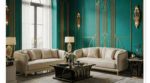
Viridian Odyssey | DE1925
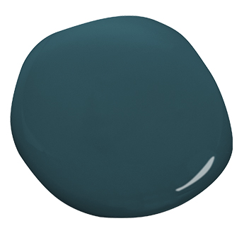
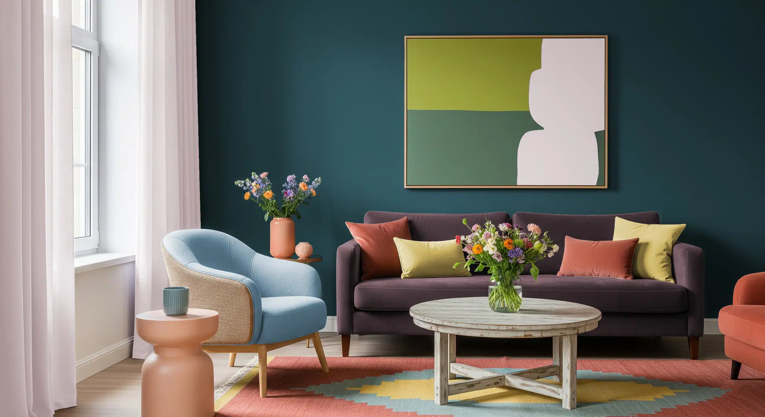
Our Color of the Century, Viridian Odyssey (DE1925) is a deep, mysterious blue green with a calming, sophisticated presence. This color evokes the sense of a journey through time, the calming presence of the ocean, and the introspective quiet that follows the perfect sunset.
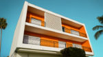
Viridian Odyssey is the perfect color for creating a dramatic, immersive space. Use it for color drenching a dining room to make it feel intimate and luxurious, or on the walls of a media room to enhance the cinematic experience. It's also a fantastic choice for a dark and modern exterior or front door accent. Wherever it's used, Viridian Odyssey sets the stage for deep connection and quiet contemplation, a place where stories are told and futures are imagined.
Gothic Revival Green | DET507
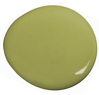
Gothic Revival Green (DET 507) is a rich citron green with a touch of yellow. It feels grounded and natural, while also appealing to our sense of nostalgia to recreate the type of opulent, carefree existence we imagine that previous generations enjoyed.
Use this color to build a moody and luxurious atmosphere in a home office or a library, or to create a jewel-box effect in a small space like a powder room or entryway. It pairs well with vintage accents and brass fixtures, and looks beautiful in a sun-drenched room or even on a front door. Both inside and outside, Gothic Revival Green is a bold, yet calming shade that adds a layer of sophistication and introspection. It’s a color that makes you want to get lost in a good book or host a historic-themed party.
Eagle's View | DE6394
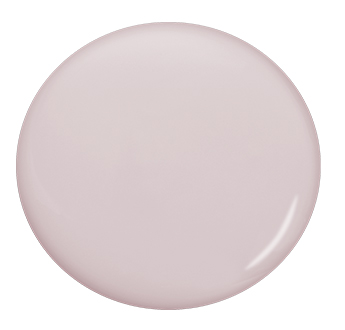
Imagine the comforting softness of your favorite blanket, the color of the sunset on a cozy, overcast day, the faded scent of lilies wafting from another room. Eagle's View (DE6394) is just like that. It's a soft, muted mauve with a wash of gray; a complex, blushing neutral that feels calm and romantic, but not in an overly sentimental way.
Consider using Eagle's View in a bedroom, laundry room, or nursery to promote relaxation and a sense of peace. As an exterior color, it looks stunning alongside warm creamy whites, soft sage greens, or even deep charcoals to create a more dramatic, elegant contrast. Wherever it's used, Eagle's View invites serenity and reflection. In a fast-paced, demanding world, it reminds us that daydreaming is just as important as doing.
Country Air | DET581
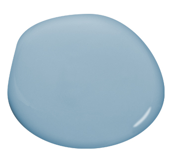
Country Air (DET581) is a tranquil and slightly desaturated blue. It is the color of a clear, endless sky on a perfect day, or the soft, worn hue of your favorite pair of faded jeans. As our lives become increasingly busy, Country Air offers a visual exhale, a reminder for us to pause and breathe.
This shade is a perfect fit for a bedroom, dressing room, or even a kitchen, where its calm, stable presence helps us relax and appreciate life in the moment. For a more playful space, consider painting a ceiling in Country Air to give the impression of a room with no boundaries. On exteriors, Country Air adds a touch of calm to nearly any architectural style; creating an atmosphere for play and rest, where happy moments are as limitless as the sky itself.
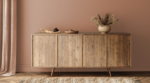
Gypsum Rose | DET452
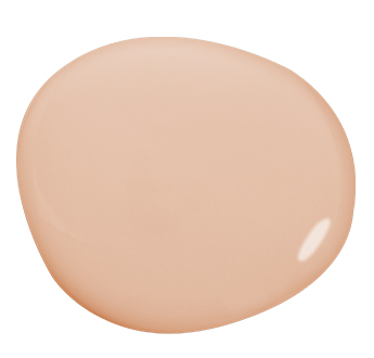
Gypsum Rose (DET452) is a soft, earthy peach that feels naturally radiant, like the delicate blush of a seashell or the first hint of morning light. Gypsum Rose adds a quiet, nurturing quality without being overwhelming.
A warmer, more grown up version of Millennial Pink, it is a beautiful choice for a living or dining room, where it creates a welcoming, sophisticated atmosphere. Gypsum Rose pairs well with natural materials like pottery, basketry, and linen, and it looks especially stunning when accented with darker toned woods, which help prevent it from leaning too feminine. On exteriors, it presents a soft, sun-drenched aesthetic, especially with stucco or wood siding. Wherever it goes, Gypsum Rose graces walls with a gentle, timeless glow that feels both refined and heartfelt.
Cedar Grove | DE5152
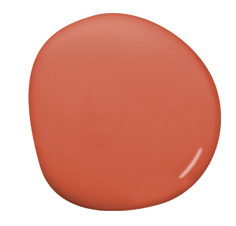
Cedar Grove (DE5152) is a punchy, coral terracotta that feels like a sun-drenched memory. Happier than red, more playful than orange, Cedar Grove is the perfect hue to make a bold statement without being heavy-handed.
For interiors, consider using Cedar Grove in a living room or dining room to create a dramatic and inviting focal point. When used on kitchen or bathroom cabinetry, it adds a bold, organic personality that pairs beautifully with natural wood, stone, and brass hardware. Use it in places where you want to capture a warm Mediterranean aesthetic, or as a fun pop of color to complement playful wallpaper and window treatments. On an exterior, Cedar Grove creates an instant invitation, hinting at the warmth and love that resides within.
Sonoma Chardonnay | DET471

Sonoma Chardonnay (DET471) is a soft, buttery yellow that captures the beauty of an endless summer afternoon. Inspired by the golden landscapes of wine country, this historically accurate color was once common in Victorian homes.
On walls, Sonoma Chardonnay acts as a ray of hope and optimism, making it a fantastic choice for a breakfast nook or kitchen, where it creates a cheerful, uplifting start to the day. For a more playful aesthetic, use it on a gallery wall in an entryway or paint it on the inside of a closet for a small, delightful surprise. This color is the perfect inspiration for creating happy memories and cheer.
Antique Coin | DE6270
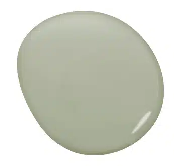
Antique Coin (DE6270) is a muted gray green that captures the serenity of nature and evokes the nostalgia of a cherished, time-worn past. Like a morning walk through a dewy forest, it brings feelings of calm, balance, and rejuvenation.
On kitchen cupboards, Antique Coin feels both modern and nostalgic, contributing to a space where family recipes are passed down and happy memories are made. It makes for an incredibly soothing bedroom or bathroom color, transforming any space into a sanctuary for rest and reflection. As an exterior color, Antique Coin achieves the impossible: it harmonizes with both traditional and modern styles, for a soothing vibe that is as versatile as it is sophisticated.
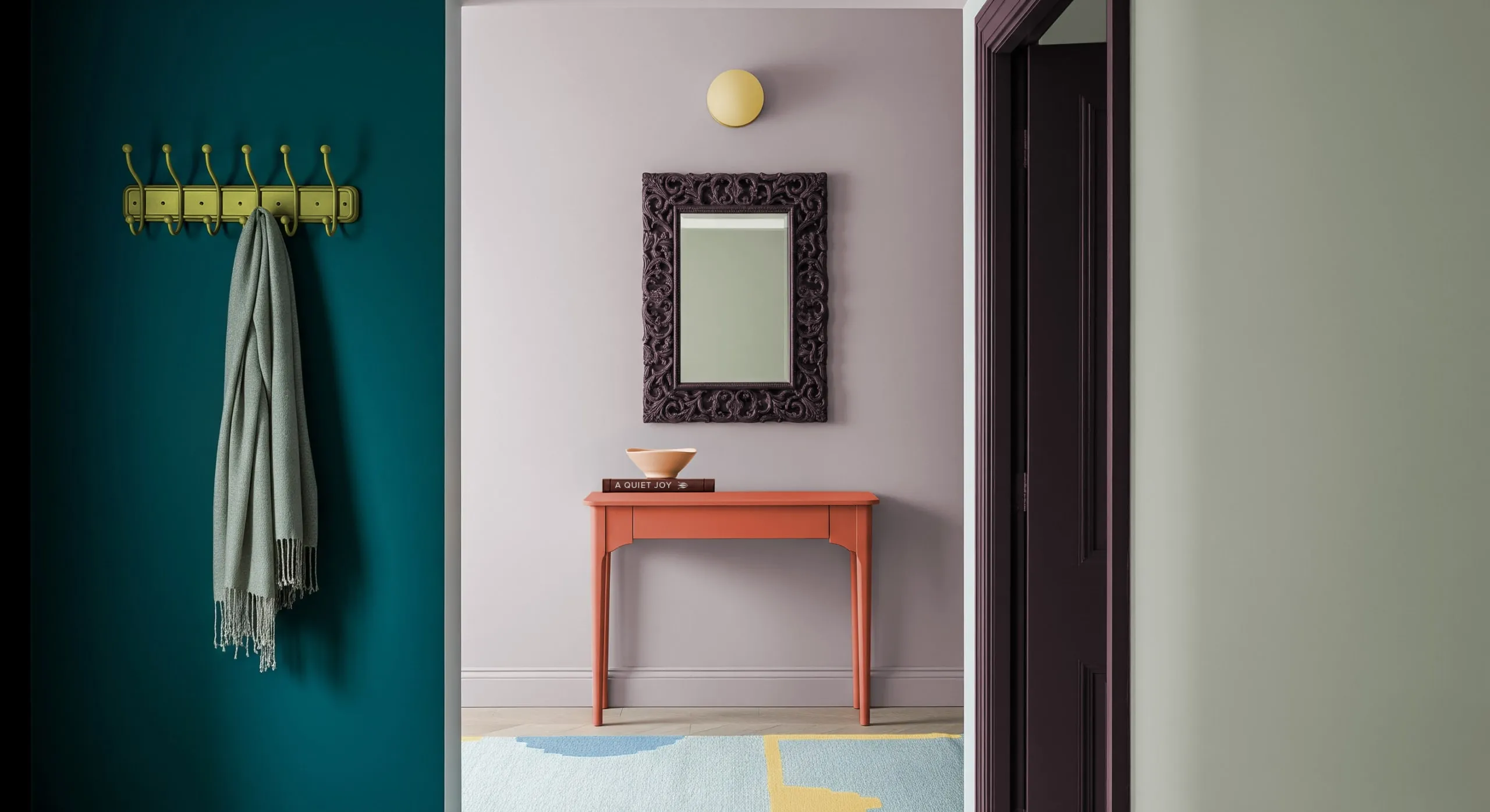
Purple Prose | DET405
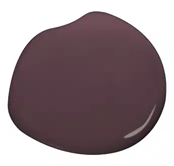
Purple Prose (DET405) is a wine-stained brown with soft gray undertones. It is a complex, sophisticated shade that is both luxurious and introspective, helping you design spaces with a sense of coziness and grandeur.
This color is a great choice for creating a moody atmosphere that tells a story. Use Purple Prose in a living room or media room to build a sense of drama. Its rich, enveloping quality also makes it an excellent choice for color drenching a bedroom or library, imparting a sense of old world sophistication and an enduring feeling of serenity. On exteriors, Purple Prose is a stunning and unexpected choice that almost feels like brown ... but with a much more intriguing backstory.
The 2026 Color Trends Collection is a celebration of the belief that true beauty lies in the quiet, everyday joys of life. These colors are here to help you create moments of inspiration every day, so you can appreciate the beauty that's already around you. Because when you fill your life with colors you love, it's easier to love the colorful moments that make life worth living.
Learn more about the 2026 Color Trends Collection here.