
Colors of the Decade 1945
07/29/2025 | Lauren Hoferkamp |

As Dunn-Edwards celebrates 100 years of color and innovation, we’re looking back at the hues of the century. The Colors of the Decades Collection showcases the stand-out shades from every era through 11 unique palettes. Today, we’re taking it back to the 1940s—a time where people found strength and perseverance.
1940s Palette
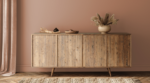
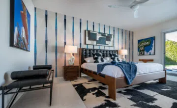
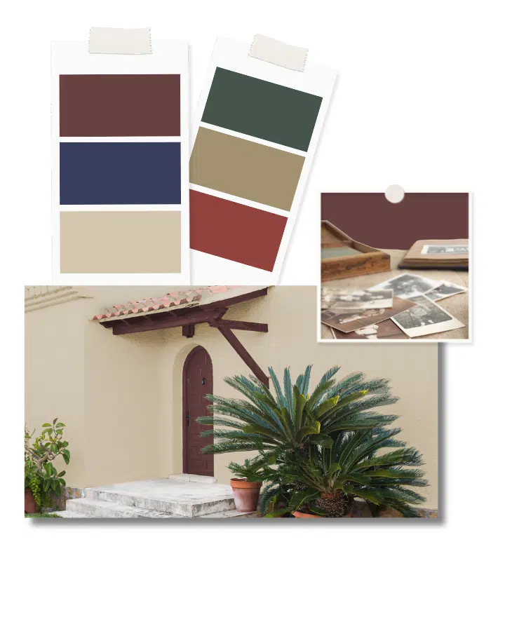
The utilitarian existence of the 1930s brought rationing and practicality to the 1940s. As people were seeking a sense of relief, designers leaned into a simpler aesthetic, bringing forth neutral colors like beige, taupe, and brown to symbolize stability.
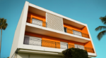
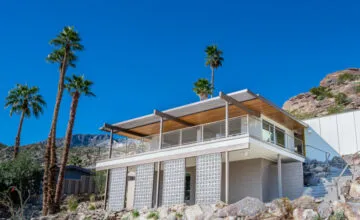
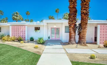
The turn towards neutrals was partly influenced by the widespread paint shortage that occurred during the war. This led to a preference for colors that could be easily touched up, aligning with the resurgence of rammed earth and adobe construction. Neutral tones complimented this building style and its Spanish Revival look.
In the midst of the war times, there was a shortage across the workforce. Many women began stepping into new roles in factories and offices. Female empowerment became a focus, and symbols like Rosie the Riveter embodied the strength and grit of the era. With a renewed appreciation for America, patriotic shades of blue and red made their way into homes and public spaces.
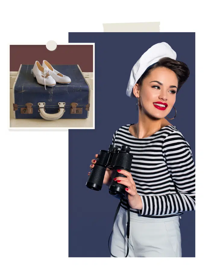
Amid these tough times, many turned to music and movies for escape. The stark contrasts and shadows of Film Noir translated to deeper, moodier hues in interiors. It was during this era that diners rose in popularity, providing another escape. These Art-Deco-inspired diners, often complete with dark and muted tones, became hubs of community during a time of uncertainty.

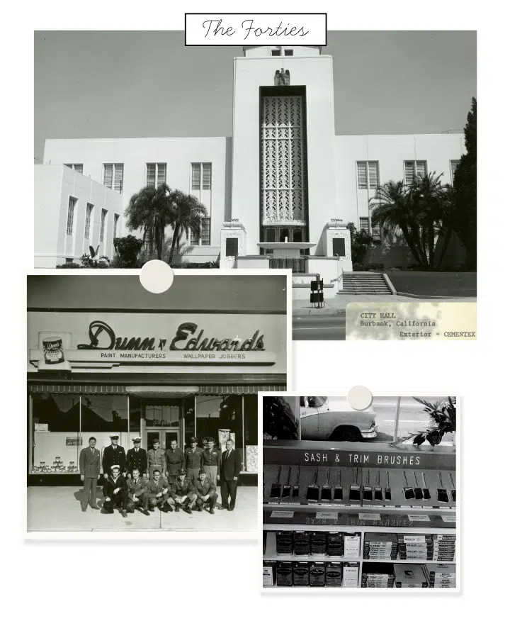
The 1940s were a decade of resilience and growth for Dunn-Edwards. In 1940, the company launched Cementex, a durable masonry finish used on iconic landmarks including the Hollywood Roosevelt Hotel and MGM Studios. Despite wartime material shortages and the draft, Dunn-Edwards supported the war effort by supplying paint for military bases. By 1949, we deepened our commitment to quality by embedding employees with companies like Purdy Brush to advance our brush and roller expertise, ensuring professionals had the best tools to pair with our paints.
The 1945 palette is filled with colors that represent the strength and perseverance of the decade. From the comforting neutrals of Natural Bridge (DE6194) and Nomadic Taupe (DE6192) to the deeply saturated hues of Red Craft (DET423) and Singing the Blues (DET576), these shades remind us that beauty can be found in challenging times.
Be sure to subscribe to our newsletter and follow us on Instagram for more Colors of the Decades palette releases.