Popular Color Palettes Through The Decades: 1970s—2010s
05/11/2022 | Dunn Edwards |
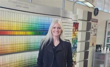
You may know our Then, Now and Forever® Collection—historically accurate paint colors inspired by classic architectural styles of the American West. Or perhaps you’ve seen Dunn-Edwards’ latest Poolside Gossip Color Collection, influenced by the vibrant homes of Palm Springs in the 1960s and 1970s. But have you ever wondered which color palettes truly defined each decade? We love looking back at the history of design and exploring exactly what cultural trends and phenomena led to the dominance of certain color trends. We’re taking a look back at the iconic palettes that have shaped the past 50 years of design and color trends.
These decade-defining color palettes didn't just reflect style but also told the story of shifting cultural values, fashion, and even technology trends. From the warm, nature-inspired tones of the 1970s to the polished minimalism of the 2010s, each era introduced shades that captured the lifestyle and spirit of the time. Looking back helps us understand how color connects to emotion, memory, and design choices we still see today.
2010s Popular Colors
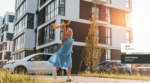
In the 2010s, Millennial Pink was everywhere. Pink, a color that in the second half of the 20th century became synonymous with girls and femininity (but more on that later), became a new neutral in the 2010s. So neutral, in fact, that Millennial Pink became the star color in everything from office interiors to trendy restaurants like the Insta-famous, India Mahdavi-designed Gallery at Sketch and even in tech products. This subtle pink tone played a key role in popularizing the minimalist aesthetic that defined the decade. While Millennials embraced their signature shade, rising Generation Z introduced a bold contender: Gen Z Yellow. This vibrant, cheerful hue splashed across interactive exhibits of the late 2010s, including the Color Factory and the Museum of Ice Cream.
The 2010s colors were shaped by digital culture, wellness trends, and an obsession with curated minimalism. Millennial Pink became one of the most iconic colors of the decade. Often paired with light gray, blush, or creamy white, it appeared on everything from bathroom tiles to office accent walls. On the other side of the spectrum, Gen Z Yellow captured attention in social, high-impact environments like cafés and pop-up exhibits. This bold, bright color was splashed across Instagram and Pinterest feeds due to its photo-friendly nature.
2000s Color Design Palettes
The cult classic Mean Girls had us wearing pink on Wednesdays throughout the 2000s, years before ‘Millennial Pink’ would dominate fashion trends. The decade was also shaped by Apple’s iconic tech and sleek marketing — both major influences on the defining color trends of the era.
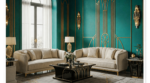
At home, a wave of Tuscan-Spanish-inspired decor took hold, likely sparked by the nostalgic 2003 filmUnder the Tuscan Sun. Sunbaked palettes, wrought iron accents, terracotta tiles, and faux finishes became staples in many interior spaces.
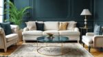
In addition to Tuscan influence, the 2000s introduced a blend of rustic elegance and modern comfort. Accent walls became a popular tool for adding color without overpowering the space, often painted in rich reds, warm golds, or clay-inspired tones. Beige reigned supreme, especially in open-concept homes, offering a neutral canvas for layered decor. Meanwhile, light blues and sage greens appeared more frequently, adding soft contrast to the warm, Mediterranean-inspired palette.
1990s Paint Color Trends
Tradition and grunge — two key elements that helped define some of the reigning colors of the 1990s. Both introduced a darker palette than in previous decades. Deep reds, dark greens, browns, and beiges set the tone for this grounded era. While purple walls like those in Monica Gellar’s apartment on Friends may have been a dream come true, this daring design move may have been too bold for most.
While grunge made waves in fashion, interior design leaned into moodier, more grounded aesthetics. Forest green kitchen cabinets, burgundy dining rooms, and beige-heavy living rooms became popular color choices. The '90s also saw a rise in faux finishes. Sponging, rag-rolling, and color-washing added texture and depth to the walls. These paint techniques made darker colors feel more dynamic and gave homeowners more creative control. This was the era of balance: rich color without overwhelming intensity.
1980s Neon-Inspired Color Palette
Lisa Frank, bold makeup, Jazzercise, Miami Vice, rattan, and MTV were just a few 1980s icons that brought bold, vibrant color palettes into the spotlight. Neon tones and beachy hues defined the decade’s design energy.The boldness of the ’80s extended beyond fashion and music—it was all over interior spaces, too.
High-contrast color pairings, glossy finishes, and geometric patterns took over homes. Neon pinks and electric blues found their way onto walls, furniture, and even kitchen appliances. Pastels were popular too, often used in Art Deco-inspired homes. These colors mirrored the decade’s playful, expressive energy, reflecting the rise of individualism and pop culture as serious design influences.
1970s Paint Color Trends
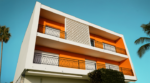
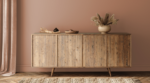
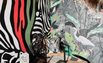
The Flower Child movement brought earthy, muted tones into homes throughout the 1970s. Avocado green, rustic brown, and mustard yellow led the design palette, appearing in everything from upholstery to appliances. Want more 70s-inspired color stories? Check out this updated modern chalet that pays homage to 1970s alpine culture.
The popularity of earthy tones during the ’70s wasn’t accidental. The 1970s color scheme was defined by a return to nature and a desire to bring organic textures indoors. Materials like wood paneling, shag carpeting, and rattan furniture paired well beautifully with warm golds, harvest oranges, and muted greens. These tones were often seen in open-plan living rooms and kitchens, creating a cozy, relaxed atmosphere. Homeowners sought harmony with the natural world, and paint colors delivered: subtle, warm, and grounded.
A Colorful Journey Through Time
From the warm, natural hues of the 1970s to the clean minimalist palettes of the 2010s, each decade left its mark through color. These palettes reflect design preferences and the moods, movements, and cultural shifts that shaped our homes and lifestyles. Even as trends change, color continues to be a powerful form of personal and creative expression.
Explore the full range of Dunn-Edwards paint colors and order free color samples to find the perfect shade inspired by the past, made for the present.