


Popular Dining Room Paint Colors
Choosing the right dining room color enhances the atmosphere for both daily meals and special gatherings by creating a space that feels polished and welcoming. Whether you lean toward the energy of bold lime greens and sunny yellows or the tranquility of soft olives and warm neutrals, these Dunn-Edwards shades are designed to complement various lighting, furniture, and textures. Lighter tones provide a relaxed, versatile backdrop, while darker hues add a layer of dramatic richness and depth that sparks conversation. Ultimately, these curated colors infuse the room with warmth and character, ensuring the environment feels complete and inviting regardless of your personal design aesthetic.
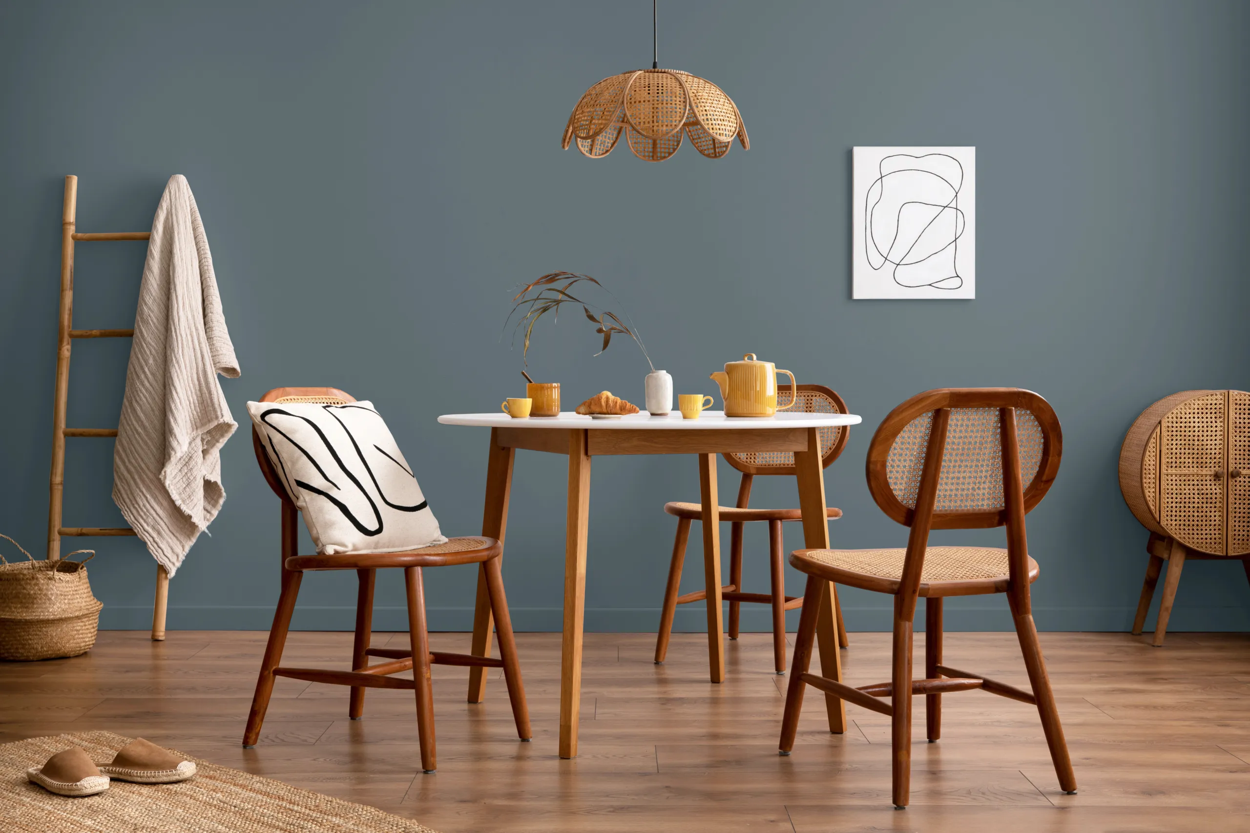
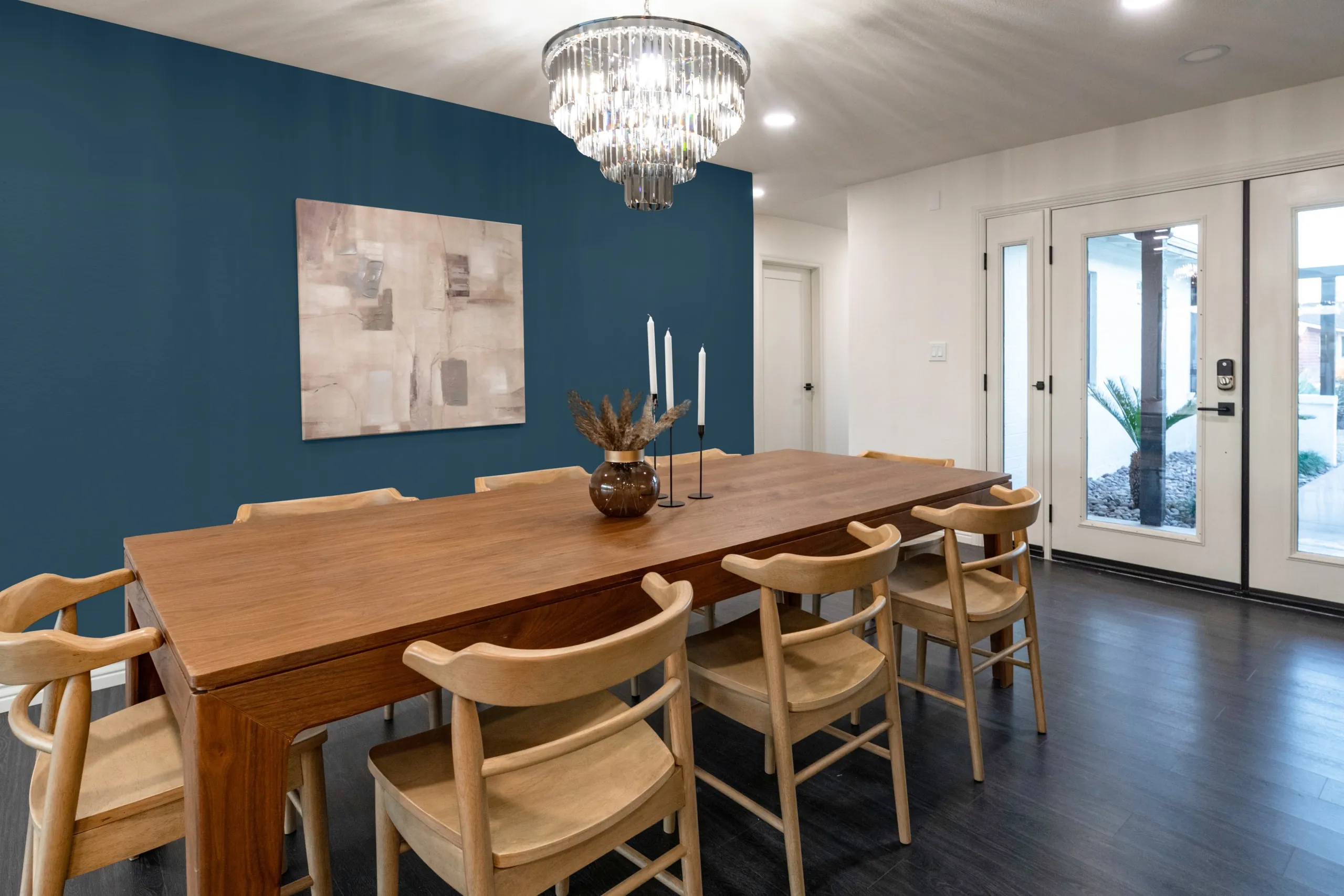
Dunn‑Edwards 2025 Color of the Century, Viridian Odyssey, is a deep blue‑green that looks elegant and timeless. Its rich tone makes it a striking backdrop for a dining room. Pair it with warm wood furniture or brass accents for a polished, inviting look.
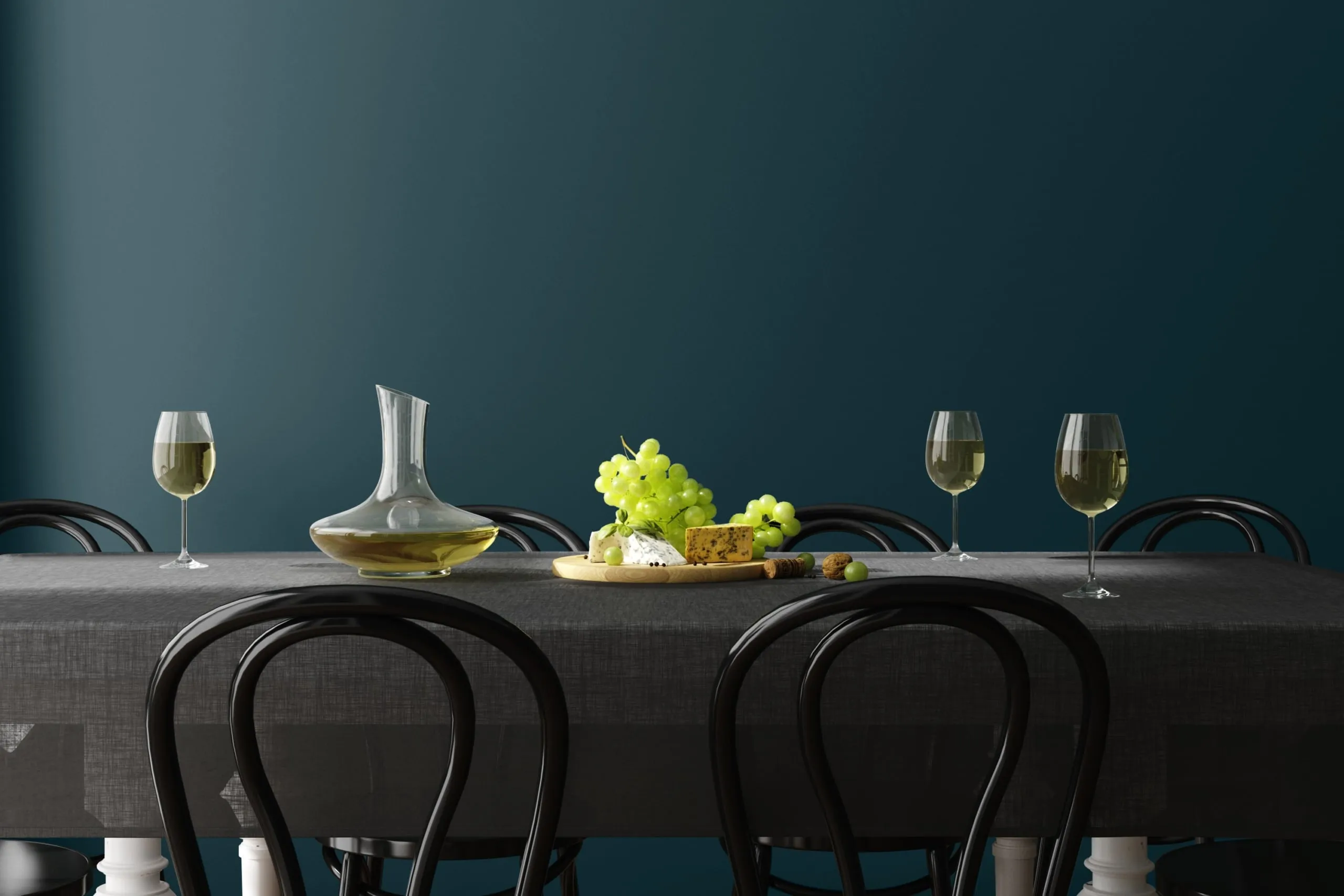
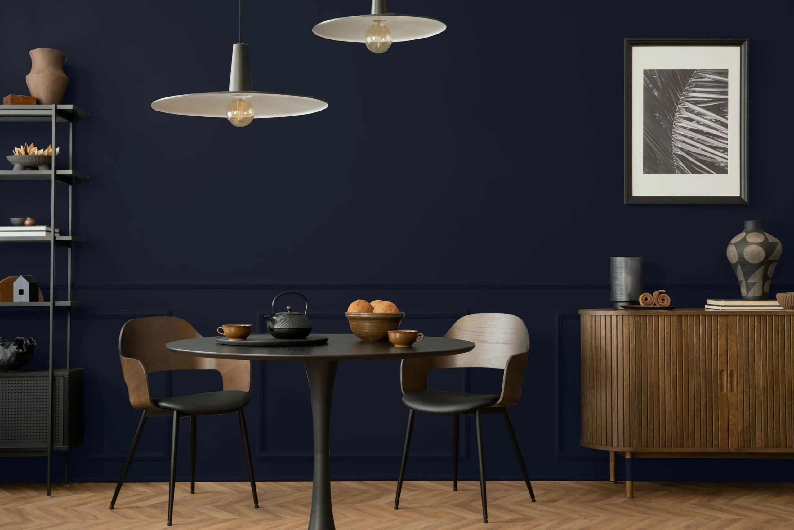
Dark & Stormy is a deep blue that adds drama and depth to dining rooms. It works well in cozy spaces with soft lighting and warm‑toned table settings.
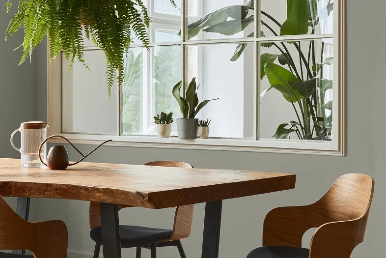
Reclaimed Wood is a light gray with a touch of warmth. It pairs well with wood furniture and soft fabrics, creating a comfortable and refined space for both casual meals and formal dinners.
Ball of String carries the soft charm of kitchen twine and milky off‑white tones with a touch of yellow. Its subtle depth makes it ideal as an all‑over dining room color, creating a timeless, relaxed backdrop that pairs well with transitional design styles.
Swiss Coffee, a warm white with creamy undertones that feels neutral yet inviting. Resembling fresh cream, it’s a versatile color for dining rooms, adding a touch of warmth and works beautifully with both light and dark furnishings.
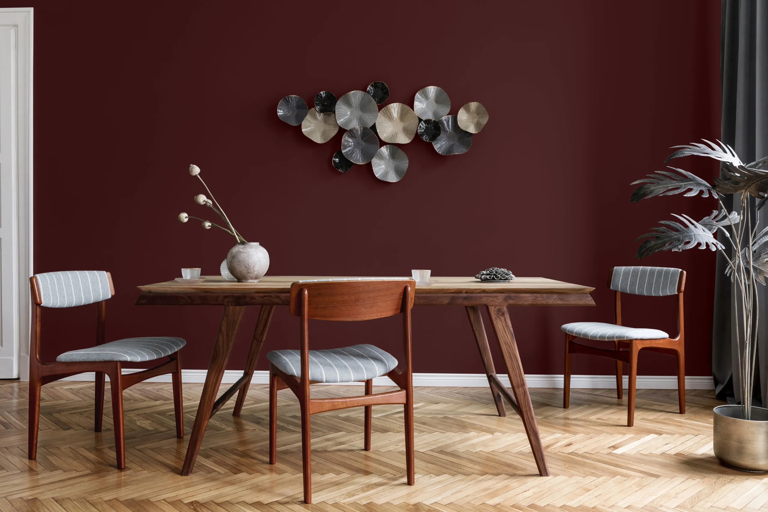
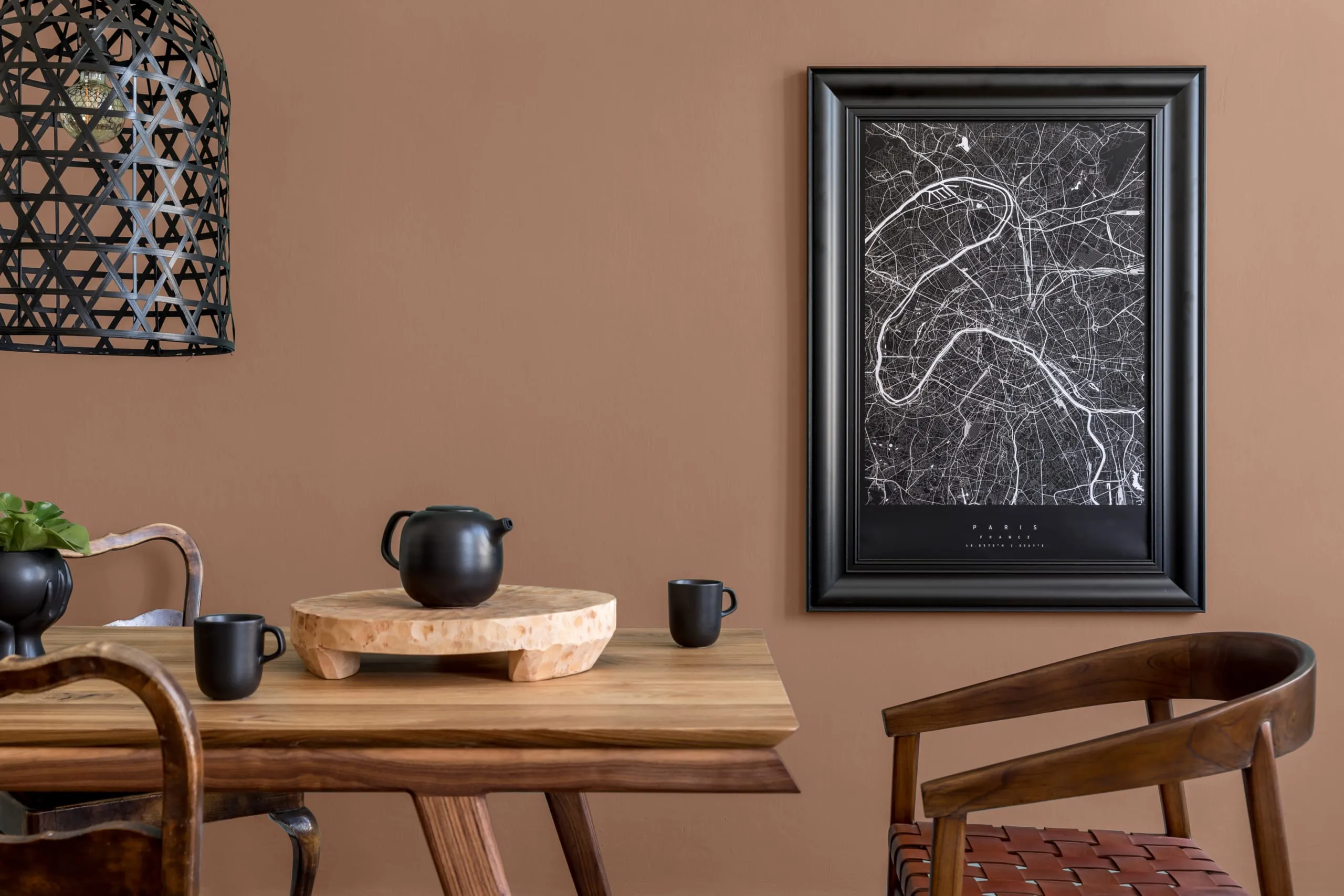
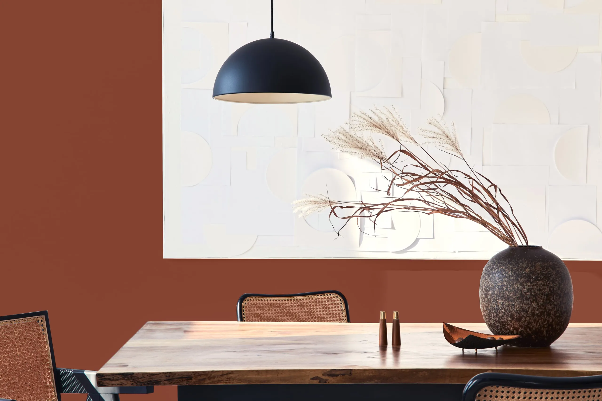
Folklore is a deep, muted reddish‑brown that brings warmth and an earthy, vintage character to the dining area. Reminiscent of aged leather and autumn leaves, it provides a grounded backdrop for wood furniture and natural textures.
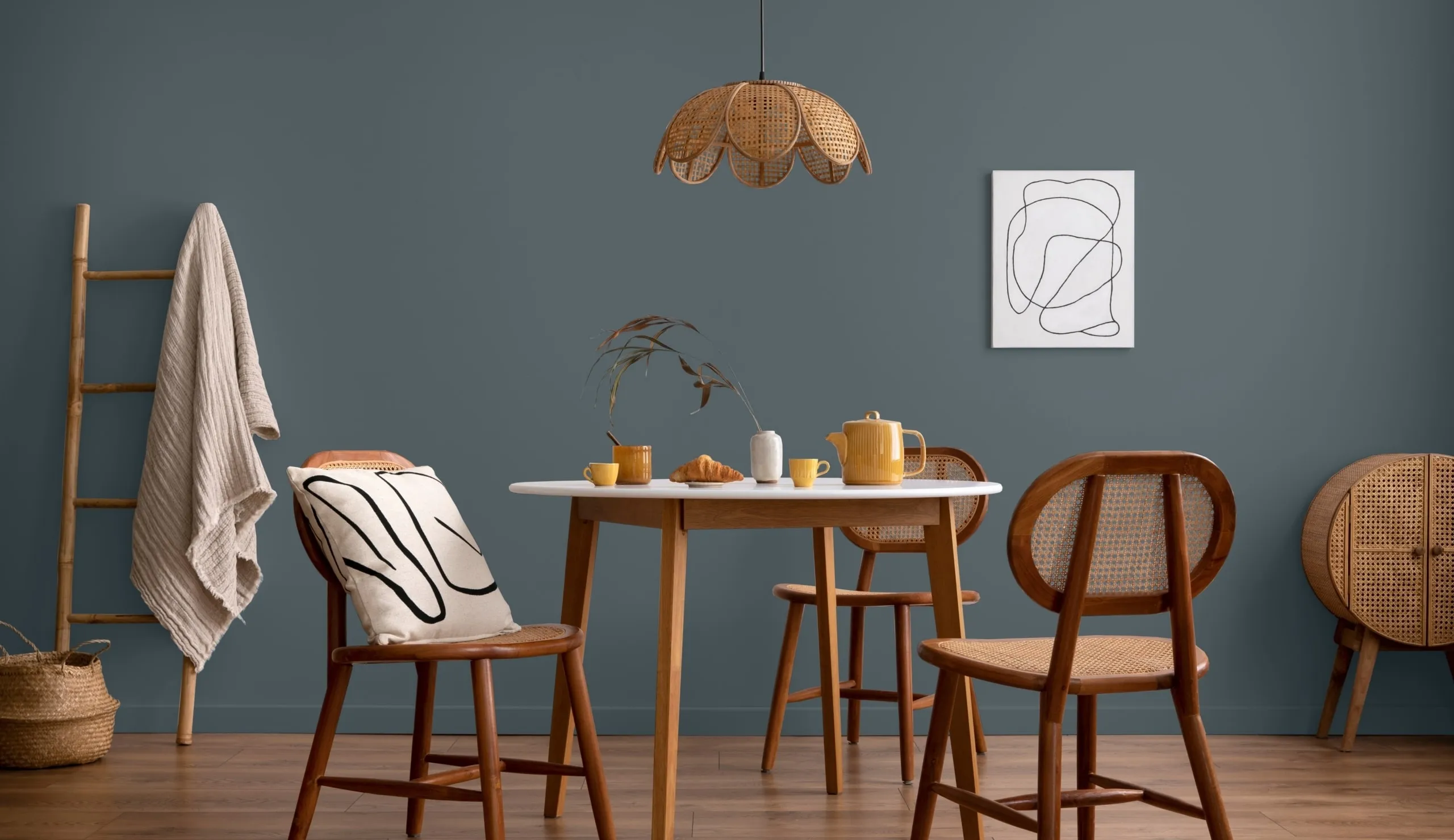
Summer Night is a dark, muted blue with a dreamy, understated richness. It brings a bold, sophisticated presence to dining spaces, especially when paired with lighter walls, soft fabrics, or subtle metallic accents to balance its depth.
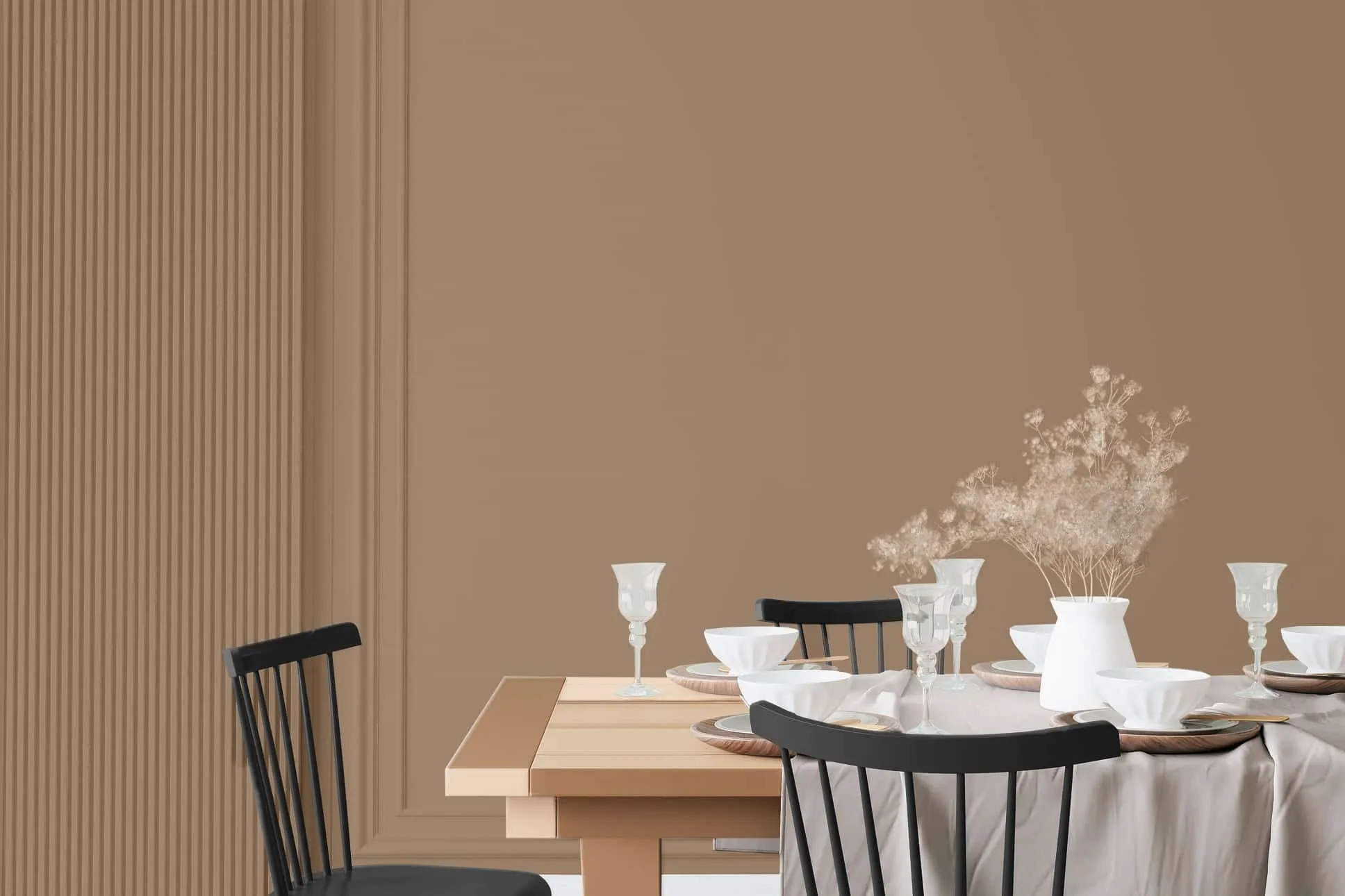
Leather Bound is a meditative mid‑tone brown with a soft red undertone. Warm and grounded, it creates a contemplative atmosphere in dining rooms and serves as a strong backdrop for vintage‑inspired décor and natural wood accents.
This light khaki carries gentle green and brown undertones, giving dining spaces a calm and understated look. Inspired by potter’s clay, it pairs well with muted linens and simple wood furniture for casual, relaxed settings.
Let’s Get Cozy is a soft beige with a subtle red undertone that sets a welcoming foundation. It suits both traditional and modern dining rooms, working well with natural materials or dusty pastels to create a peaceful, inviting space.
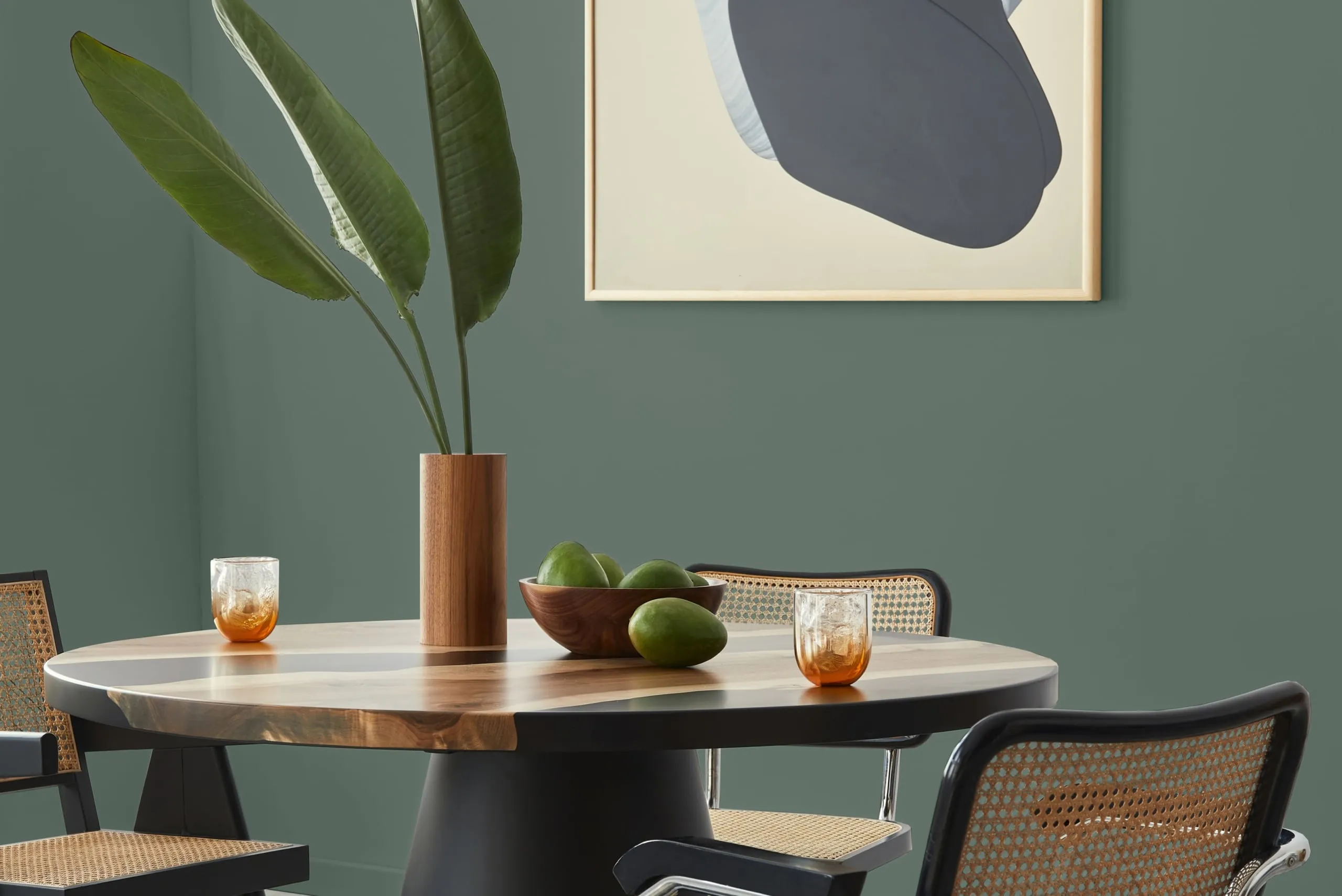
Sage Heather is a mid‑tone gray with earthy green undertones that bring the outdoors in. Its nature‑inspired depth complements dining rooms with wood finishes and textured fabrics, creating a balanced and grounded setting.
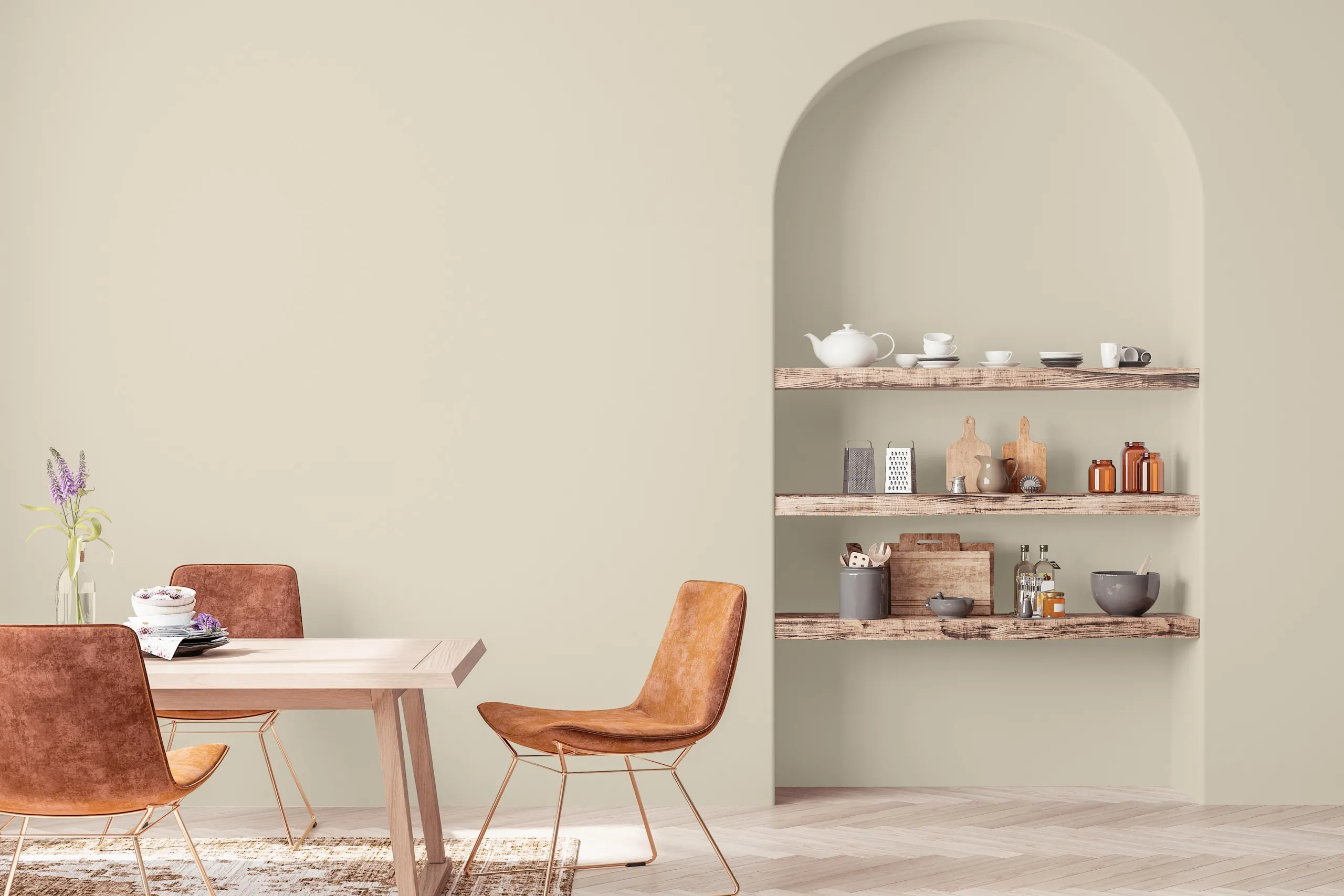
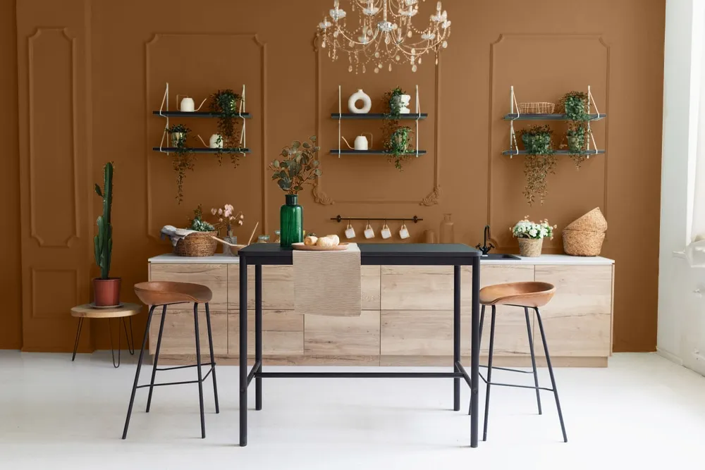
Caramelized is a warm neutral with soft, earthy tones that evoke sun‑baked landscapes. It brings a cozy and welcoming presence to dining areas and adapts naturally to any lighting. In bright spaces, it appears golden and airy, while in dimmer settings, it takes on a deeper, muted quality. This versatile shade pairs seamlessly with creams and off‑whites or creates a modern contrast against navy or charcoal accents.
Taliesin Blue is a muted, cool blue that brings calm and sophistication to dining rooms. Its soft tone works well with light neutrals, natural wood finishes, and metallic accents. It creates a serene backdrop suitable for everyday meals and intimate gatherings alike.
Cherry Cola is a warm reddish‑brown with earthy richness. This bold shade anchors a dining space, adding warmth and depth. It pairs naturally with wood tones, leather seating, and textured accents to create a cozy, welcoming atmosphere.
Limerick is a muted sage green with a natural, calming presence. Its earthy undertone connects indoor spaces to the outdoors. It suits dining rooms with wood furniture, stone surfaces, or soft neutral linens, giving the room a grounded and versatile appeal.
Why These Colors Work for Dining Rooms?
Since dining rooms are the heart of the home, made for connection and shared experiences, the right color should look welcoming and set a comfortable tone for every guest. Use the tips below to narrow down your choices while exploring dining room color ideas:

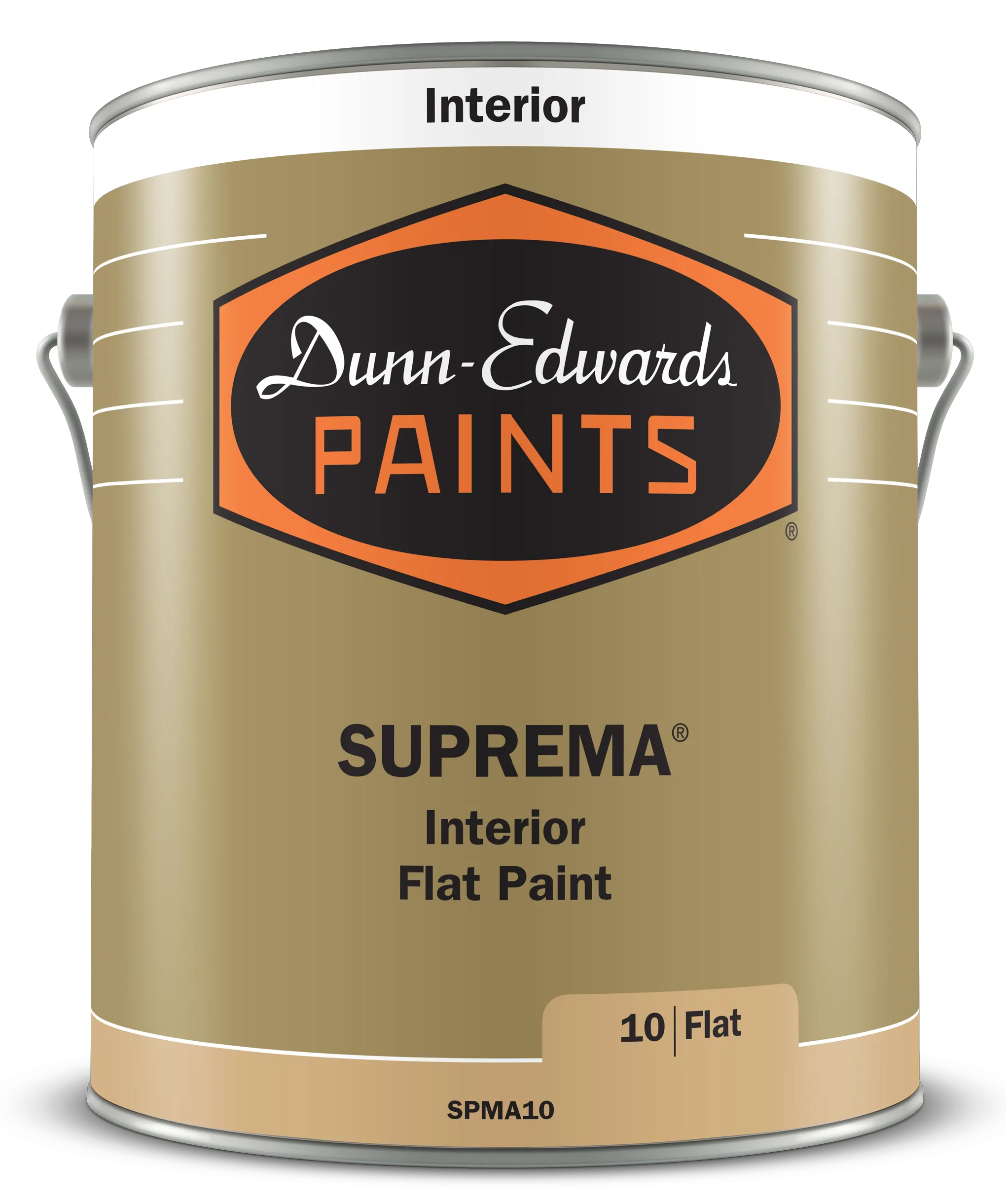
Featured Product
SUPREMA® is a complete line of ultra premium, ultra-low VOC, acrylic latex paints. It combines exceptional hide with superior durability, washability and block resistance. It is ideal for use in any interior setting where superior performance is required.
Sample Before You Paint
Before committing to any shade, test paint colors for your dining room in the space where they will live. Lighting, furniture, and flooring can subtly change how a color looks throughout the day and evening.
Use Dunn‑Edwards Perfect Palette® tools and sample swatches to view each color in both natural and artificial light. Sampling first ensures your final choice feels cohesive, inviting, and perfectly suited to your dining area, creating a space you will enjoy for everyday meals, weekend gatherings, and special celebrations with family and friends.
Bring Your Dining Room Color Ideas to Life
Turn your dining room color paint ideas into a space that feels warm, inviting, and uniquely yours with Dunn‑Edwards. Browse our curated palettes for inspiration, order swatches, or sample your favorite dining room paint colors at home to see how each shade interacts with your lighting and décor.
Testing colors in both natural and evening light helps you make a confident choice that complements your furniture and flooring.
Start your dining room transformation today. Order your paint samples and bring your perfect palette to life.
| Flat | Velvet | Eggshell | Satin/Low Sheen | Semi Gloss | Gloss | High Gloss | |
|---|---|---|---|---|---|---|---|
| WALLS | |||||||
| Family Room | |||||||
| Living Room | |||||||
| Dining Room | |||||||
| Bedroom | |||||||
| Kid's Room | |||||||
| Kitchen & Bath |
FAQS
SHOP NOWWhat is the best paint color for a small dining room?
Light, warm neutrals work best in smaller dining rooms because they reflect light and make the space feel open and inviting. Colors like Swiss Coffee (DEW341) or Ball of String (DE6190) are strong choices, as their soft, warm undertones add depth without making the room feel closed in.
What are some bold colors that still feel inviting in a dining room?
Bold shades like Viridian Odyssey (DE1925), Cherry Cola (DEA156), and Summer Night (DE5811) create a statement without sacrificing warmth. These rich tones pair well with wood furniture and metallic finishes for a welcoming, sophisticated space.
Which colors work well with modern dining room decor?
Cool, clean hues like Taliesin Blue (DEC798) or Limerick (DE6299) provide modern appeal and a fresh look. Pairing these shades with minimalist furniture and crisp white trim keeps the space feeling open and contemporary.
How can I make a traditional dining room feel updated with paint?
Earthy mid-tones like Throwing Clay (DEBN67) or Sage Heather (DEGR40) offer a fresh take on classic design. These colors bring natural depth and pair well with both antique and newly updated furnishings.
Is it okay to use multiple paint colors in one dining room?
Absolutely. Try using a deeper color like Dark & Stormy (DET572) on an accent wall and a lighter shade like Let’s Get Cozy (DEBN01) on the remaining walls. This adds dimension while keeping the space balanced.
Should a dining room be lighter or darker than the living room?
There’s no fixed rule, but it’s best to keep undertones consistent between connected spaces so they flow naturally. A dining room can be slightly deeper in tone than an adjoining living room — using a shade like Caramelized (DET687) or Leather Bound (DEBN17) — as long as the undertones coordinate.