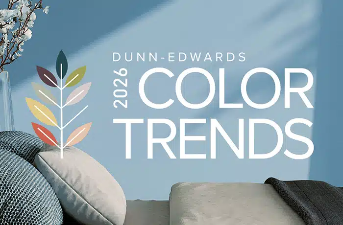
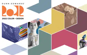
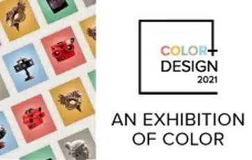
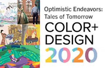
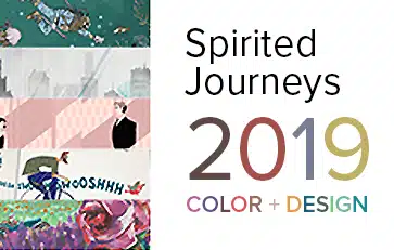
2021 Trends Story: Querencia
Querencia: a place from which one’s strength is drawn, where one feels at home; the place where you are your most authentic self.
In Querencia, we discover a renewed fascination for artisan crafts. When we talk about sustainability, creativity is often forgotten. However, we see a real evolution in the "aesthetics of sustainability." The quest for meaning and a desire to act concretely motivate us to take an interest in materials, reconcile ourselves emotionally with these ideas, and focus on eco-responsible creative processes and the virtuous aesthetics that result.
Like a remedy to anxiety, we prefer immersive vegetation decoration and take inspiration from the flamboyant colors and incredible textures of the plant and animal world. Aesthetics linked to climate change are adorned with a resolutely poetic veil of nostalgia.
Rooted in the charm of regional traditions and history, establishing local foundations and rediscovering emotions. We look to simple joys filled with gratitude and generosity. Leaning into connections, we cherish family, especially the elderly, as well as first responders who selflessly come to our aid in times of crisis.
As we seek goodness in life, we treasure simple joys and days filled with gratitude, generosity and kindness. Amid the current crisis and staying away from friends and family for safety’s sake, we crave intimacy and connection.
The chase for perfection has comes under fire, and there is now a backlash to the never-ending cycle of unattainable lifestyles. We learn to trust our inner voices and find comforts in the home are where we are meant to be.
Inspiration
Think local and rediscover the know-how and vitality of regional richness, redesigned through the filter of modern times. There is a decadence in the uncomplicated tasks of daily life, while disconnecting from technology and resetting daily life.
We connect to emotions based on authenticity. There is a focus on the south Mediterranean, a region rich with a tradition, and rediscovering the pleasures of good products created with established, local know-how. As a result of the touch crisis, we seek tactility and comfort in these authentic products.
New immersive spaces, modeled on old-fashioned specialist stores, celebrate an authentic part of living with a contemporary take, based on regional gastronomy and everyday functionality.
Design
Through the design lens, we crave innocence and whimsy and delight in homespun, small-town delights filled with humor and nostalgia. Retro styles of the 1950s — ’60s era highlight a return to the golden age of design. And, as we tire of the cheap fast-fashion, we yearn for simple classics that are updated to modern times. Home offices are key jumping-off points, as many of us will continue to work remotely for the foreseeable future.
There is a design revival in learning new skills to turn the ordinary and outdated into a new, timeless and whimsical aesthetic. Interior design take shape through themes of playfulness and whimsy, to the simple elegance and a focus on the core essentials.
Color Palette
Subtle, delicate and graceful, the palette starts with soft, chalky and watercolor tones with infusions of light and patina effects. There is a soft warmth to the range of hues balanced by toned-down cooler shades. Pops of tangy pastels add a cheerful, fresh mood, while ’70s sunset gradients punch up the retro vibes.
Rethink the red, white and blue flag colors and classic tricolors, as the importance of joyfulness highlights delightful quirkiness. Transparent filtered colors are sentimental, while graphic tones, tempered by gradated half-tones applied on summer stripes, as well as mini geometrics from the archives, showcase a softened retro, summery vibe.
Materials and Textures
There is a light-heartedness and focus on comfort in materials and surfaces. Soothing and organic, heirloom-quality and artisan. Here are distinctive concepts to consider when designing with Querencia in mind:
- Regional heritage — hand-crafted braiding, straw and cane work, and traditional weaving. Workmanship from another era is revived and reinterpreted in artisan-designer collaborations. Add to this a fondness for Mid-century modern revivals: snake-channel tufting, soft curved lines and ergonomic chairs in poppy hues.
- Stained glass revival — colored neo-stained glass transparency and cloisonné enamel, in addition to metal outlines or satin patchwork, precious ornamental and geometric textures.
- Barware revival — glassblowing is a fascinating art form that has recently regained traction and — along with that — a renewed interest in artisan glassware and barware. As we continue to practice social distancing, home bars are in-demand design elements.
- Modern chatelaine — medieval references — such as chains, precious historical ornamentation in jacquard, and resin-coated feathers and vintage ceramics, and couture scarves recycled as cushions highlight a new decorative industry.
- Kitsch florals and country calico — overdyed checks, blocky contrasted color, rural mini-geometrics, trompe l’oeil embroidery, country florals or naïve gouaches. Fresh decorations combined or working in positive-negative treatments.
- Re-enchanted nostalgia — turned wood and painted paneling, stained-glass windows from yesteryear, azulejos or cement tiles reawaken the charm and emotion of a family home. Combine precious details and folk accessories to tell a new story of the place and live there in the present. Modernized tailoring in silk, linen and wool muslin with updated pinstripes, argyle and painterly surfaces exude qualities of bygone eras.
- Customized tradition — showcase the handcrafted aspect of production, highlighting quality and sense of detail, for illustrations as well as for the choice of material-media and for expressing developed expertise.
- Family story — like a summer seaside memory, we romanticize regional traditions. The result is authentic, intimate and comfortable. Seaside graphics, diagonal stripes, retro geometrics and candy-colored saturated stripes and glassware are key to seaside nostalgia.
- Childhood charms — childlike, simplistic forms and fonts highlight positivity and energy to Querencia. Voluminous constructions and malleable forms permeate the brighter range of colors within the palette.
2021 Trends Story: Solibre
Solibre: literal translation "sun free." Sounds like "soy libre" — I’m free
What is the biggest challenge we face? This question was recently posed by Fernando Ausin, an international entrepreneur with a passion for social justice and global sustainability, during a virtual program on trends and practices to carry us forward post-pandemic. When Ausin questioned elders in his research within Mexico’s indigenous cultural communities, rather than pointing to outside influences, their answer was fear or "chicuaqui." Described as an energetic parasite, chicuaqui feeds on our doubts, fear, anger, worry and sadness. When the fear is fed, there is a constant anxiousness.
Solibre is a story of overcoming our fears and transferring these negative emotions into a new freedom of ideas for sustainable practices, self-optimization and adaptive design. A push forward to innovate on the edge of uncertain times, ideas are free to flow, liberated from fear.
Solibre puts climate issues back into the heart of restorative creation, nourished by a symbiotic relationship with nature and indigenous cultures.
Nature under threat is a subject of reflection and fascination. There is a feeling of loss as we seek to repair connections with the land. Artists, designers and scientists are interacting with nature and coming up with restorative concepts poised between ancestral know-how and cutting-edge technological developments.
Design
How do we utilize the inspiration of Solibre to the world of design? There is a symbiotic relationship between reality and the artificial worlds as we look to innovations in digital intelligence — sensors, AI, Alexa, integrated devices, etc. — to aid in protection and preparation. Yet, innovation has moved us past fear into increased lives melding digital and reality.
Technology is coming of age with real-time interactions. Virtual advancements allow us to better ourselves through science, as well as traditional healing practices. We are pushing the limits of what the human body can do, moving beyond our comfort zones. Solibre highlights that we can perceive discomfort of these scientific and technological developments as necessary for growth. Pushing boundaries is the gateway to new design frontiers.
Products that offer preparation and protection are key elements. Adaptive designs allow greater self-sufficiency, while expanding creative boundaries, which foster breakthroughs in technology and transformative design solutions. The new luxury is the ability to choose refuge.
Adaptive design inspires dynamic tools that increase convenience and preparedness for the unknown. It is streamlined, displaying only the absolute essentials, which cultivates a safe haven and bolsters our courage to discover the unknown.
Products will continue to push the boundaries of creativity and — because there will always be matters beyond our control — design will continue to give us innovative tools for additional preparation. Immersive design experiences focus on solar energy, reconnecting with cultural heritage, and re-creating paradise in gallery form.
What architectural approach befits Solibre? Brutalism. That’s right: Brutalism isn’t dead. After appearing, then disappearing, brutalism is back in softer, surrealist and eco-focused forms. Balance is central to brutalism, as well as future-facing design, which is crafted for longer-term appeal. This architectural style is reminiscent of the California coastline and reborn out of fire protection — utilitarian and essential.
Color
The Solibre color palette is strong and nurturing, comforting us through uncertain times. This organic palette is reminiscent of desert landscapes, real and surreal, revealing brown and red tones that echo the Earth’s hues. Creating balance, pastels whisper the promise of new life, greens protect flora and fauna, and yellows showcase the power of solar energy. Bathed in light that radiates from all surfaces in pearly glints, ambers and soft iridescence, this color scheme is invigorated by a soft Day-Glo acid yellow.
This warm palette is influenced by raw materials, art and nature, all enhanced by yellow. Paired and gradient contrasts reinvent light and shadow, the day’s beginning and end. Botanical hues are omnipresent, greens and khakis are filtered through the sun and polished with yellow accents yet blended with shades of dark brown.
Color Palette
Material and Texture
"Necessity is the mother of invention," goes the well-known proverb, and it’s more relevant than ever. Necessity is pushing designers to reinvent materials for indestructible protection, in hyper-real finishes and durable fibers. Self-healing and anti-viral protective fabrics are crucial materials.
Designs are organic, utilitarian and offer an artisan approach; imagine new heirlooms for future generations. Glassware is transparent, offering unusual forms. Lighting designs are pushing boundaries of form and function with a focus on sunlight and solar-light infusions — amber colors, tinted glass, light sensors, lustrous and gradated textures, iridescent weaves and light sensors. Other featured design, materials and textures include:
- Themes of island life and exotic survival — plating, printed heather, raffia knit, openwork fishnet, as well as crafts inspired by Oceanic art, including exotic feathers, straw, leather, rattan — anything that reinvents tribal spirit.
- Plastic reformation — in a blend of natural and digital manifestations, upcycled and recycled products emerge with impression of diluted and shot decoration, half-floral or half-aquatic, like new camouflage. New landscapes, aqueous marbling, imaginary island flowers, and patterns that look like Rorschach tests. Mirror-polished stainless steel adds the right touch of tech.
- Sunlight everywhere — abundant sunshine with contemporary materials that catch or filter the light through colored glass, glossy corrugated iron, glazed textures, and interiors that open out onto nature, mixing high-tech equipment with ancestral accessories, with an exotic futuristic vibe.
- Nature’s rebirth and metamorphosis — appreciate the richness of nature’s constant transformation. Honeyed shine, hot-foil stamping, sizzling summer heat gradations, organic mutations of plant life, raw limestone, charred cork, oak, resin, coated honeycombed knit, micro textures, beeswax, and perforated metal. Nature is influenced by environmental awareness and technological advances, and new nature focuses on discovery and understanding, from original to man-made.
- Mutations and mysteries of nature — fantastical vegetation formations, metamorphosing flora and fruit to adapt to extremes, dehydrated shapes, botanic mimicry. There is a strange, otherworldly exoticism to decorative leaf patterns and textures and extravagant vegetation with acid accents. Add to this supernatural vision oversized botanical elements, hybrids of flora and fauna, and pearlized finishes.
In surface design, the influence of biotechnology is paramount. Patterns include speckled and gravel-coated, granular effects, along with numeric typography — rulers, bold numbers, charts and graphs. Heat-mapping graphics in bright chemical-colored prints represent escapism, as well as environmental influences. Volcanic lava spatters display the raw power of Earth, while color gradients in sunrise and sunset hues elevate design to dream states.
2021 Trends Story: Hanabi
Hanabi: a Japanese term meaning “fireworks.” Hana = flower. Bi = fire.
Hanabi explores the codes of inclusive, optimistic and laid-back design re-creating links between the generations. Borrowing energy and inventiveness from our childhood, then turning this vivacity and creativity into a collaborative and festive playground. Finding better solutions for the challenges that lie ahead.
Design
Embracing childhood through spontaneity and freedom of play, designs showcase happy and wide-ranging results, more artistic in nature, that show you don’t have to take life so seriously. Design can provide cheerful and upbeat escapes from the everyday.
Hanabi asks us to look at design through the eyes of a child — an easy-going approach in which the space is brightened by playful shapes and colors and plays-on-scale. Drawings are random and in oversized forms.
Color
The Hanabi color palette is experimental and fresh. Early-childhood shades of marshmallow pink, mint and bleached yellow boost the playful palette, which is darkened by bright blues and greens and stimulated by radiant purple and coral.
Color can play a role in function and fun. Monochromatic coating and graphic color blocking reveal practical purposes, while highlighting the enjoyment that design can bring to commercial and residential spaces. Multicolored and childlike graphics are shown on floor trails, resulting in wayfinding fun.
Color Palette
Materials and Textures
Hanabi creations are artistic, filled with freedom of movement and rediscovery of childhood dreams. The playground inspiration is brought to life through vivid, fruity color combinations, handmade textures and fun graphic decoration. A positive and spontaneous new spirit reflects our wish to prolong childhood, as well as not take oneself too seriously. Vibrant, colorful and brimming with charm, key materials and textures include:
- Children’s drawings — rediscover the spontaneity of childhood through sketches or an artistic combination of effects with crayon drawings and clay models. Liberation can be found in creative freehand drawings as figurative or abstract patterns look as though they have been doodled with a felt-tip pen.
- Creative compilations — from furniture to accessories, we envision reassembled color-collage forms using scissors or 3D printers to create new, unique designs.
- Line drawings — surface patterns are inspired by simple stripes and colorful shapes in color. Serpentine tubing or dotted hatching add line interest.
- Volume — classics are revamped in plump and oversized shapes; fresh designs with playground vibes and glossy textures.
- Typography and graphics — comic forms are embraced through speech balloons and high-impact typography. Storytelling is rediscovered through characters on product packaging, wall art and other inspired outlets — inviting us to envision these tales through the eyes of children.
2021 Trends Story: Lagom
Lagom: a Swedish term that signifies the right amount or balanced perfection. Not too little, not too much — just right. Lagom is easygoing, unplugging, connecting with others in real life and disengaging from social media. It's about taking time for yourself, doing something with your own hands, and giving back.
Lagom challenges the notion of classical form, while praising timeless qualities of design. Finding the ideal balance of old and new. Reaching out for ageless points of inspiration, designers and artists channel archetypal historical references to build new visions of enduring purpose. Essential design with artistic touch. Lagom speaks to the spirit of storytelling, decoding the past and reframing the future.
Design
The individual and collective narratives are told theatrically in an opulent aesthetic. We cultivate mystery by blurring couture, bourgeois, rock or neo-cyborg references. Important classics are revived in a glam, dressy version. The ornamental baroque style imposes itself; colors are darker, and forms are distorted.
Lagom seeks to rebalance the notion of old traditions, creating fresh legacies in design and art, as well as a resurrecting the beauty of craftsmanship. Rethinking past designs reveal innovative layers for today. Sharing, inclusive designs reveal a new balance. Asking oneself what heritage means in using depths of emotion to create novel and meaningful classics. Art Nouveau, Arts and Crafts, enchanted design, and architectural styles of years past come full circle, as the need for escape and timeworn beauty are everywhere.
Learning to rewrite history with a more inclusive approach provides opportunities to grow and re-allocate value to newer ideals of design and art, rethinking splendor and timeless aesthetics. This synthesis to the design process provides hope and meaning to products. The individual and collective narratives are told theatrically in a picturesque aesthetic.
Key highlights to Lagom include heirloom-quality designs transformed by fresh symbolism, as well as classically tweaked designs layered with refined and subtle embellishments. Melding ancient and modern techniques, perfecting the process of design is essential, taking the time to reveal what’s beneath the surface.
Color
The story of neutrals through layers of time, antique hues with a touch of decadence and romance. A global archaic influence peaks through as grays are softened and touches of flesh pink and deep rust red infuse the palette with the spirit of art.
This mineral-inspired palette layers shades of marble, granite and concrete, while overlaying a veil of sand and fragile fresco hues. Nature’s influence is displayed through modern blues and plant-based greens.
Color Palette
Material and Texture
Lagom is design with purpose, and a fundamental attention to the process. Repurposed heirlooms, classical mashups and superior craftsmanship are foundations for an ideal design. Add light, decadent accents for a luxurious touch to finalize a storybook setting. Other key design details, materials and texture highlights include:
- The idea of subtle movement and motion — channeling caryatids or ancient Greek pleating — supple textiles, sculptured stone with texturized folding and fluid draping, cool sensuality, a study in the anatomy of design.
- Artisan made — crafted vegetable-tanned hides, repurposed composite, craftsperson-made goods, resin, brass, dried floral arrangements and other Art Nouveau floral interpretations. Vibrant damask, delicate velvets and toile are finely crafted. Other materials of note include walnut wood, Italian marble, gas-fired clay, shearling wool, smooth leather, antique bronze, alabaster and colored glass.
- Mythology reborn — arrows, goblets, chalices, thrones, columns. Modernized ancient references drawn from Greco-Roman epic poetry and mythology. Paying tribute to classical imagery tinged with modernity through typographical treatments in art installations with a nude color palette.
Surface pattern highlights include opulent textures, aggressive distressing and molded impressions, with darkly hued walls and Rococo details adding romance. Pattern and graphics commemorate ancestry, while complex geometrics and typography intensify playful, strong messaging for updated twists to tradition. Other key details include pear motifs, dainty floral-patterned wallcovering, romantic curves, hand-painted foliage, micro-tiles, carved woodwork and inlayed patterns.
Other key design details embody the following characteristics:
- Lines drawings — delicate graphics, networks and grids for decoration or in wiry structures, for outlining, articulating or surrounding voids
- Revamped brutalism — as noted in our Solibre Trend story, brutalism has returned. With Lagom, the focus is on forged metal, coffered concrete, retracted enamel, and roughness that retains traces of the mold or tool. Material scarification and scoring — primal minimalism. Raw concrete and pale marble overlaid with traces of frescoes and architectural sketches feature elegant contrasts. Add comforting textiles to soften these neo-industrial spaces.
- Ancient languages –– calligraphy and hieroglyphics gathered over the course of time add unique decoration through repeating cross-hatched geometrics, allegorical scenes, signs to decipher, and engraved or stamped designs.
2021 Trends Story: Moonwake
Moonwake: reflection of moonlight on a body of water
"Anytime you try something new and creative, the very next thought you experience is fear," said Elizabeth Gilbert, author and poet. Yet creativity is the cornerstone of a happy life. As you face a new design project, how do you face your fears and unmask that creative spark? Moonwake speaks to the mysteries of the creative process, letting go of fear and nourishing new ideas.
We feel a need to give the future back a certain amount of mystery and magic, while continuing to nourish imaginative ideas, awaken creativity by giving it meaning, and recording this process over time.
Moonwake speaks to our collective desire to connect. Design takes on an atmosphere of romance downtown at night — a picture that is both vibrant and dark with fantastical verdant themes running throughout. The ritual of forest-bathing takes on journeys as the woodland opens up its mysteries with every step down an unknown path. There is a heightened fondness for nature and biophilic design is front and center.
Spurred by the growing popularity of fortune-tellers and psychics, along with consumers’ desire to reconnect with nature, Moonwake highlights a need for escapism with layers of intuition and magic. The mood is fabricated with nocturnal colorways, shadowy florals and organic shapes that often feel disturbed.
There is a focus on cyber-reality, technological infusion, eco-sustainability and an interest in what lies beyond. The online world is a greater need than ever, as our daily functions and connectivity rely on digital apps and computers; thus, becoming a blurry reality between analogue and digital.
As we dive further into the electronic world, we create dramatic avatars for our virtual worlds. And the design realm is responding — with online fashion shows and fitting rooms, while furniture and décor industries are creating robust online showrooms.
Design
With this new, deeper level of cyber-integration and fantasy, a curious and playful utopia of oceanic and forest influences has emerged, drawing us into magical, immersive experiences such as secret gardens and otherworldly delights.
Escapism is fundamental to the Moonwake aesthetic. Showcasing surreal flora and fauna in this fantasy world, it focuses on natural iridescence, overgrown proportions, liquid movement and subtle undercurrent of beautiful decay. The full lifecycle of nature is on display.
As we seek refuge in virtual worlds, designs concentrate on warped forms, sci-fi allure, soft dimensions and molded synthetics. Try a twist of nostalgia in clashing design eras with overtones of opulence to create surreal atmospheres.
Color
Moonwake displays a warm, romantic and decadent palette filled with nocturnal moods. This melancholy palette starts with a base of deep darks tinged with acid, luminous cloudy blues and flashy purples.
Splashy accents on city-influenced dark tones, shimmering monochromatics, intense color — a story of noir fiction. Positive energies display luminous brights and intense neutrals, uplifting the spirit in this dreamy escape that sparks energy. Hyper blends of blues, greens and pinks mixed with pastels showcase these fantasy-driven colors.
Intense chromas are decadent ties to digital realities, while purple shades nurture the imagination. Uplifting coral and chartreuse promote the importance of mood-boosting color.
Color Palette
Materials and Textures
Moonwake transports us to a playful, eco-fantasy utopia filled with forest and marine images. Beyond the aesthetic, we look to material, textures and surfaces that speak to this story. Commercial spaces are especially influenced by Moonwake, creating immersive experiences such as hidden sanctuaries and Alice in Wonderland-style landscapes.
Fairytale escapes — organic utopia, luminous glass, crisp silk, shimmering coatings, lacquered glitter, soft surfaces such as velvet and chenille — all inspired by nocturnal luxuries and Art Deco jazz lounges.
- Fabrics allude to the Renaissance. Iridescent lace, or lace with insect or branch motifs, and textured velvet, help create this dark fairytale aesthetic.
- Florals are bright and outlined with metallic yarns, which take on a more eroded appearance than pure metallic. Abstract jacquards for outerwear are updated with wavy lines.
- Dark creatures on prints and tableware embrace a darker view of garden escapism.
Otherworldy — ethereal and futuristic. What’s real anymore? Otherworldly highlights the blend of cyber and reality, creating a "new familiar" in design.
- Tweeds and wool suiting, too, are blurred with brushed effects. Prints are abstract forms that don’t resemble anything in real life.
- A new level of coziness with "rich, full-body fabrics" and "dense products without the weight." The cocooning trend evolves with shapes that are "generously cozy" and that are "blown-up" yet ultra-light
- Lighting is key as designers push boundaries with ethereal lighting formations.
- Lucite, resin, Murano glass, silicone, powder-coated steel and concrete materials are key material inspirations to futuristic design play.
Psychedelic opulence — a heightened sensorial experience through design, distorted outlines and exaggerated form push design boundaries, while kaleidoscope coloring lends a playful quality.
- Accessories are based in dark metallic and are enhanced with gasoline effects or "shadowy enamel."
- Warm and cool color blends with newer techniques, tie-dye enhance, surface movement and hybrid creations.
Bio-tech fixation — the deeper, mysterious qualities of underground biodiversity emerge as novel forms of inspiration for eco-fantasy designs.
- Moss covering, mushrooms, intricate micro-views of organic matter, faux rust, warped metals, sandblasted glass, carved textures and marbled textiles all play with form and function for organic décor.