


This Color Trick Will Make Your Books Really Pop
03/28/2018 | specs+spaces staff |
For as long as we can remember (well, certainly the last decade at least) every blog — design or otherwise — has espoused the virtues of the color-blocked bookshelf, and in particular the rainbow-hued version. From Apartment Therapy, to Architectural Digest, to Domino, and even Slate, these blogs have said forget size, topic, author, or even alphabetical arrangement, that those desiring a design-forward look on their bookshelves ought to opt for organizing by spine color. And why not, it’s beautiful. For a room with a wall of books, this look can truly transform a space. However, going on a decade plus, this trend can feel tired, and it can certainly detract from the vibrant color choices on a room’s walls.

For those reasons, when it comes to arranging bookshelves, there’s one trick you probably haven’t tried that you should — one that will make the colors on your walls pop, rather than the colors of your books. The trick? Turn your books, spine-side in.

Singing the Blues (DET576). Image Credit: STRUKTR Studios
Turn your books around and let their pages face outward. In a recent article, Missouri-based interior designer Natasha Meininger tells the Wall Street Journal, “It can give a really sculptural effect.” Meininger describes the architectural and clean look effect created by books positioned this way. “You can get a little crazier with other things in the home if you have a neutral palette.” By allowing the similarly-colored white or cream pages to blend together, a clean palette is created — a palette ideal for showcasing a bold color wall. The above photo showcases an eclectic collection of books and décor against a backdrop of Singing The Blues (DET576), while below, Amour (DE5104) stands out vividly against a stack of books. This minimalistic design decision is not without its controversy. The article continues, with some naysayers likening the move to an art gallery displaying its art with the paintings turned backwards.
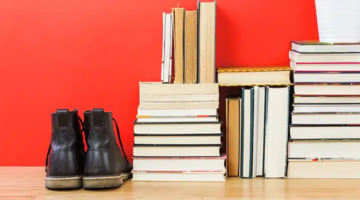
Amour (DE5104). Image Credit: STRUKTR Studios
The Observer writes that today books are more props than reading tool. That whether in a home, a retail space or otherwise, books are used to provide an aesthetic — a vintage sensibility and thoughtfulness. The argument being, in today’s Kindle and iPad-driven world, chances are a good number of the books on any given shelf can also be found in digital form on a tablet around the house. It’s an argument that makes the practicality of this design choice somewhat mute.
Regardless of whether books act as a prop in your space, or they’re still pulled off the shelf every so often, this clever design trick will allow any paint color choice to take center stage in a space.
Featured Articles
-
 Best Oranges for the Perfect Summer Beach Cottage
-
Get Ready for Fall with These Trendy Color + Design Moods
-
Try These Color Palettes To Nail A Tomato Girl Summer At Home
-
Embracing Barbiecore: Popular Pinks Throughout The Ages
-
The Color Yellow: Essential Color Theory, Symbolism and Design Application