

An Observation of the Millennial Pink Trend
06/01/2017 | davidcamacho |
Pink, in all it glorious ranges, continues its dominance in color trends. Within the range of popular pinks is a hue that many have started calling “Millennial Pink,” a gender-neutral range of shades — from beige with blush touches, to a hybrid peachy-salmon color. This particular pink pervades the senses as it continues to sell products from personal care to housewares, and the trend doesn’t seem to be slowing down anytime soon.


Naive Bar. IMAGES COURTESY OF AKZ ARCHITECTURA.
On further reflection, this hue has been around, as most other colors, for centuries. It has touched us globally and locally. Those who are of the 1950s, 1960s and/or 1980s decades remember well the many popular shades of pink similar to “Millennial Pink.” Why do we think of pink traditionally as a feminine color? We can trace this association to 1950s American First Lady Mamie Eisenhower. As a traditionally feminine first lady who loved the color pink, her obsession with the color carried from the White House décor to her fashion. Her 1953 ball gown for President Eisenhower’s inauguration was known as “Mamie Pink” and kicked off a
trend in pink throughout America, with everything from kitchens and bathrooms, to fashion and cars with at least a touch of pink.

A model walks the runway at the Dolce & Gabbana fashion show during Milan Fashion Week Fall/Winter 2016/2017 on February 28, 2016 in Milan, Italy. (Photo by Victor VIRGILE/Gamma-Rapho via Getty Images

Accessories bag detail on the runway at the Dolce & Gabbana Autumn Winter 2016 fashion show during Milan Fashion Week on February 28, 2016 in Milan, Italy. (Photo by Catwalking/Getty Images)
Pink was not always thought of as a color for girls. Back in 1918, the trade publication Earnshaw’s Infants’ Department published an article stating, “The generally accepted rule is pink for the boys, and blue for the girls.”

Cold Pressed Juice Shop. IMAGE COURTESY OF STANDARD STUDIO; PHOTOGRAPHY © WOUTER VAN DER SAR

Earthenware Bowls by Herriott Grace. Image courtesy Herriott Grace.

Museum of Ice Cream, Los Angeles. Image courtesy Museum of Ice Cream.
This Millennial Pink is more grounded, less candy-sweet and a bit nostalgic and is shown in both men’s and
women’s fashion runway shows, art installations, product launches, as well as a range of marketing and branding launches. In 2014, the Color Marketing Group, a global color-forecasting group chose Shim, a deep pink-beige, as the 2016 emerging color — an early version of Millennial Pink. The name Shim is a play
on “she” and “him.” Mark Woodman, the former president of CMG, calls the color a “moment of quietude” and explains that “there’s so much stress that people think, ‘What can I do in color and texture that I can take with me that gives me a moment to calm down?’ That’s why velvet is interesting in this millennial color pink, because it’s a tactile softness with the visual softness.”

The Gallery at Sketch, London. Photo Credits: Sketch.
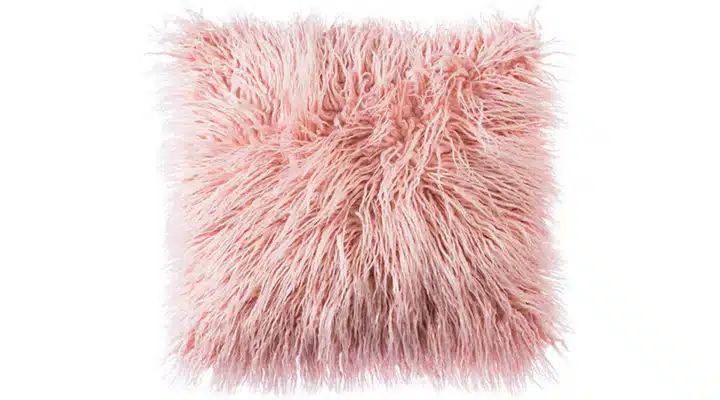
OJIA Deluxe Home Decorative Super Soft Plush Mongolian Faux Fur Throw Pillow Cover Cushion Case, Amazon. Image courtesy Amazon
Then, in November 2015, Pantone chose Rose Quartz, a light peachy-pink, and Serenity, an almost-periwinkle blue, as its colors of the year. Leatrice Eiseman, executive director of the Pantone Color Institute,
stated that the Agnes Martin exhibit at the Tate Modern, which featured both colors prominently, was a one of the reasons they were chosen. Then in fall 2016, Pantone chose Pale Dogwood for its spring 2017 fashion color report. By now, the Millennial Pink spectrum had transitioned from the brighter rose quartz to
include this much paler shade, which is closer to beige with a blush tint. Eiseman from Pantone described Dogwood as a “nuanced neutral. It has that staying power.”

Downtown Horizontal Tote, Amazon. Image courtesy Amazon.

#Girl Boss, by best-selling author Sophia Amoruso. Photo Credit: Amazon
These range of pinks will continue to infiltrate the color and design world in the foreseeable future. Try
these Dunn-Edwards pinks on your next project and create your own pink visions.