

20 Ways Color Psychology Can Create a Beautiful Home
06/26/2015 | specs+spaces staff |
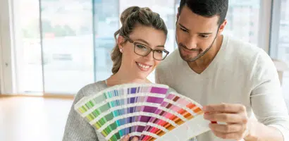
Every time you begin a new interior design project you must choose the best colors that complement the overall look of the space and reflect your client's personal style. You should also take note that colors can have a strong psychological affect and ought to be selected carefully based on how they will make the client feel.

Putting color psychology to work isn't difficult if you take the time to understand how individual colors may affect a homeowner. Consider these 20 ways to use color psychology in your next interior design project:
- An all-over black on the walls can make a space feel tight and constricted. Consider painting the ceiling black instead and pairing it with neutral walls in a shade of grey.
- Pink is an excellent choice for a retreat or meditation room. Pink promotes serenity and tranquility and can help a homeowner center and feel restored.
- White fixtures in a bathroom promote a clean, sleek feeling. An all-over white bathroom invokes a spa-like feeling.
- Since the color orange is often associated with improved lung function it is a perfect shade for an exercise room. A bold shade of orange on the walls will help to boost energy and promote deep breathing.
- Shades found in nature, such as browns, greens, and tans, help create a neutral color palette that complements many different home designs. These natural colors in your home contribute to feelings of peace and serenity.
- Choosing familiar colors from a client's childhood can help create a space that utilizes a personal connection. There may be fond memories rooted in these colors that allow a homeowner to reminisce about days gone by.
- Bright colors promote the illusion of more space and leave a room feeling larger. Yellows, oranges, and greens add energy to a room while feeling lively and vibrant.
- A highly educated client may be more likely to choose complex colors that illicit a strong response. Consider choosing colors with two word names and those that feel sophisticated.
- Since red has been found to increase appetite it is the perfect choice for a bright kitchen. Red can be used effectively on a focal wall, in painted furniture, or on cabinet doors.
- Cooler colors are great shades for the warm summer months. Using blues, purples, and greens will leave your client's home feeling clean, fresh, and cool all summer long.
- A home's foyer is the perfect space for blending the home's interior and exterior design. Consider integrating a few exterior colors in the foyer space while extending the palette from the rest of the house.

- Using warm colors, including yellows, oranges, and reds, is the perfect way to add warmth to a space during colder months. These same colors can make a home feel more welcoming when used in the exterior design.
- Choose relaxing colors for bedrooms to promote sleep and serenity. Bold colors can make it difficult for clients to unwind and relax.
- Avoid using red if a client has high blood pressure or is known to be irritable. Consider using cooler shades in living spaces to help reduce stress and irritability.
- Ask your clients what colors they like to wear most and consider painting the bathroom one of these colors. The colors in your home are reflected in bathroom mirrors and can help clients feel better about how they look each day.
- Use colors strategically in combination for exercise or yoga rooms. A deep blue and soft yellow work well together without overdoing the sensation of feeling hot.
- Choose a shade of green for a home office to promote concentration and focus. A light green can work as a neutral shade and will complement a variety of color palettes.
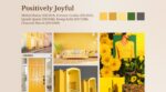
- Avoid using yellow in nurseries and playrooms as it is known to create irritability in young children. Instead, incorporate your favorite shade of yellow in the foyer or entryway.
- Purple brings a sense of royalty and wealth to a home. Shades of purple typically work well with subtle greens and yellows.
- Brown promotes a natural feeling and brings a sense of earthiness to any space. However, overuse of brown has been known to increase feelings of depression in some people.


Visit us online at Dunn Edwards to learn more about how to integrate a variety of colors in your home. Our team is committed to providing resources and information to help transform any space with the perfect paint colors.
Featured Articles
-
 Best Oranges for the Perfect Summer Beach Cottage
-
Get Ready for Fall with These Trendy Color + Design Moods
-
Try These Color Palettes To Nail A Tomato Girl Summer At Home
-
Embracing Barbiecore: Popular Pinks Throughout The Ages
-
The Color Yellow: Essential Color Theory, Symbolism and Design Application