


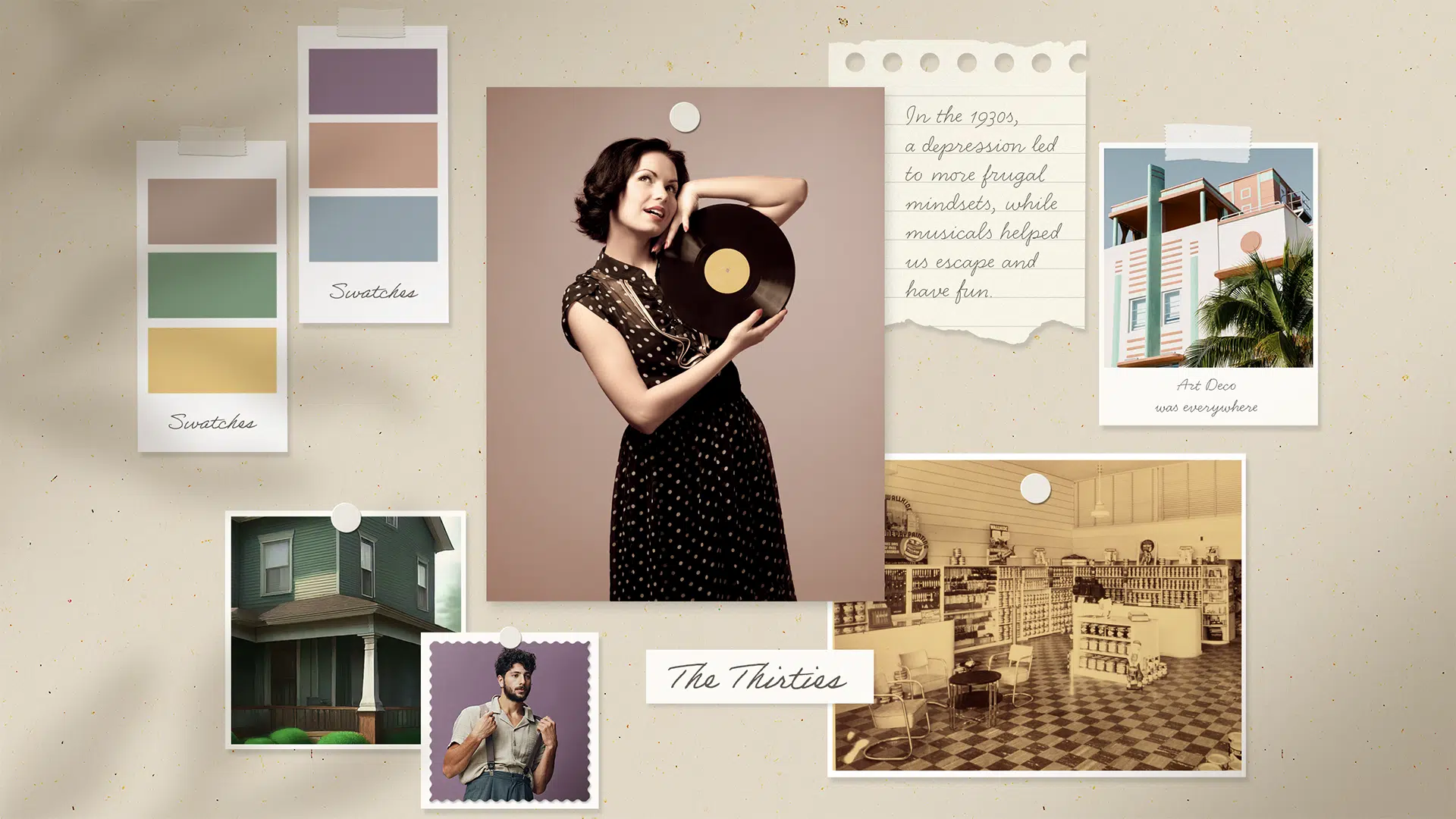
1935
DUNN-EDWARDS COLORS OF THE DECADES

DECADES COLOR PALETTE
The 1930s were marked by economic hardship, which brought a shift towards a more subdued color palette in our lives. This decade’s softer, muted colors offered a sense of comfort and stability to the practical interiors of the time. Soothing hues like pale blue and dusty pink paired with green and gold inspired by nature, helped to create a calming yet sophisticated atmosphere.

6 colors
1935 DECADES BLOG
Explore the serene, muted colors of the 1935 palette to add a soothing dose of tranquility to your next painting project.
READ ON
FAQS
SHOP NOWHow Can I Create A Calm And Relaxing Bedroom Space?
Beachcombing (DET494) creates a soft, serene feel in the bedroom. Pair it with white linens and natural textures for a peaceful retreat.
What Is A Good Way To Add A Pop Of Unexpected Color To A Living Room?
Highlight an accent wall or shelf with Half Moon Bay Blush (DET457) for a fresh, inviting touch that suits any style.
How Do I Incorporate Deep, Moody Colors Into My Home Decor?
Use Vineyard (DE5648) in dining rooms or reading nooks for a bold, elegant look. Pair it with gold accents or warm lighting to keep the space inviting.
How Can I Bring Earthy, Natural Tones Indoors?
Try Muted Berry (DE5977) for a cozy, natural red or Frontier Land (DE6074) for a rustic touch. These shades pair well with indoor plants and textured accents.