Use the Pantone Spring 2015 Color Report to Liven Up Your Clients’ Spaces
05/12/2015 | specs+spaces staff |
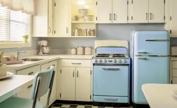
Pantone, the leading global expert on color and paint color trends, has recently released the 2015 Color Report. This collection of sixteen colors represents what's hottest right now in interior design. Incorporating any of these colors into a client's home will help the space stand out and demonstrate an appreciation for current paint color trends.
Aquamarine This is a cool and ethereal shade that brings a watery feel to a home's interior. Aquamarine is an ideal shade for use in a minimalist space because of the pop it brings to a monochromatic design. It can liven a client's project, especially in a space with all-white walls, when used as an accent stripe or painted behind built-in shelving.
Scuba Blue Scuba Blue is a bold, cool color that draws its inspiration from clear blue tropical waters. Scuba Blue can be easily incorporated into a stripe pattern painted on the walls with complementary colors such as Glacier Gray and Lucite Green.
Lucite Green Drawing inspiration from 1950's interiors, Lucite Green has a retro feel with a modern punch. It is light both in tone and weight and may feel almost transparent when used in an open space as the primary wall color or as an accent stripe.
Classic Blue This specific shade of blue may bring back childhood memories of bold primary colors. It is an introspective shade that seems reliable and strong. It has depth and striking qualities that allows it to act as a versatile component of many different color palettes.
Toasted Almond Toasted Almond brings a cool neutral to the 2015 Color Report and offers designers an organic shade to work with. The neutral characteristics of Toasted Almond make it an ideal choice for an all-over wall color in a room with plenty of natural light.
Strawberry Ice Similar in shade to the blush of a child's cheeks, Strawberry Ice is delicate and warm. It is a subtle color that evokes feelings of a candy confection or a healthy glow. Designers have been using this shade in combination with Toasted Almond to create a unique balance of color in a variety of spaces.
Tangerine Tangerine is an energizing shade that brings a feeling of spontaneity and fun to a room. It can stand alone as the primary accent color in a room or it can work in concert with other bold shades. Homeowners are often drawn to Tangerine because it feels friendly and fun-loving.
Custard This muted yellow shade has a mellow feel and it works to develop good feelings in a room. It is sunny and sassy without being overbearing or jarring. When used on a focal wall it brings an understated yet cheerful feel to a room.
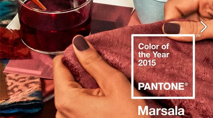
Marsala The 2015 Pantone Color of the Year is grounded in its red-brown hue and offers designers a natural earthiness to work with. It is deep and confident and its presence in a room's color palette brings stability to the space while offering contrast to other shades.
Glacier Gray Glacier Gray is an ideal neutral to use throughout a client's home. It can stand alone as the main wall color or it can work in coordination with other colors. This specific shade of gray is a perfect base to a monochromatic room designed with minimalist sensibilities. It can be used as the primary wall color while bringing a sense of simplicity to the space.
Dusk Blue Don't think that paint color trends are limited to just the walls! Dusk Blue, a classic shade that soothes and relaxes, can be used on a room's trim and doors. This bold choice brings the color into the room and can be paired with white walls and darker blue accents.
Treetop A truly natural shade of green, Treetop is ideally used as a background for other shades. It is deep and soothing and offers homeowners a relaxing presence. This shade can be used as a wall color with accents of red and white for a royal feel.
Woodbine Woodbine is the perfect shade of yellow-green that can be used as an organic neutral or a bold accent color. Used as an all-over wall color Woodbine feels lush and mossy. Pair it with shades of yellow to balance the rich earthy tone.
Sandstone A rugged color, Sandstone is a neutral that allows you to bring paint color trends to an earthy palette. Consider using Sandstone in a kitchen or bathroom that receives a bounty of natural light.
Titanium One of this year's hottest paint color trends is to use a basic shade with classic appeal. Titanium is one of those shades. If you're thinking of using Titanium on the walls make sure to pair it with lighter floors, trim, and furniture so the room doesn't appear heavy and drab.
Lavender Herb Lavender Herb is perfect in coordination with other shades. It can work with a variety of color palettes but often makes its boldest statements with grays such as Glacier Gray or Titanium.
To keep up-to-date you can visit the Dunn-Edwards website to learn more about current interior paint trends. We are committed to staying current on paint color trends and helping painting and interior design professionals deliver the designs their clients are seeking.