

As bright sunny days and vivid hues of summer begin to fade, the golden light of autumn brings a sense of comfort and calmness. Fall invites us to slow down and get cozy, and what better way to reflect that seasonal shift than by layering your home with warm, rich, earthy colors? Use burnt orange, mustard yellow, deep burgundy, and subdued green alongside warm neutral colors to create a space that feels grounded and welcoming. Whether you’re refreshing the exterior of a Craftsman or Ranch-style home or just adding a pop of color with a painted accent wall, these autumn-inspired hues offer a cozy touch that lasts all year long. Explore the fall color palette and find your new favorite this season!
Carousel


SEASONAL COLOR PALETTE COLORS 30 colors
FEATURED FALL COLORS
Fall palettes introduce deeper tones that mirror changing leaves and rustic textures. These shades bring warmth and comfort to gathering spaces, especially when paired with natural materials.
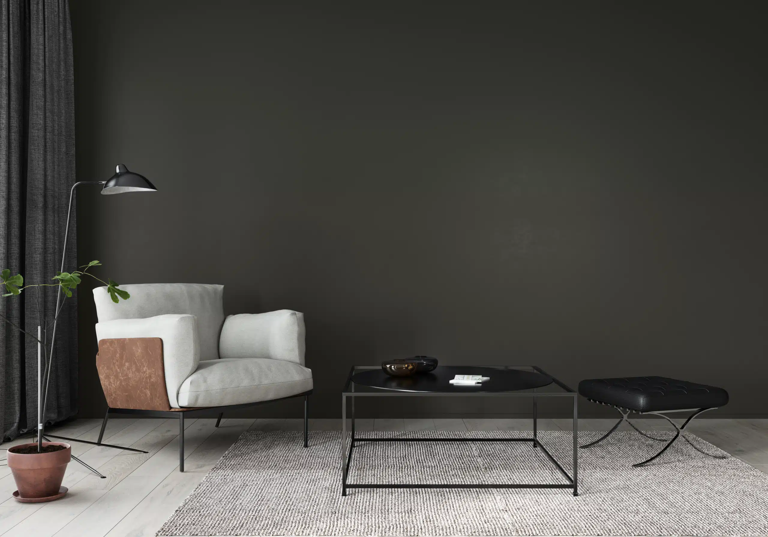
Dark Pewter | DE6314
Moody yet refined, Dark Pewter is a deep slate gray with blue-green undertones that brings modern depth and architectural drama, pairing beautifully with white trim, stone textures, and warm wood accents.

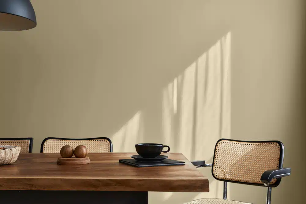
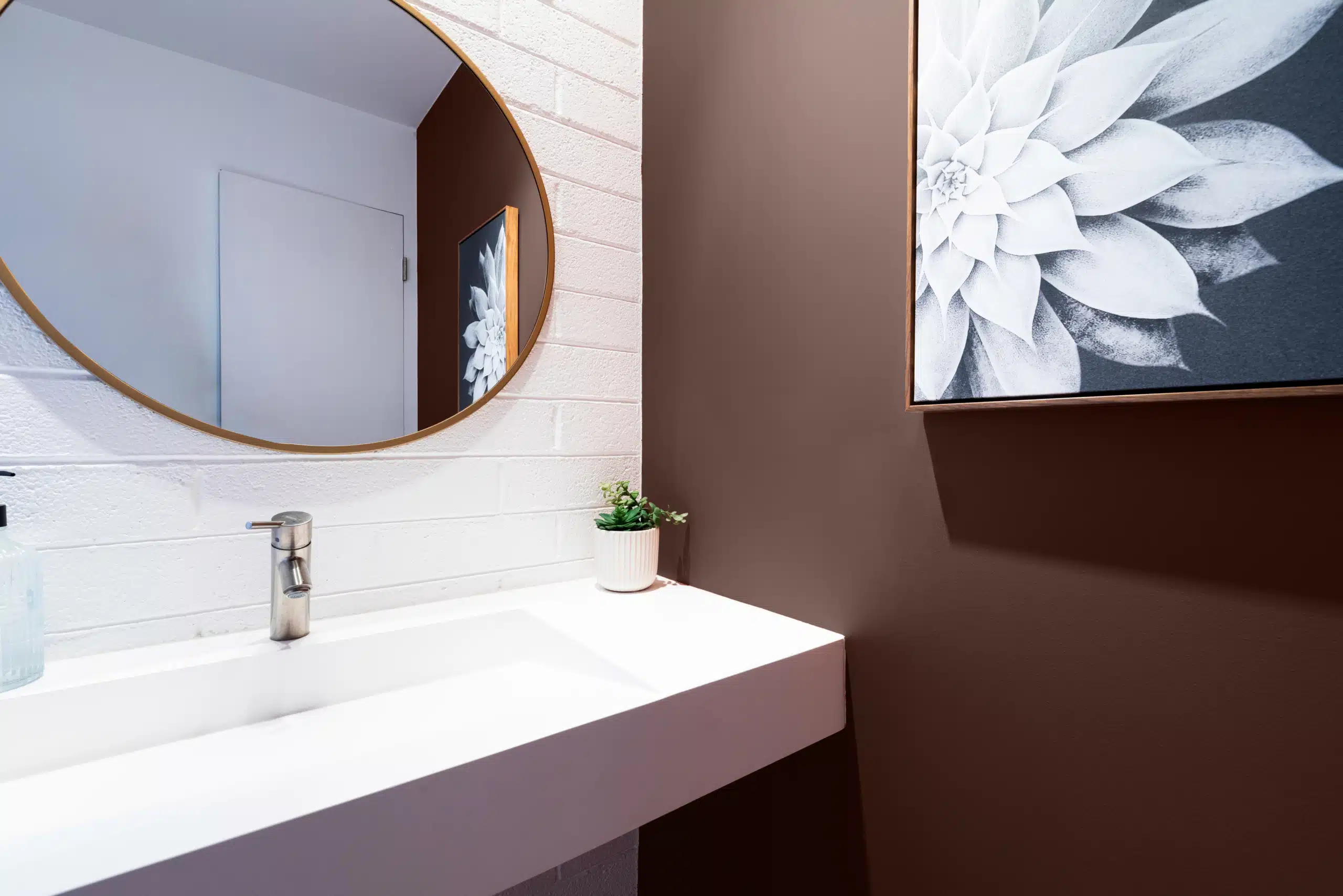
Bison Beige | DEC750
Soft and grounded, Bison Beige is a versatile neutral that delivers balance, warmth, and relaxed elegance across a wide range of spaces.

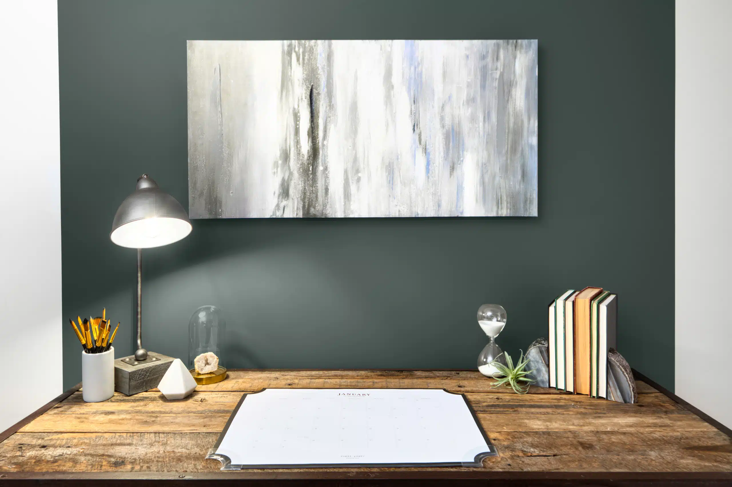
Shutters | DET519
Tailored and timeless, Shutters is a muted olive-gray with weathered undertones, offering subtle earthiness that feels architecturally grounded and effortlessly classic, especially in interiors that blend rustic texture with refined details.

Hickory | DEC759
Hickory color is a warm neutral and part of our Classics Collection. Inspired by the hickory tree and its changing leaf colors through fall season, Hickory is a perfect color for interiors and exteriors of traditional style homes.
Throwing Clay | DEBN67
Throwing Clay is a subtle, light khaki warm neutral color with understated hints of green and brown undertones and part of our New Neutrals Collection. Resembling the color of potter's clay, this color is understated and relaxed, perfect for casual design styles. The comforting quality of this appealing neutral makes it an ideal choice for cozy minimalism.
Chaps | DE6049
A deep, earthy brown with the richness of worn leather, Chaps brings warmth and grounded character to any palette. Part of the Perfect Palette® Warm Neutrals collection, this bold shade is ideal for rustic accents, traditional interiors, or exteriors that call for timeless depth.

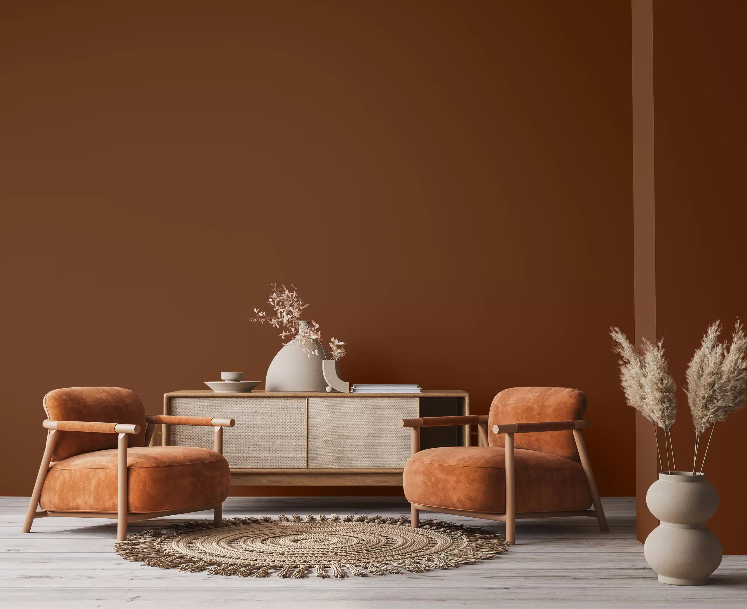
Weathered Leather | DE6105
A warm, earthy brown with the richness of aged leather, this grounded shade adds depth and character to any space. Its natural warmth makes it a perfect choice for cozy interiors, rustic accents, or timeless exteriors.

Crêpe Papier | DET644
Paper-soft and refined, Crêpe Papier is a light, creamy neutral that creates an elegant, understated backdrop for natural textures, pale woods, and softly layered warm finishes.

Charcoal Sketch | DET628
A deep warm charcoal with smoky undertones, Charcoal Sketch creates strong contrast while remaining inviting and pairs beautifully with brass, walnut, and a crisp bright white.
How do I choose the right fall colors for different spaces in my home?
Think about the atmosphere you want to create in each room. For living rooms and dining areas, warm, earthy options like Ball of String (DE6190) or Harrison Rust (DET467) bring comfort and seasonal depth. In bedrooms, try soft, inviting shade such as Cashmere (DEC758) for a restful finish.
Will dark earthy colors make my room feel too small?
Deep shades like Dark Sepia (DE6138) or Weathered Leather (DE6105) bring a sense of warmth and coziness, not confinement. You can balance these bold colors with natural light and lighter accents for a comfortable, inviting feel.
What are your best tips for combining fall colors effectively?
A great fall palette starts with a versatile neutral like Bison Beige (DEC750) or Modern Ivory (DE6197) for your main walls. For a seasonal accent, pair these with a bold option such as Warm Butterscotch (DE6151) on a feature wall or trim. This approach creates a space that feels coordinated and warm, without overwhelming the room.
Can I mix cool tones with warm fall colors?
Absolutely. Combining a warm hue like Burnt Almond (DE5258) with a cool option such as Moody Blues (DET590) adds a balanced, eye-catching contrast to your space. This pairing highlights the beauty of each tone, giving your room depth and seasonal personality.