



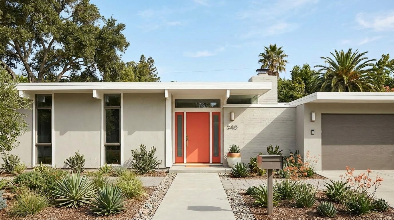
Cloud | DEC791
A light neutral gray with gentle silver undertones, Cloud offers an airy brightness with a refined neutrality to fit any style, and pairs beautifully with a crisp white.


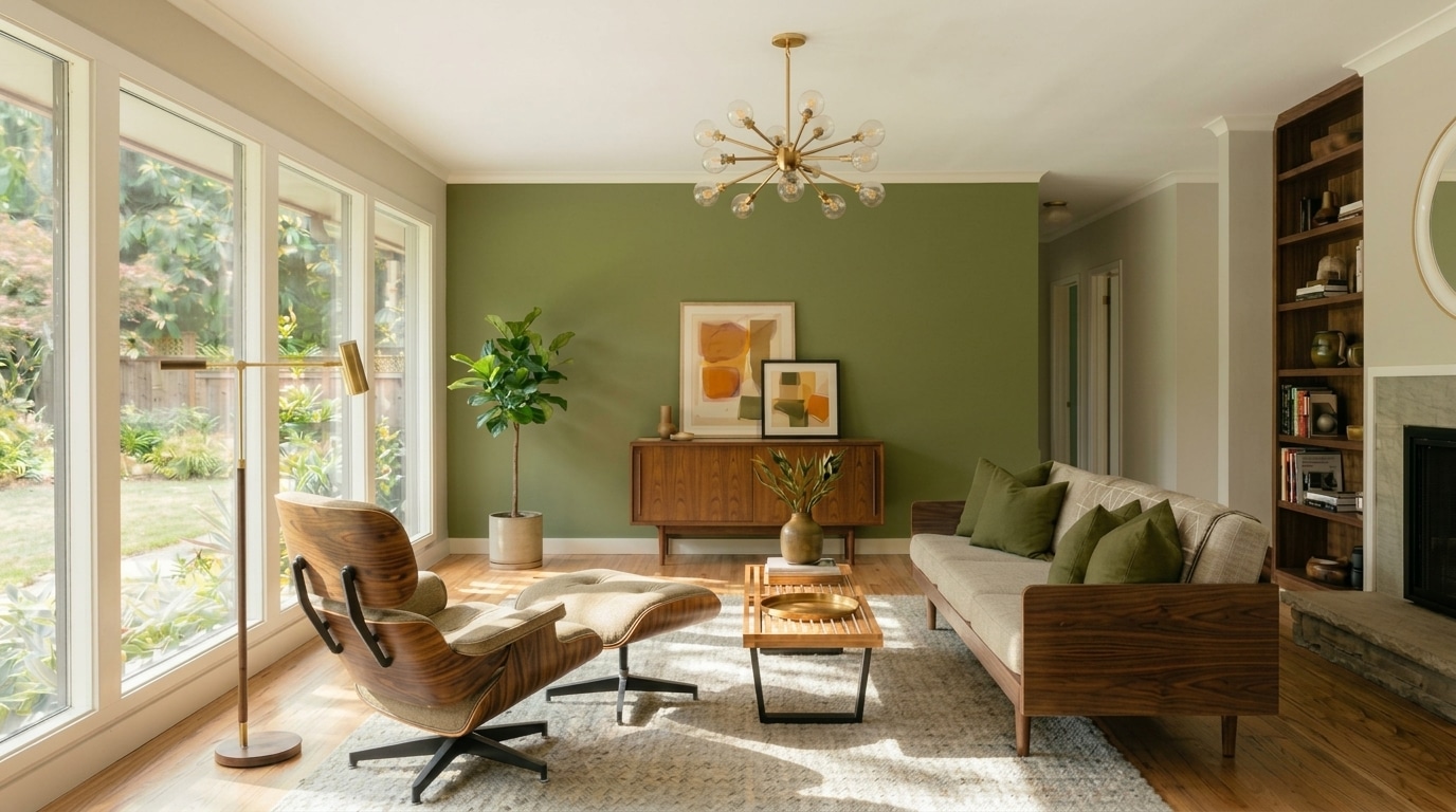
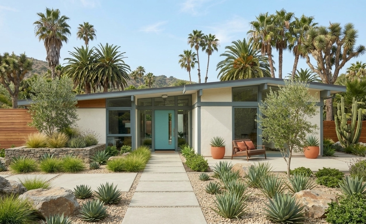
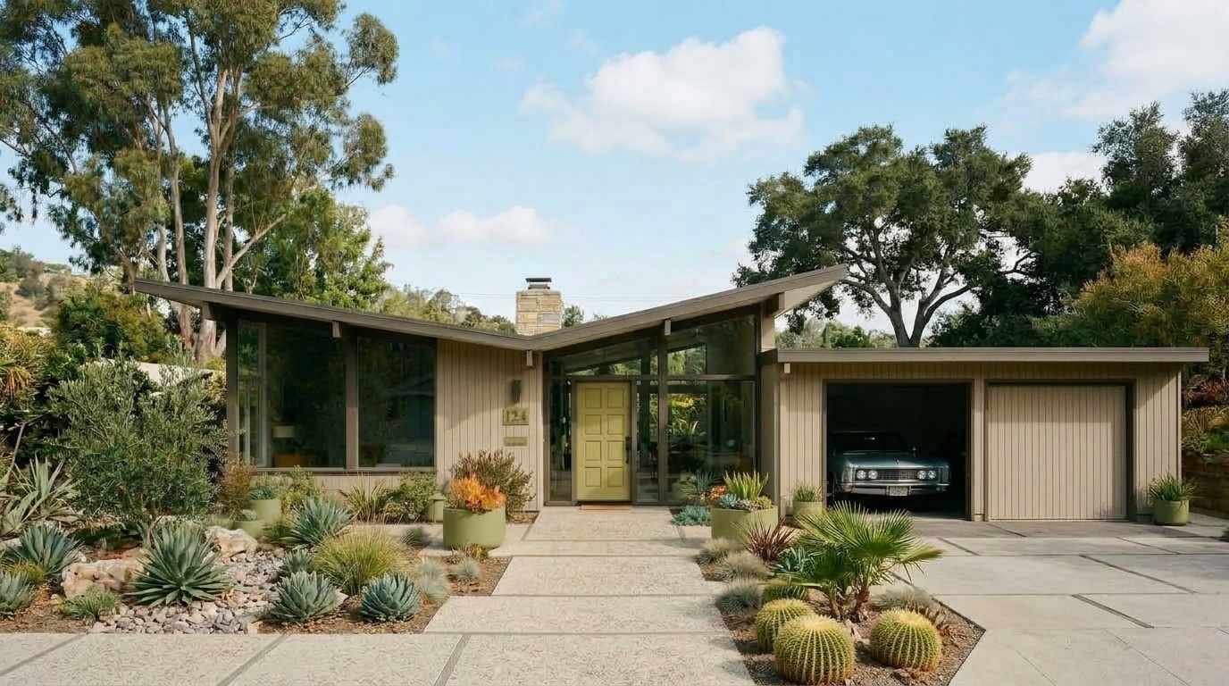
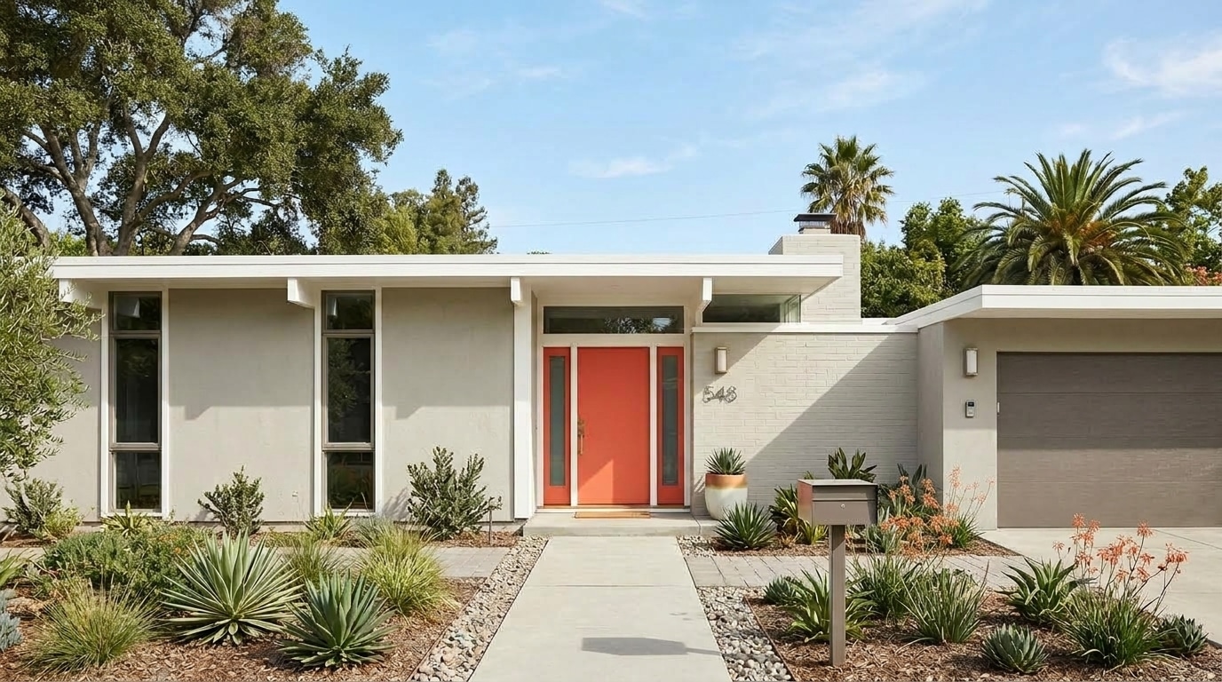
Mid-Century Modern homes are celebrated for their clean lines, simple forms, and seamless connection between indoor and outdoor living. Expansive windows, flat or gently pitched rooflines, and minimal architectural detailing create the perfect backdrop for color palettes that feel both retro-inspired and effortlessly current. Warm wood tones, soft neutrals, earthy browns, and muted grays establish a grounded foundation, while saturated accents such as teal, olive, burnt orange, mustard, and deep blue add energy and personality to the space. These palettes embrace the bold yet balanced spirit that defines Mid-century Modern design.
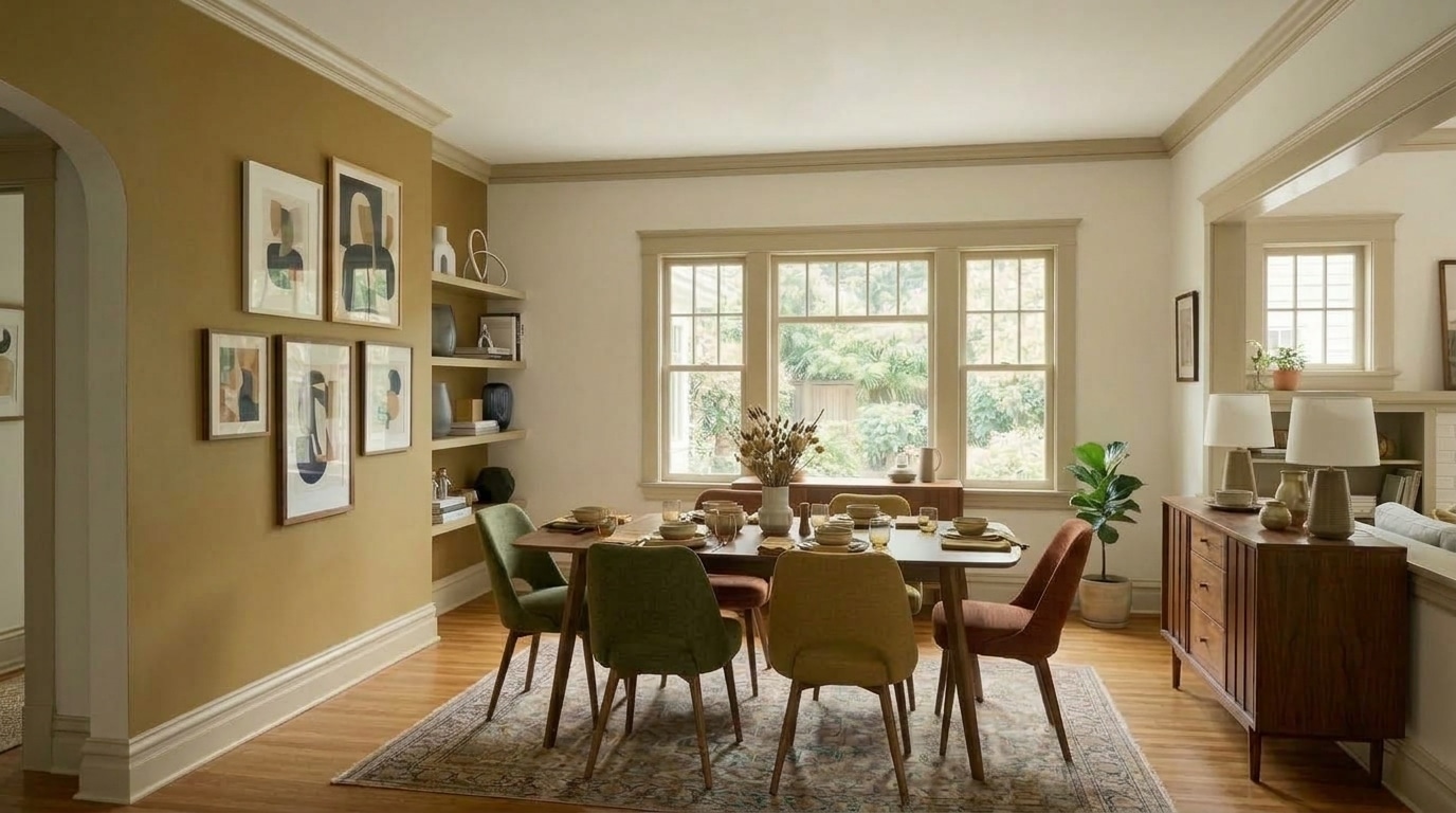
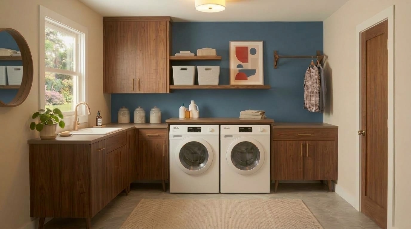
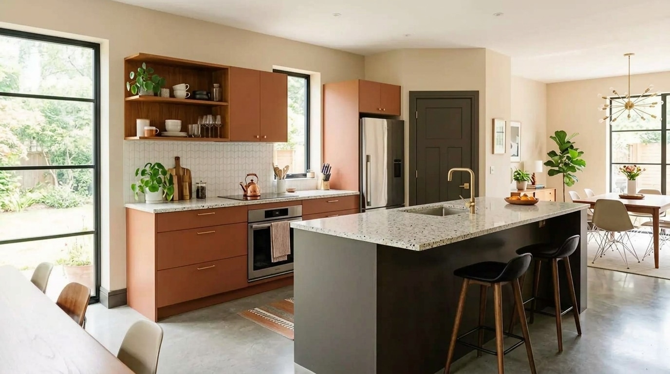

A light neutral gray with gentle silver undertones, Cloud offers an airy brightness with a refined neutrality to fit any style, and pairs beautifully with a crisp white.
Natural and comforting, Reclaimed Wood is a warm gray with brown undertones that echo weathered timber, adding depth while complementing woven textures, bronze finishes, and soft whites.
A dark cool gray with soft smoky undertones, Boat Anchor adds depth without heaviness, beautifully complementing concrete finishes, warm wood tones, and aged metallic accents.
Barely there yet unmistakably warm, Whisper feels serene and effortlessly luminous, a foundational white that pairs beautifully with neutral tones, warm wood, and natural fabrics.
Refined and grounded, Lunar Landing is a warm light greige with soft taupe undertones, offering subtle dimension, gentle warmth, and effortless versatility in calm, neutral spaces.
A warm beige with sandy undertones, Cochise creates a soft foundation, pairing beautifully with cream, wood finishes, natural stone, and woven textures.
Balanced and versatile, Shady is a soft warm gray with beige undertones, bringing approachable warmth to both modern and traditional spaces when paired with a crisp white.
Paper-soft and refined, Crêpe Papier is a light, creamy neutral that creates an elegant, understated backdrop for natural textures, pale woods, and softly layered warm finishes.
Mid-Century Modern palettes pair a grounded foundation with lively accents. Warm wood tones, soft neutrals like Swiss Coffee (DEW341), and muted grays like Shady (DEC774) set the stage, while saturated hues like teal, olive, mustard, and deep blue add personality. Together, they capture the bold yet balanced spirit of the style.
Start with timeless neutrals like Reclaimed Wood (DET625), then layer in one or two saturated accents like Cocktail Olive (DE5564) for a fresh update. This balance lets the retro roots show without feeling dated. A little color goes a long way in these clean, uncluttered spaces.
Teal, olive, burnt orange, mustard, and deep blue are the signature accents of this style — think Dark Lagoon (DEC788) for a rich teal moment or Sunbaked Adobe (DET652) for a warm, earthy burnt orange pop. Use them on a feature wall, a built-in nook, or a front door for instant energy. Keep the surrounding neutrals soft so each accent stands out.
Bring the outdoors in by echoing the colors of your landscape in your interior palette. Soft greens like Desert Sage (DET505) and Cocktail Olive (DE5564), warm earth tones, and muted blues mirror natural surroundings and feel right at home alongside the large windows and open layouts of this style. Grounded neutrals such as Lunar Landing (DE6241) can also help blur the line between inside and out — one of Mid-Century Modern design’s most defining qualities.
Choose one core neutral as your foundation — a warm, versatile option as Shady (DEC774) works beautifully — then add supporting shades that share the same undertone. Repeat a favorite accent, like Eames for Blue (DET564), in small doses from room to room to tie everything together. Our Professional Color Advisors can help you build a palette that feels intentional throughout.