




Wooded Acre | DE6130
Relaxed and grounded, Wooded Acre is an earthy neutral that delivers softness, warmth, and an easy, nature-inspired feel across layered interiors.

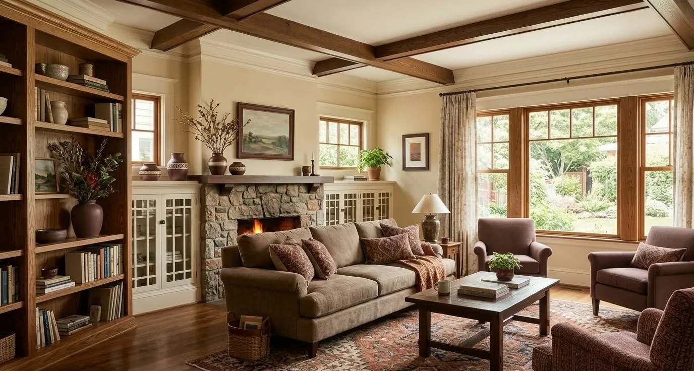
Craftsman homes are known for their warm, handcrafted character and strong connection to nature. Defined by broad front porches, exposed architectural details, layered rooflines, and substantial woodwork, this timeless style pairs beautifully with earthy, grounded color palettes. Rich greens, weathered browns, warm grays, and soft creamy whites create an authentic Craftsman look, while deeper accent shades add contrast and highlight architectural details. These palettes are designed to feel welcoming, natural, and enduring, complementing both traditional and modern interpretations of Craftsman architecture.


Relaxed and grounded, Wooded Acre is an earthy neutral that delivers softness, warmth, and an easy, nature-inspired feel across layered interiors.
A warm sandy neutral with a touch of gray, Birchwood makes a space feel grounded and understated, pairing seamlessly with white oak, leather, slate, and woven textiles.
A gentle greige with soft warm undertones, Miner’s Dust creates a calm foundation and pairs beautifully with oak finishes, linen textures, brushed nickel, and understated architectural details.
A warm, golden tan with toasted amber undertones, Gourmet Honey feels indulgent and inviting, pairing beautifully with walnut, burnished metals, cream, and terracotta.
Smooth, composed, and endlessly adaptable, Fine Grain is the foundational neutral with a balanced gray-beige undertone that makes every other element in a room look intentional.
Easy and refined, Nomadic Taupe is a light neutral that delivers softness, balance, and understated elegance across modern and traditional spaces.
A warm, light beige with ivory undertones, Bone is a foundational neutral that elevates any space, pairing effortlessly with natural linen, warm wood tones, and brushed metals.
A creamy light beige with subtle warm peach undertones, Cashmere softens a space beautifully and complements light woods, linen, matte brass, and gently layered plush textiles.
Choose one earthy body color, one complementary trim, and one deeper accent to create an authentic, layered Craftsman look. Wooded Acre (DE6130) makes a strong, grounded body color, and Historic White (DET653) offers a warm, clean trim that complements it beautifully. Rich greens, weathered browns, warm grays, and creamy whites all work together to reflect the style’s natural, handcrafted character.
Use a deeper, contrasting shade on exposed beams, brackets, and trim to make architectural details stand out. Downing to Earth (DET634) delivers the rich, grounded contrast needed to frame woodwork beautifully without competing with the home’s overall warmth. Choose an accent that’s two to three shades darker than your body color for a natural, balanced result.
Bring the warmth inside with soft neutrals and earthy greens for a grounded, welcoming feel. Fine Grain (DE6213) on the walls pairs naturally with California Sagebrush (DET513) as a nature-inspired accent, keeping things feeling rooted and cohesive. Let natural woodwork guide your palette so colors flow seamlessly from room to room.
Keep undertones consistent and let one color lead for a rich, cohesive result that never feels heavy. Nomadic Taupe (DE6192) paired with Antique White (DEW351) strikes the right balance between warmth and openness without tipping into heavy territory. If the space starts to feel too warm, a lighter neutral or soft creamy white restores the balance.
Simplify your palette and choose tones with a fresh edge that honor Craftsman roots while feeling clean and current. Gourmet Honey (DE6150) pairs beautifully with Morro Bay (DET571) for a warm body color balanced by a crisp, updated contrast that modernizes the look without losing its grounded character. If you’d like a hand finding the right combination, our Professional Color Advisors are happy to help.